Creating a Scalable Employee Platform

Overview
Role: Product Designer
Scope: 0→1 system design (workflow architecture + UX)
Duration: 9 months
Team: Product, Engineering, Compliance, HR
From Fragmented HR Tools to One Employee Experience
Executive summary
UBS® needed to consolidate fragmented internal systems into a unified employee experience platform.
The goal wasn’t a visual refresh. It was reducing friction, improving orientation, and creating a scalable foundation for future HR services.
I redesigned the platform architecture to help employees navigate tools, benefits, knowledge resources, and workflows through one coherent experience.
Context & Business Problem
Employees relied on multiple disconnected systems to access HR services, benefits, internal documentation, and career resources. The ecosystem had evolved into isolated tools rather than a connected platform.
This caused:
— navigation confusion
— duplicated content
— inconsistent interaction patterns
— low discoverability of resources
— dependency on support teams
— search replacing actual navigation confidence
The platform technically existed — but users didn’t experience it as one system.
My role & ownership
I led UX architecture and experience design for the unified employee platform.
My responsibilities included:
— mapping fragmented employee journeys
— auditing existing platform structures
— redesigning information architecture
— defining scalable navigation patterns
— structuring cross-platform content logic
— aligning UX decisions with HR and product stakeholders
— collaborating with engineering on implementation feasibility
The core challenge was making disconnected services feel like one predictable product.
Discovery & insights
Research showed employees didn’t struggle because tools were missing.
They struggled because orientation was missing.
Users often depended on search or support channels instead of confidently navigating the system themselves.
Key friction points included:
— inconsistent naming conventions
— duplicated workflows across platforms
— unclear ownership of content
— fragmented navigation structures
— lack of hierarchy between tools and resources
— repeated relearning between modules
Key insight
Users didn’t lack information.
They lacked confidence in where information belonged.
The problem wasn’t visual inconsistency. It was cognitive inconsistency.
Strategic design decisions
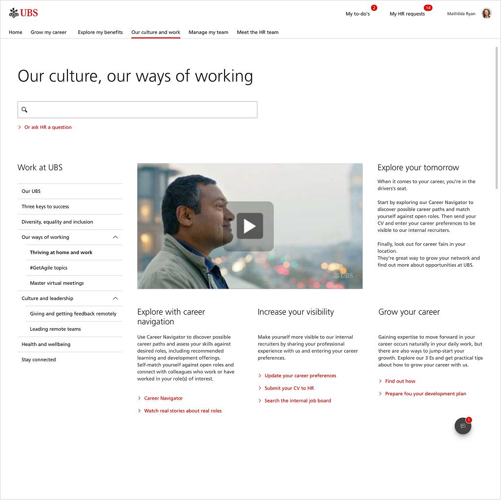
Instead of redesigning individual pages, we redesigned the system behavior.
We introduced a set of structural rules to make the experience predictable across modules and services.
Core decisions included:
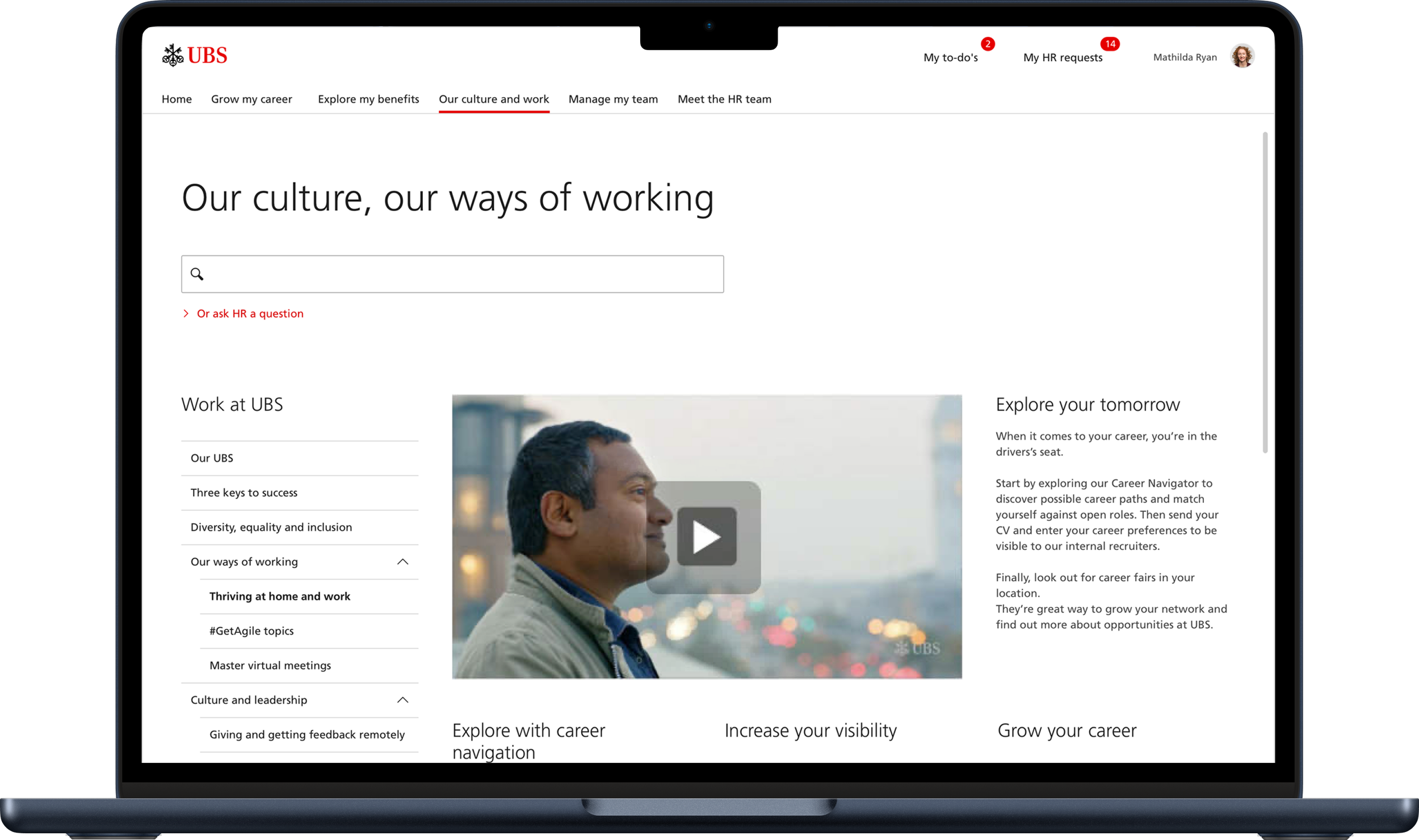
— unified global navigation
— shared interaction logic between modules
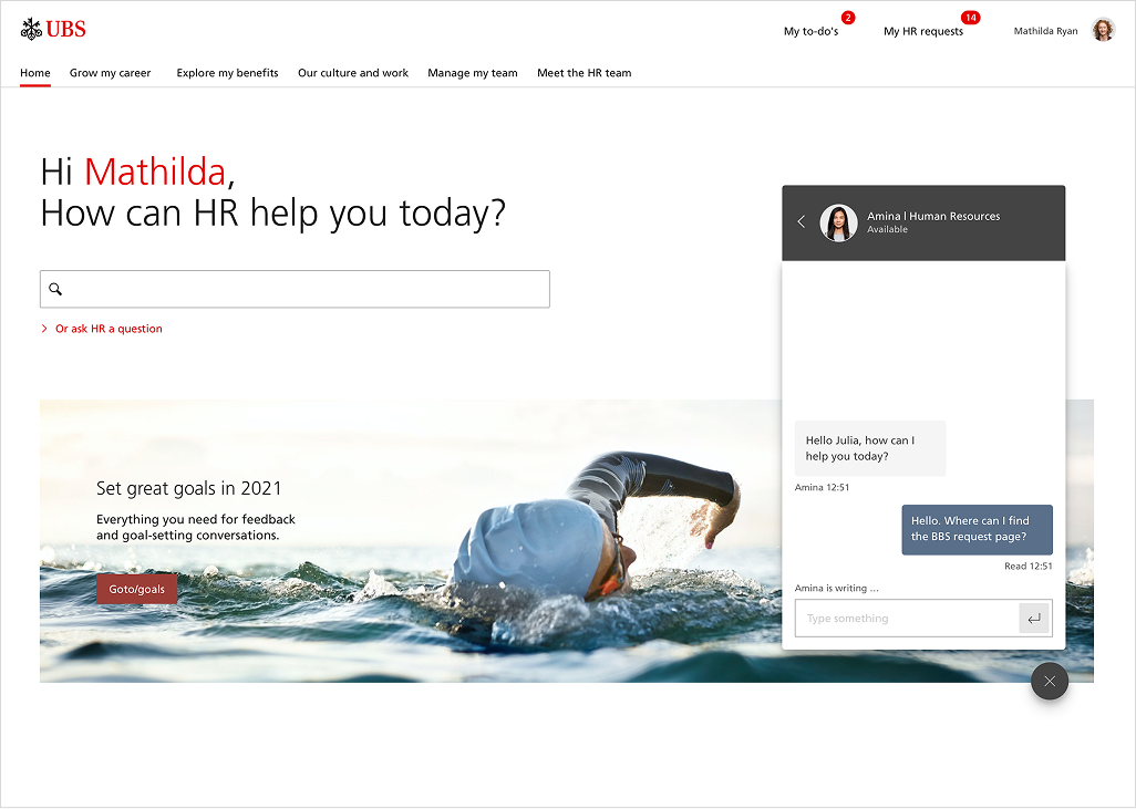
— combined search + browse discovery model
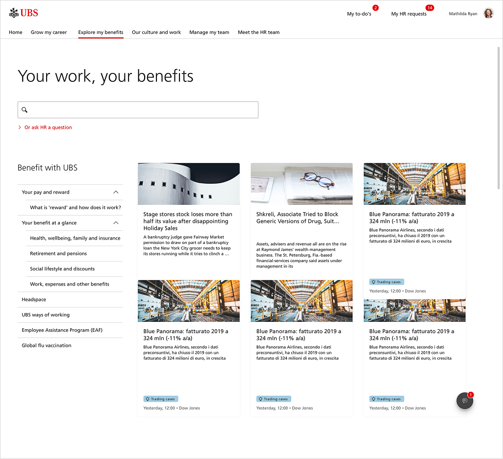
— reusable content structures
— scalable information hierarchy
— predictable page composition patterns
The goal was to create a system employees could learn once — not relearn every visit.
Information architecture redesign
We restructured the platform around employee mental models rather than organizational silos.
Instead of grouping services by internal department ownership, we grouped experiences around employee goals and tasks.
This reduced decision fatigue and improved discoverability across the platform.
Examples included:
— consolidating overlapping resources
— simplifying category structures
— reducing navigation depth
— aligning terminology across modules
— introducing consistent entry points for workflows
The architecture shifted from “where the company stores things” to “how employees think.”
Navigation & discovery model
One of the major UX problems was overreliance on search.
Employees searched because browsing felt unreliable.
To address this, we designed a hybrid discovery model combining:
— structured navigation
— contextual recommendations
— predictable browse paths
— integrated search support
The platform encouraged exploration without forcing users to know exact terminology beforehand.
This significantly improved orientation and reduced hesitation during navigation.
Design system thinking
A key part of the redesign was creating consistency beyond visuals.
We introduced reusable UX patterns that could scale across future HR modules and services.
This included:
— repeatable layout structures
— standardized content modules
— unified interaction behaviors
— consistent hierarchy patterns
— scalable navigation rules
The objective wasn’t only interface consistency.
It was behavioral consistency across the employee ecosystem.
Solution architecture
The final platform focused on:
— single access point for HR tools and services
— predictable global navigation
— scalable content structures
— unified employee workflows
— modular platform expansion
— reusable navigation and content patterns
— improved cross-platform orientation
The redesign transformed a collection of tools into a coherent employee experience platform.
Validation
We validated the new structure through stakeholder reviews, internal walkthroughs, and pilot testing.
Feedback consistently showed improved orientation and reduced friction when navigating between services.
Observed improvements included:
— faster information discovery
— fewer navigation-related support questions
— improved understanding of platform structure
— better discoverability of HR resources
— smoother movement between workflows
Employees stopped asking where to go.
They understood how the system worked.
Outcome
The redesign established a scalable UX foundation for future internal services and employee tools.
New HR modules could be introduced without forcing employees to relearn navigation patterns or interaction behaviors.
The platform became:
— more predictable
— easier to scale
— easier to maintain
— easier to navigate
— more trustworthy for employees
The biggest success wasn’t visual polish.
It was creating confidence and orientation inside a previously fragmented ecosystem.