Reducing Mobile Survey
Drop-Off by 26pp
Without simplifying the product.
Mobile surveys weren’t failing because they were complex. They were failing because every step required too much effort.
Snapshot*
Role: Product Designer (UX/UI)
I led the end-to-end redesign of the mobile survey experience, working closely with a PM, engineers, and a data analyst. I was responsible for defining UX principles, interaction patterns, and translating them into a scalable mobile UI system.
This project directly impacted response volume and data quality, making it critical for product and business decisions.
Duration: 4 months
Team: 1 PM, 3 engineers, 1 Data Analyst
Scope: Redesign of the mobile survey experience across all question types, including interaction patterns, visual system, and component architecture.
Impact:
completion rate: 41% → 67%
drop-off after question 2: -38%
avg. time to complete: -24%
mis-tap rate: improved tap accuracy and reduced interaction errors
mobile nps: +18 pts
* data based on mixpanel funnel analysis, firebase event tracking, and usability testing (n=12).
The problem
Surveys were originally designed for desktop environments. As usage shifted to mobile, the interaction model remained largely unchanged.
On mobile, this resulted in dense layouts, small tap targets, and too many inputs per screen. Even simple surveys required a high level of effort to read, process, and interact with.
What we thought was the problem
At first, we assumed the main issue was layout responsiveness. We believed that making layouts more “mobile-friendly” and improving spacing would solve the problem.
This assumption turned out to be incomplete.
Research
To understand where and why users dropped off, we combined product analytics with qualitative research. We analyzed funnel data, interaction patterns, and time-to-complete metrics, and paired that with usability testing and session recordings.
Both sources consistently pointed to the same issue: users were not confused — they were overwhelmed by the interaction model.
Quantitative insights
Funnel analysis showed a sharp drop-off within the first few questions. We also observed longer interaction times and a high number of repeated taps, indicating issues with tap precision and layout clarity.
Funnel analysis based on internal product analytics and behavioral data provided by the product team.
Qualitative insights
In usability tests, users often hesitated before interacting, mis-tapped options, or scrolled without taking action. Several described the experience as “tiring” rather than confusing.
This suggested that the issue was not comprehension, but the cost of interaction.
Exploring solutions
We explored multiple directions to reduce effort and improve completion.
Direction 1 - reduce steps
We tried grouping multiple questions into a single screen to reduce the number of steps. This approach improved initial speed, but increased drop-off later in the flow.
Users delayed effort — but abandoned the survey when the screen became too demanding.
Direction 2 - one question per screen
We tested a single-question-per-screen approach to reduce cognitive load. This made each step easier to process and interact with.
Users moved slower — but more consistently.
Direction 3 - hybrid grouping
We explored grouping related inputs while keeping some level of focus. This approach introduced additional complexity without clear benefits.
It didn’t significantly improve completion or usability.
Decision
Each direction solved a different problem — but only one improved completion without increasing friction. We chose to increase the number of steps.
Because reducing effort per step had a bigger impact than reducing total steps.
It provided the best balance between clarity, interaction speed, and completion rate. Each step required less effort, which improved overall flow despite increasing the number of steps.
Trade-off
The trade-off was between perceived length and actual effort. More steps increased perceived length, but reducing effort per step significantly improved completion.
Accessibility vs Customization
Accessibility was a critical requirement. We needed to meet WCAG 2.1 AA standards, ensuring proper contrast, readable typography, and tap areas that were easy to interact with on mobile.
At the same time, survey creators expected full control over branding — including custom colors and logos.
Initially, we tried to prevent users from creating inaccessible color combinations by enforcing strict rules. While this ensured compliance, it significantly limited flexibility and created friction during survey setup.
We realized that blocking users wasn’t the right approach.
Instead, we shifted from restriction to guidance. We allowed full customization, but introduced real-time feedback — highlighting contrast issues, suggesting accessible alternatives, and clearly indicating when designs didn’t meet accessibility standards.
This approach preserved flexibility while still supporting accessibility, without forcing users into rigid constraints.
It also scaled better across different use cases, where strict enforcement would have been too limiting. Strict enforcement improved accessibility — but hurt adoption.
Guidance preserved both.
Building a mobile system
This redesign wasn’t just about improving individual screens. We needed to rethink how surveys behave as a system across different devices, contexts, and question types.
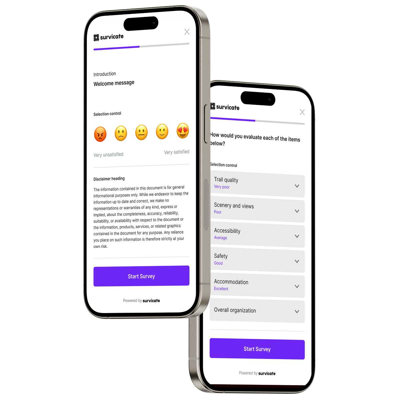
We started by redefining core interaction patterns for mobile. Every component was designed to be easy to tap, readable at a glance, and usable with one hand. This meant increasing tap areas, simplifying layouts, and removing unnecessary visual noise.
At the same time, we built a reusable mobile UI kit. Instead of designing screens one by one, we created a system of components that could scale across all survey types. This ensured consistency and made it easier to maintain and extend the product over time.
Because surveys were configured in a SaaS dashboard and rendered dynamically on mobile, we also had to ensure that what users set up matched what respondents experienced. This required defining clear rules for how configurations translate into UI.
We worked closely with engineers to adapt existing desktop components into mobile-first versions. Designs were delivered with defined states, behaviors, and constraints, which reduced ambiguity during implementation and improved handoff quality.
Outcome
The redesign had a measurable impact on how users interacted with surveys on mobile.
We focused on reducing cognitive load and simplifying interactions at each step, which directly improved completion and reduced friction across the flow.
Key metrics
+26% completion rate
-38% drop-off after question 2
-24% time to complete
-31% mis-taps
+18 NPS
Funnel impact
Before the redesign, the funnel showed a steep drop-off early in the flow, particularly between the first and third question. This suggested that users were encountering friction almost immediately after starting the survey.
After introducing a single-question-per-screen model, the funnel became significantly flatter. More users progressed step-by-step, and fewer abandoned the survey midway.
This shift indicated that users were no longer overwhelmed at the beginning of the experience.
What changed behavior
The improvement wasn’t driven by visual polish.
It came from restructuring how users interacted with the survey.
By reducing the number of decisions per screen, increasing tap comfort, and improving focus, we lowered the effort required to complete each step.
This made the overall experience feel faster and easier, even though the total number of steps increased.
Business impact
Higher completion rates translated into a larger volume of usable responses, improving the quality and reliability of collected data.
This allowed teams to make better product and business decisions based on more complete datasets, especially for longer and more complex surveys.
Validation
Metrics were tracked using Mixpanel funnel analysis and Firebase event tracking, based on events such as:
survey_started
question_answered
survey_completed
These quantitative insights were supported by usability testing (n=12), where we observed reduced hesitation, fewer interaction errors, and smoother progression through the survey.
What I’d do differently?
Looking back, earlier validation could have helped us identify some issues faster. We also focused mainly on completion metrics, while perceived effort could have been measured more directly.
Exploring adaptive behavior based on user context would be a valuable next step.
Final takeaway
Mobile UX isn’t about reducing steps. It’s about reducing effort per step. When effort drops, users move forward — even if the flow gets longer.
This shifted our focus from optimizing flows to optimizing interactions.