

E-Banking Authorizations
Eliminating approval chaos in a 5-department onboarding system
Designed a scalable authorization framework across HR, Compliance, Finance, and IT — reducing onboarding time by 40% and eliminating manual coordination.
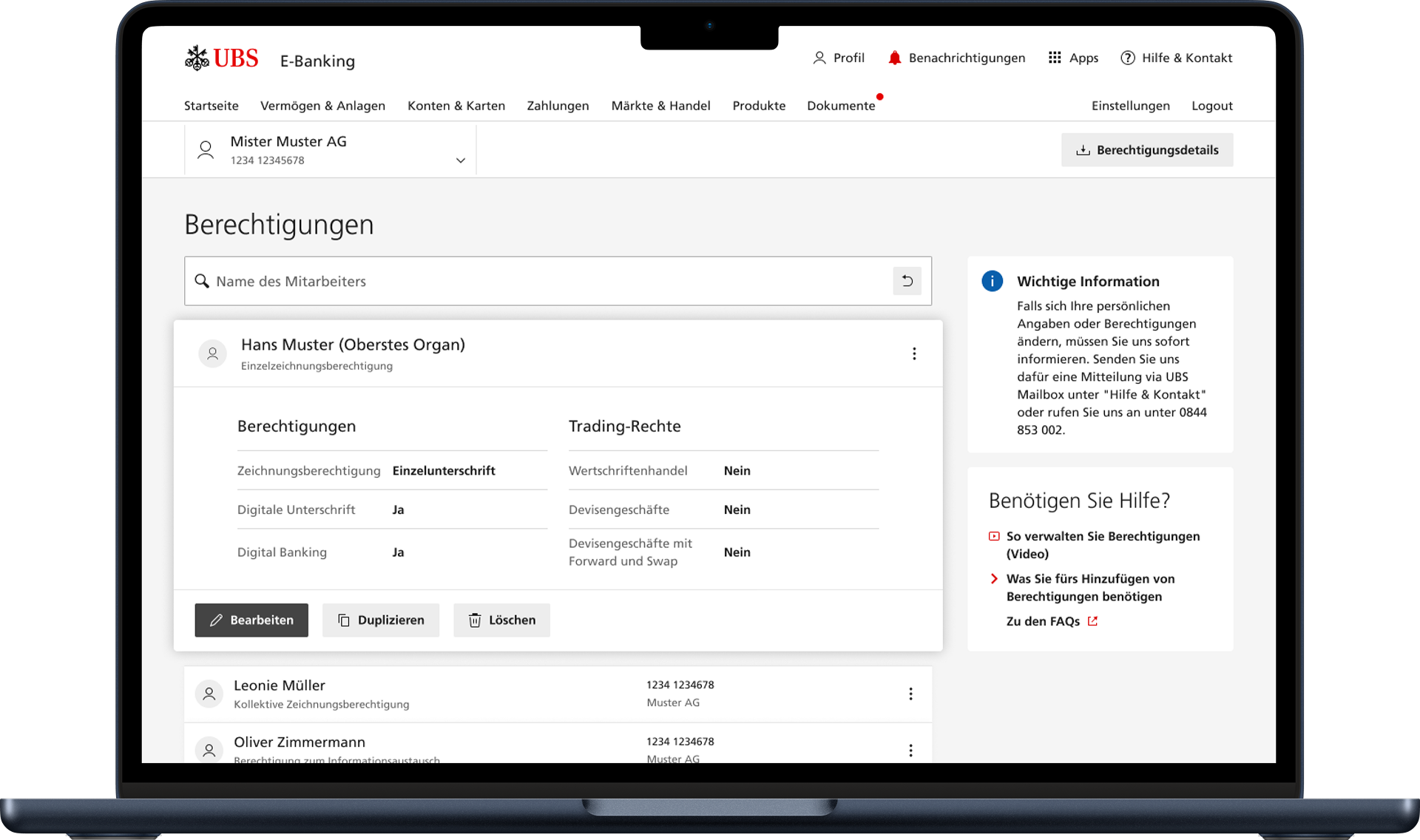
Overview
E-Banking Authorizations Designing a workflow system that made complex multi-department approval processes visible, owned, and predictable.
Role: Product Designer
Scope: 0→1 system design (workflow architecture + UX)
Duration: 9 months
Team: Product, Engineering, Compliance, HR
Executive summary
UBS onboarding relied on fragmented, email-driven coordination across multiple departments. No shared system connected approvals, ownership was unclear, and teams had no visibility into workflow status.
I designed a flow-based authorization system that made the process visible, structured, and predictable.
The solution reduced onboarding time by 40%, eliminated manual follow-ups, and cut support tickets by 68%.
Context & Business Problem
Employee onboarding workflows spanned five departments: HR, Compliance, Finance, Managers, and IT Provisioning.
Each step had dependencies and approvals, but the system lacked a shared orchestration model.
This resulted in:
users not knowing who owned the next step
departments tracking progress independently
onboarding steps completed out of sequence
unclear escalation paths
silent failures that went undetected for days
Early explorations — mapping complexity
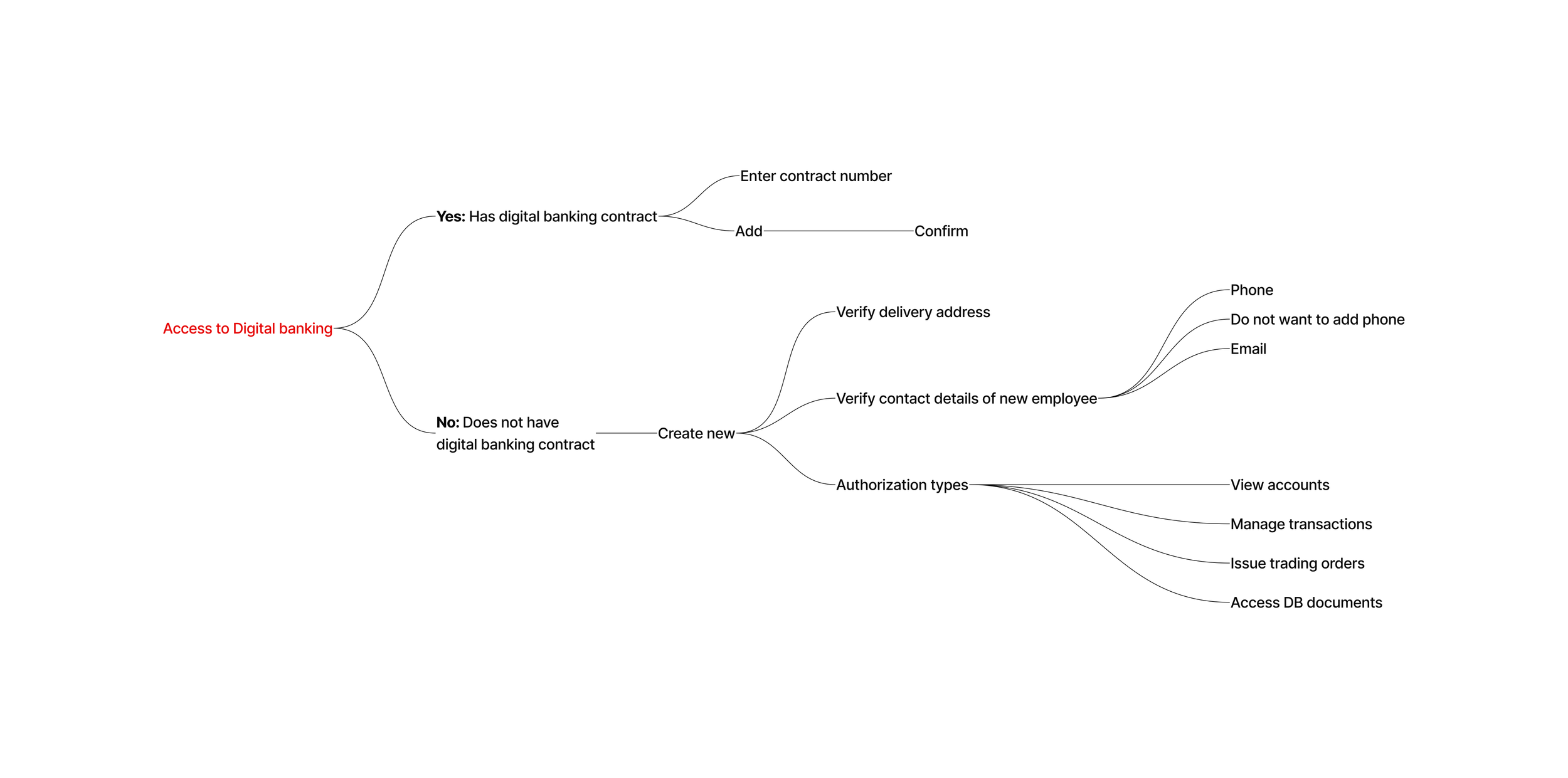
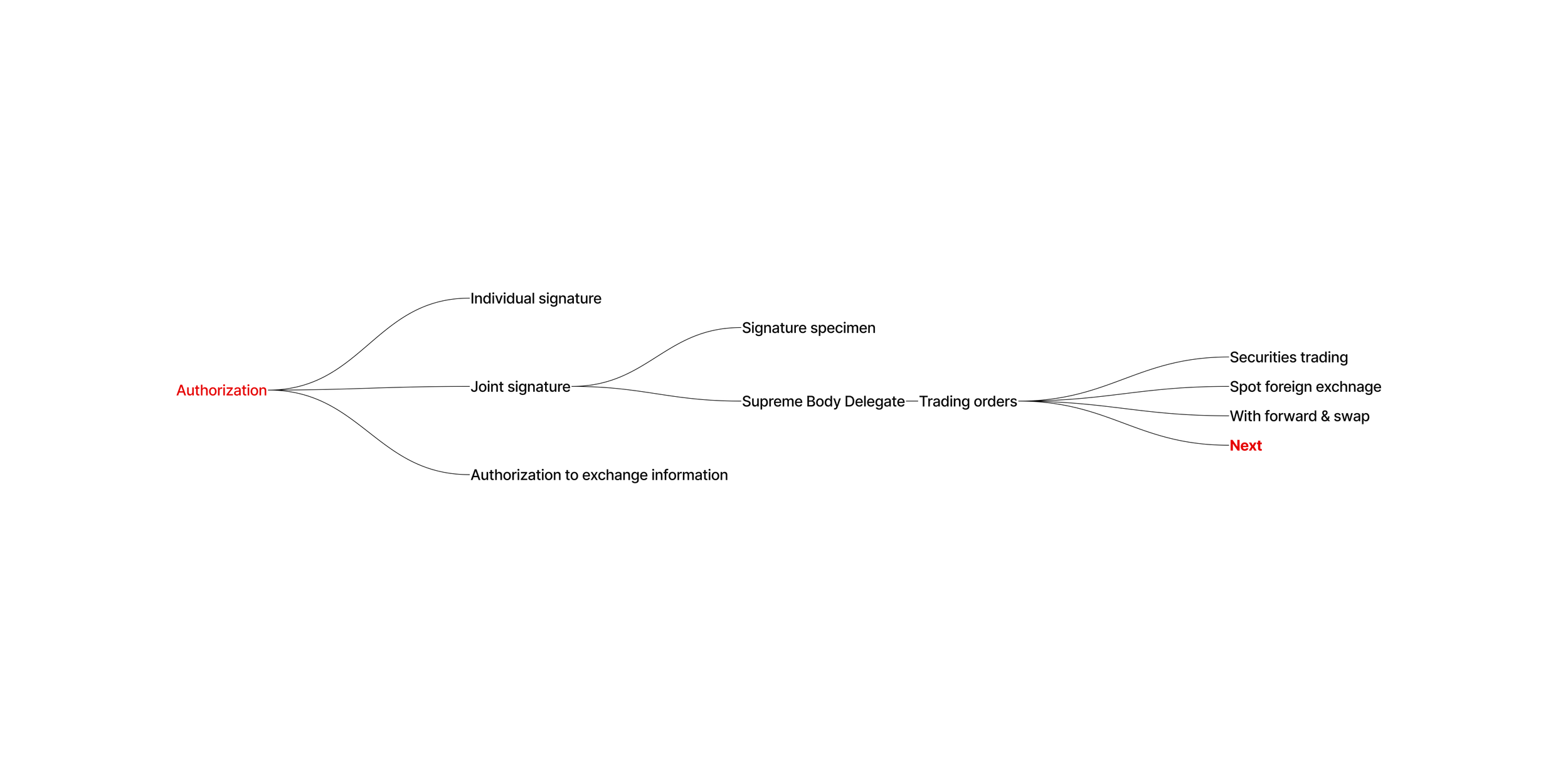
To understand the structure of the authorization system, I mapped out key flows, decision points, and dependencies across onboarding scenarios.
This exercise revealed a high level of branching logic, duplicated paths, and inconsistencies between similar use cases (e.g. new vs. existing contracts).
It became clear that designing individual screens would not be sufficient — the problem required a system-level approach.
Exploring onboarding flow complexity
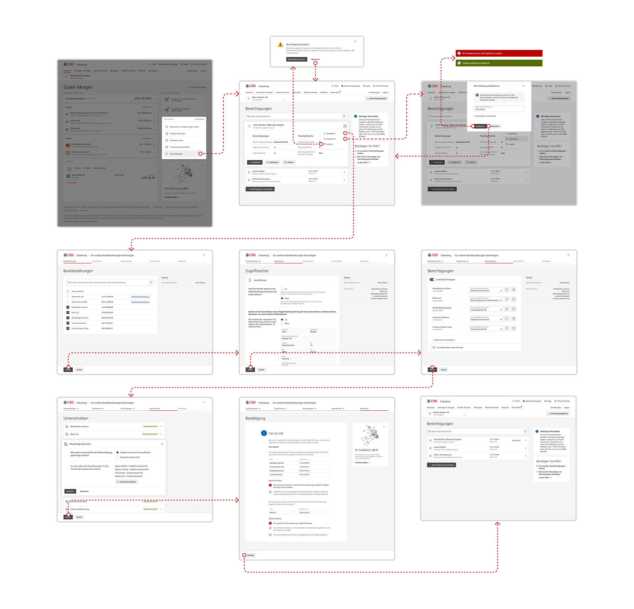
I mapped the onboarding flow for granting access to digital banking, covering both new and existing contract scenarios.
The flow quickly expanded into multiple branches, including contract validation, data verification, and permission assignment.
This revealed how even a single use case introduced significant complexity and dependencies between steps.
Fragmented entry points and feature surface
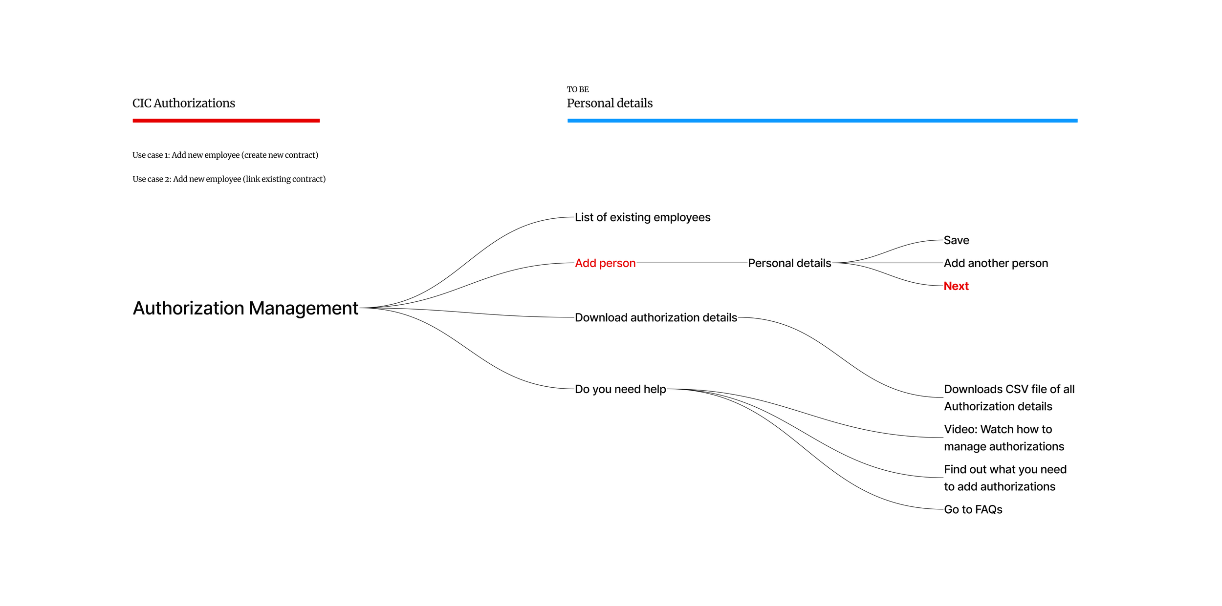
The authorization system exposed multiple entry points and actions, such as adding users, downloading data, and accessing help content.
These features were not structured around a clear workflow, making it difficult for users to understand where to start or what action to take next.
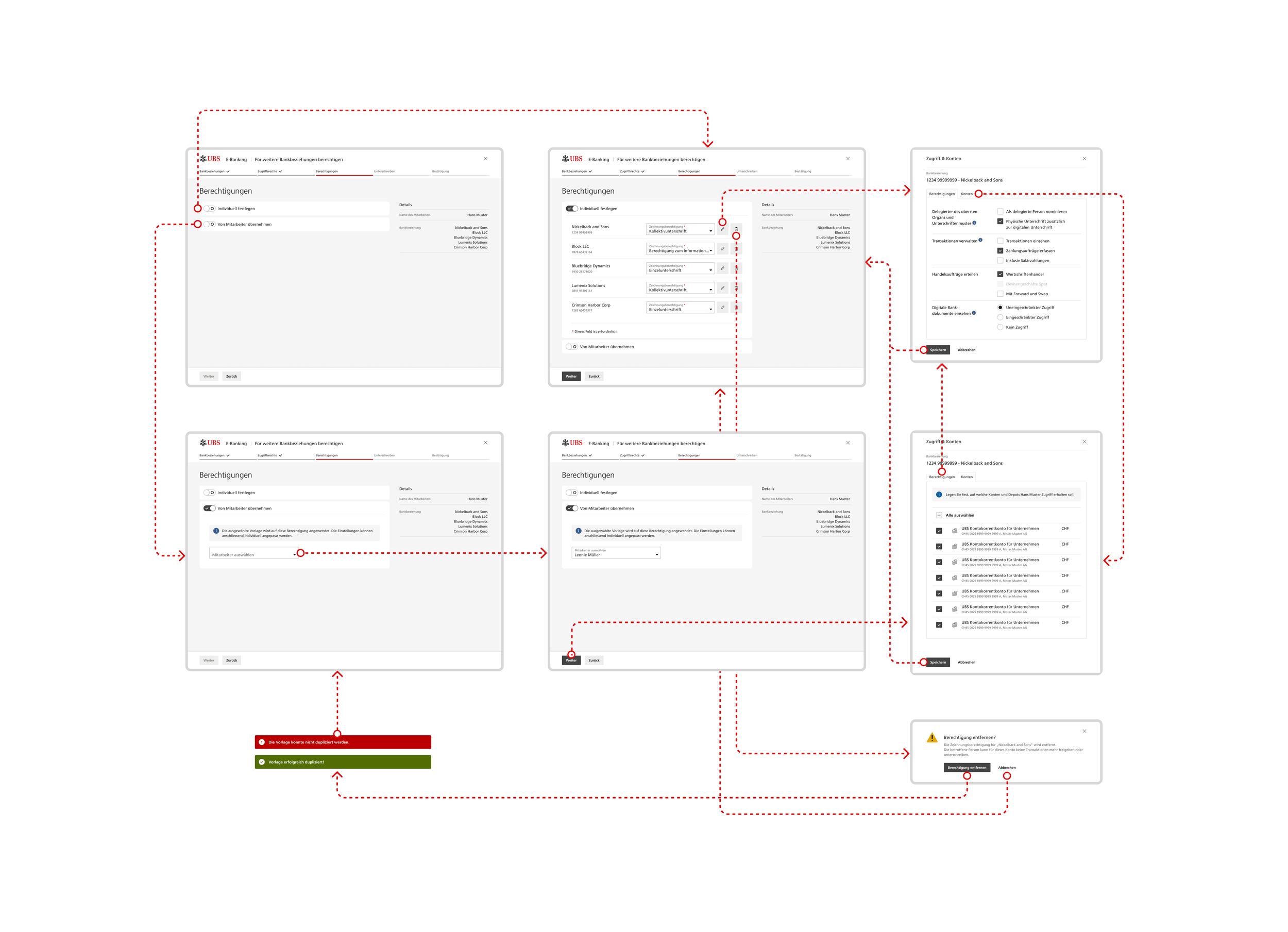
Underlying authorization model complexity
Beyond the UI, the authorization logic itself was complex, involving multiple permission types, roles, and combinations of access rights.
This added another layer of difficulty, as the interface needed to reflect and manage this complexity without overwhelming the user.
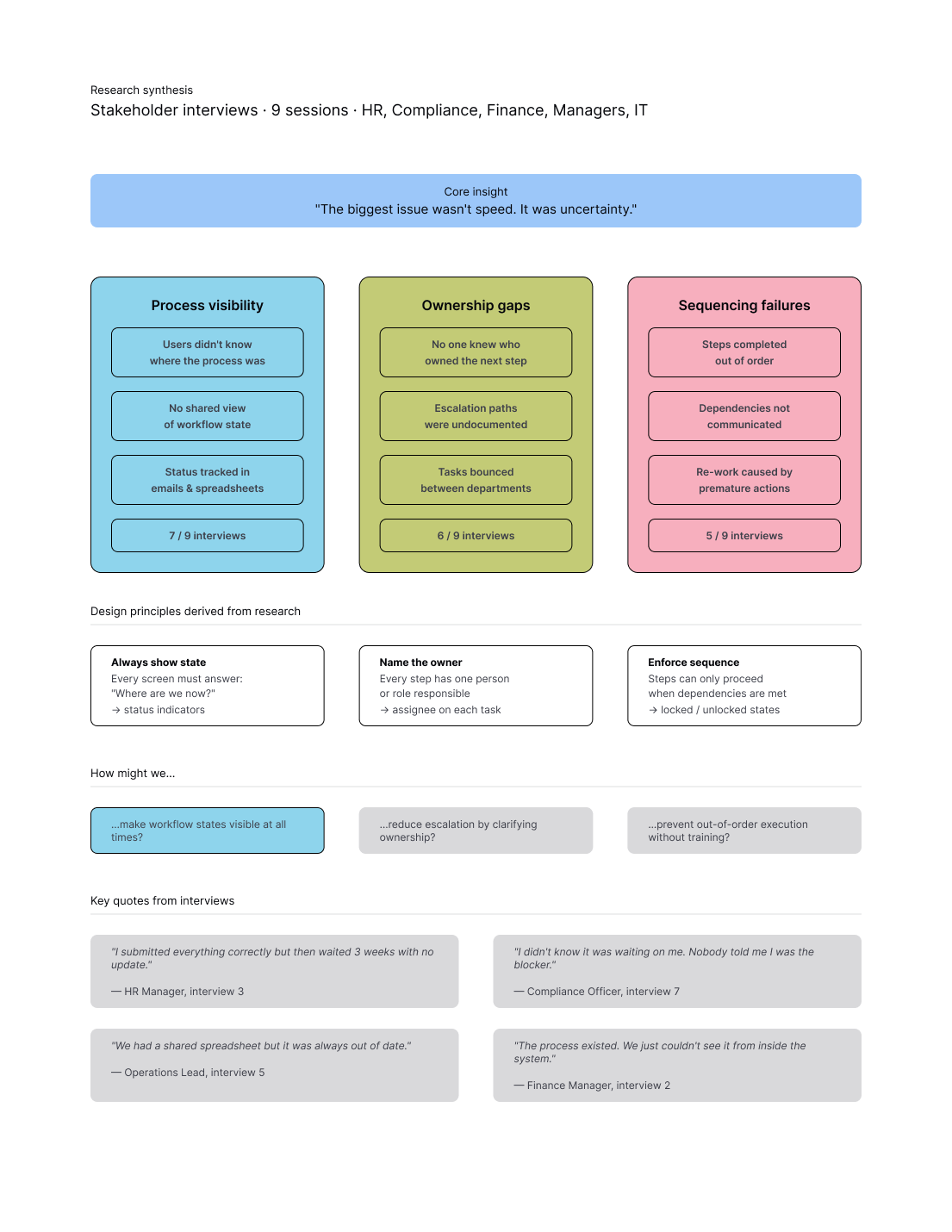
Core insight
The biggest issue wasn’t speed — it was lack of visibility.
Users were completing their tasks blindly, often blocking the entire onboarding process without realizing it.
The system failed at the orchestration level, not at individual task execution.
Approach
Instead of redesigning individual screens, I focused on defining a workflow system that could:
expose process state
define ownership
enforce sequencing
This shifted the problem from UI design to system design
Strategic Decision
Decision: Flow-based system vs screen-based design
We initially explored a step-by-step wizard and a dashboard-based approach.
The wizard simplified individual steps but completely failed in real workflows — users lost context and couldn’t understand the overall process.
The dashboard provided visibility but didn’t guide action.
I chose a flow-based architecture that exposes the entire workflow state, including:
step progression
ownership
dependencies
Trade-off:
(+) full transparency and scalability
(-) higher complexity in system design
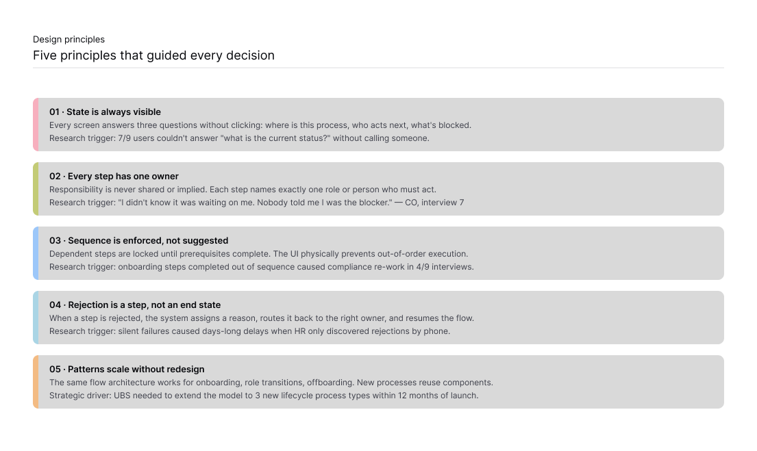
Key design decisions
1. Make workflow state always visible
Every screen answers:
where is the process
who owns the next step
what is blocked
2. Assign clear ownership per step
Each step has exactly one responsible owner.
This removed ambiguity and reduced escalation overhead.
3. Enforce sequence, don’t suggest it
Steps unlock only when dependencies are met.
This prevented out-of-order execution and reduced compliance risks.
4. Treat rejection as part of the flow
Instead of ending the process, rejection routes the workflow back with context and ownership reassignment.
5. Design for reuse, not one scenario
The same system supports onboarding, role transitions, and future lifecycle workflows without redesign.
Ideation
Before committing to a direction, we explored three distinct approaches in a structured ideation session with 2 designers and 1 PM.
Direction A — Dashboard-first A global overview with drill-down into individual workflows. Strong for managers, but didn't guide action for task-level users.
Direction B — Step-by-step wizard A linear, screen-by-screen flow. Simple mental model, but users lost context of the whole process and power users found it frustrating.
Direction C — Flow-based view (chosen) A persistent view showing all steps, their states, and owners simultaneously. Scored highest on visibility, ownership clarity, and scalability.
We ran Crazy 8s to explore 8 UI patterns for displaying authorization state in 8 minutes. The status grid pattern from sketch 8 became the foundation for the final design.
Iterations
The system evolved through three major iterations:
Iteration 1 — Full flow mapping
Revealed 14 unexpected edge cases, including partial approvals and role reassignment mid-flow.
Iteration 2 — Status visibility
Early prototypes showed status only at workflow level.
We introduced step-level and field-level status indicators.
Iteration 3 — Rejection handling
Initial designs treated rejection as an end state.
We redesigned it as a recoverable step with ownership reassignment.
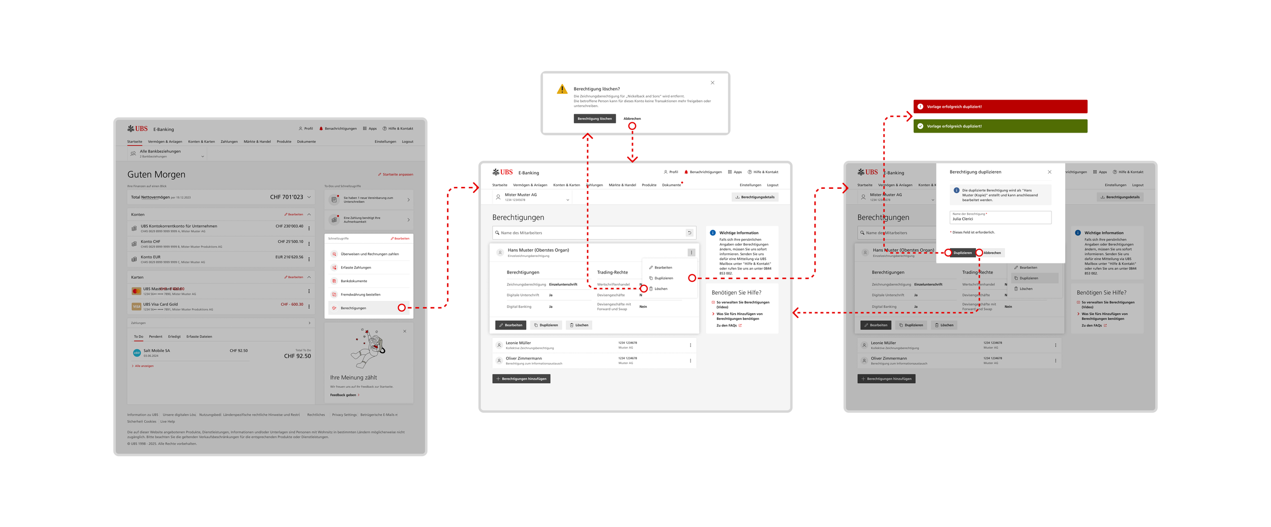
Validation
We validated the solution through two usability testing rounds and a 6-week pilot.
Round 1 (prototype):
users completed tasks but missed locked states
introduced stronger visual indicators and tooltips
Round 2 (pre-launch):
100% task completion
zero prompts needed
compliance requested “rejection reason” → added before launch
Pilot results:
managers no longer needed manual coordination
teams could identify blocked states independently
onboarding flows completed with fewer support requests
Outcome
The system introduced a reusable workflow framework across departments.
Impact:
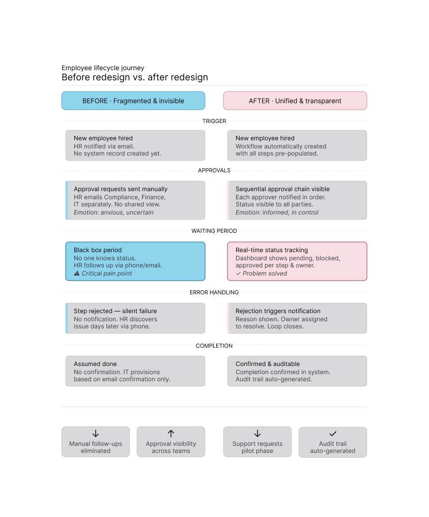
onboarding time reduced by 40% (18 → 11 days)
support tickets reduced by 68%
manual follow-ups eliminated
workflow visibility increased across all teams
The framework was later extended to additional lifecycle processes without redesigning the core system.
Reflection
This project shifted my approach from designing interfaces to designing systems.
I learned that in complex enterprise environments, clarity doesn’t come from simplification — it comes from structuring complexity.
If I continued, I would validate system assumptions earlier using real workflow data instead of relying on mapped scenarios.