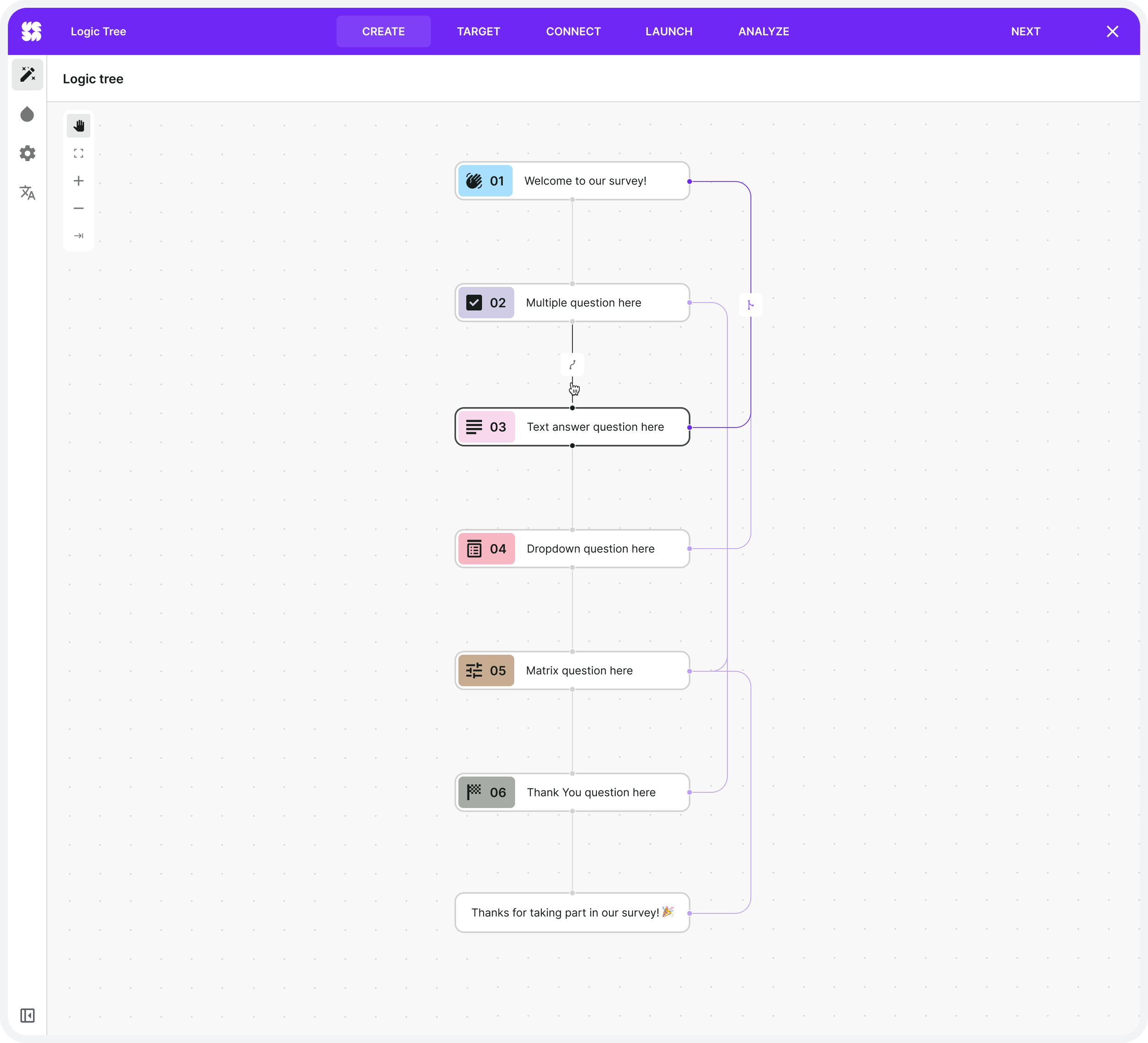
Designing a scalable visual logic system for advanced surveys
How I transformed complex conditional survey behavior into a visual system that non-technical users could confidently understand and control.

Overview
Meta strip
Role: UI/UX Designer
Scope: Product Design · UX Systems · Interaction Design · Design System
Timeline: 3-4 months
Platform: Web Application
Hero metrics
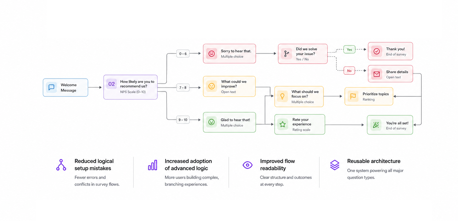
Reduced logical setup mistakes
Increased adoption of advanced survey logic
Improved flow readability for non-technical users
Created reusable logic architecture across all major survey typesOverview
Executive Summary
Survey Logic was one of the most structurally complex problems I worked on at Survicate. As surveys became more advanced, users needed a way to build conditional flows, branching paths, dynamic endings, and personalized experiences — without requiring technical knowledge.
The existing experience technically supported advanced logic, but it became difficult to scale. Large surveys quickly turned into confusing structures that were hard to understand, maintain, and debug.
The challenge wasn’t adding more functionality.
The challenge was reducing cognitive overload while preserving system power.
The final solution introduced a visual logic system that made survey flow visible, editable, and scalable through a consistent interaction model and reusable UI architecture.
Context & Business Problem
As Survicate matured, customers began building increasingly advanced survey scenarios:
conditional branching,
dynamic paths,
personalized follow-ups,
survey endings based on responses,
multi-step decision flows.
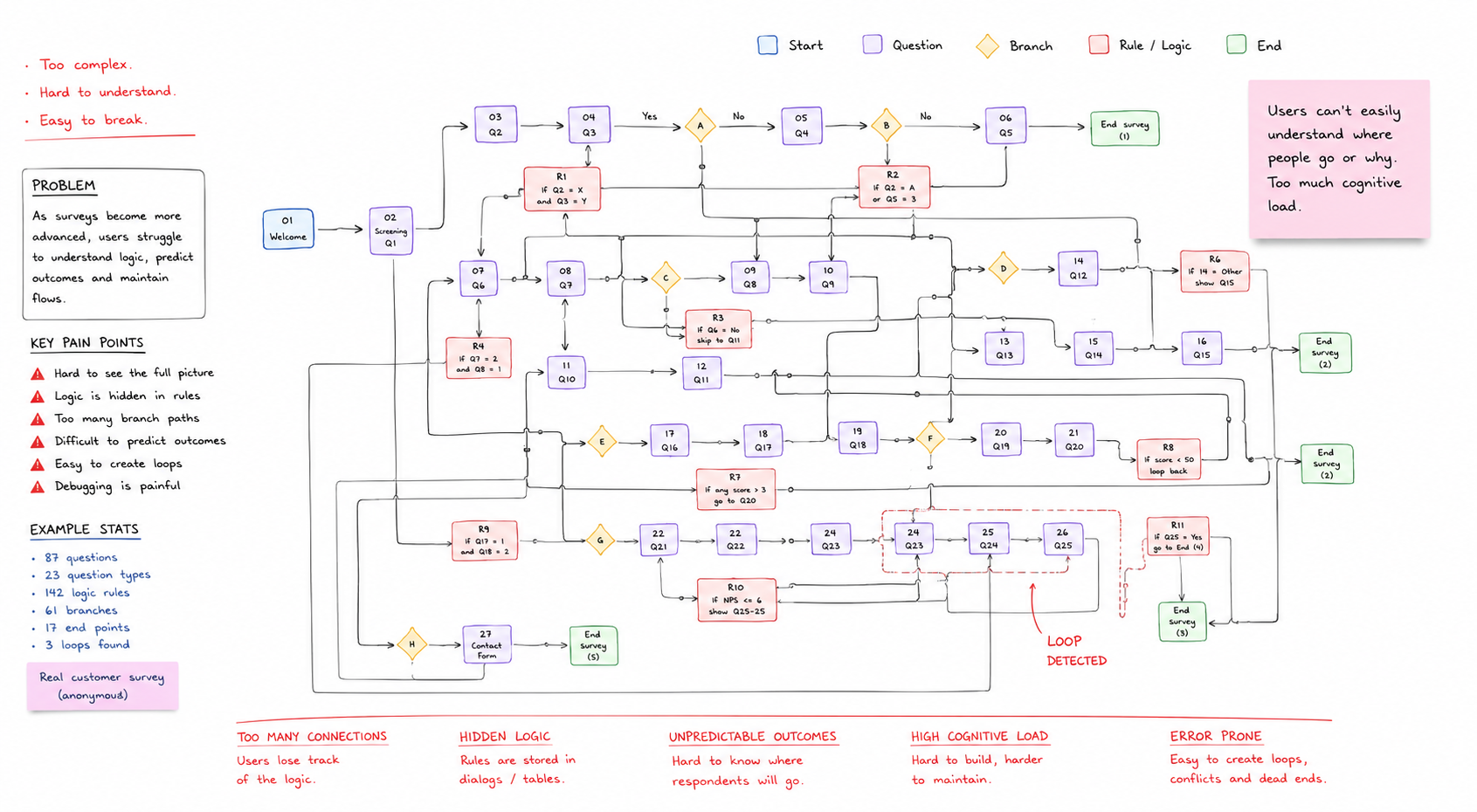
While the platform already supported logic rules, the experience scaled poorly as surveys became more complex.
Users struggled with:
understanding survey structure,
predicting outcomes,
debugging logic conflicts,
maintaining larger flows,
editing conditions without losing context.
Advanced functionality existed — but usability collapsed under complexity
This created a major product risk: advanced logic was becoming accessible only to technical or highly experienced users.
The Challenge
We needed to design a system that:
supports complex conditional logic,
remains understandable at scale,
works for non-technical users,
reduces cognitive overload,
behaves consistently across question types,
remains maintainable as the product evolves.
This wasn’t a single-screen redesign. It was a system-level UX problem involving:
information architecture,
interaction patterns,
visual hierarchy,
reusable behaviors,
mental model simplification.
Every simplification introduced new trade-offs.
Discovery & Insights
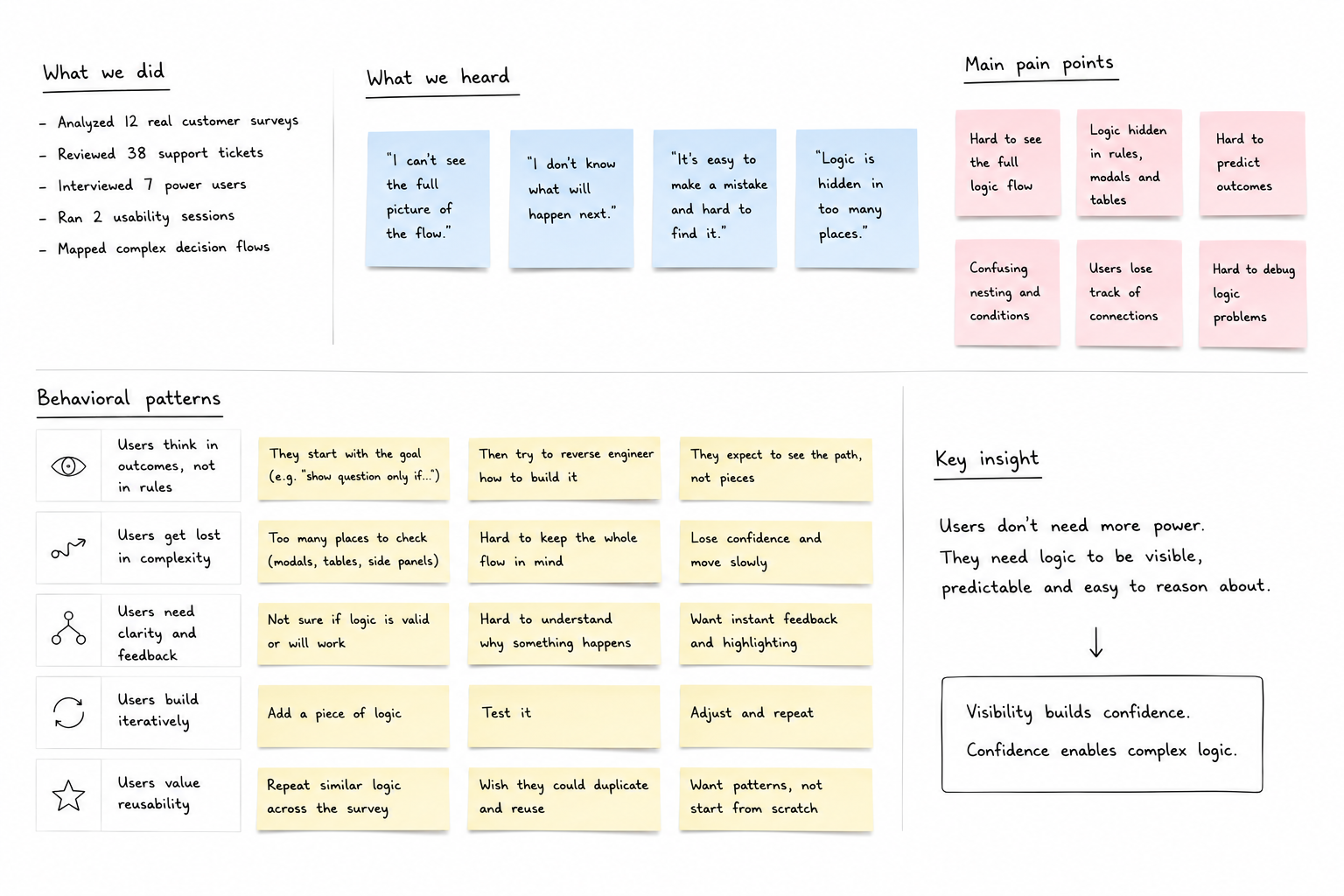
We analyzed real customer surveys, support cases, and complex decision flows.
Several behavioral patterns emerged:
users think in outcomes, not rules,
users need visual confirmation of flow structure,
users lose confidence when logic becomes hidden,
users struggle to predict survey outcomes,
large surveys create significant cognitive load.
This led to one critical insight: Logic must be visible, not hidden.
Users needed to understand:
where respondents go,
why a path changes,
what happens next,
how decisions affect the survey structure.
That principle became the foundation of the entire system.
Design Decisions & Trade-offs
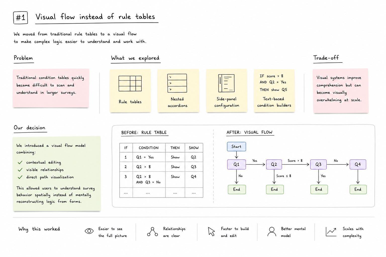
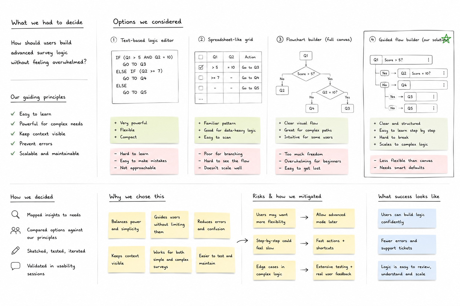
Decision #1 - Visual flow instead of rule tables
Problem
Traditional condition tables quickly became difficult to scan and understand in larger surveys.
What we explored
rule tables,
nested accordions,
side-panel configuration,
text-based condition builders.
Trade-off
Visual systems improve comprehension but can become visually overwhelming at scale.
Final decision
We introduced a visual flow model combining:
contextual editing,
visible relationships,
direct path visualization.
This allowed users to understand survey behavior spatially instead of mentally reconstructing logic from forms.
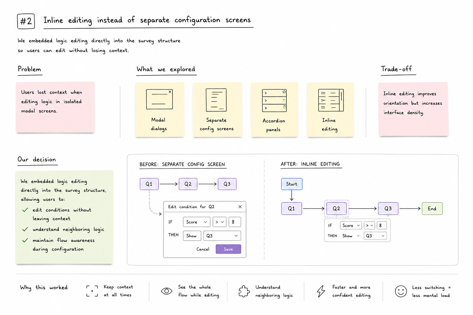
Decision #2 - Inline editing instead of separate configuration screens
Problem
Users lost context when editing logic in isolated modal screens.
Trade-off
Inline editing improves orientation but increases interface density.
Final decision
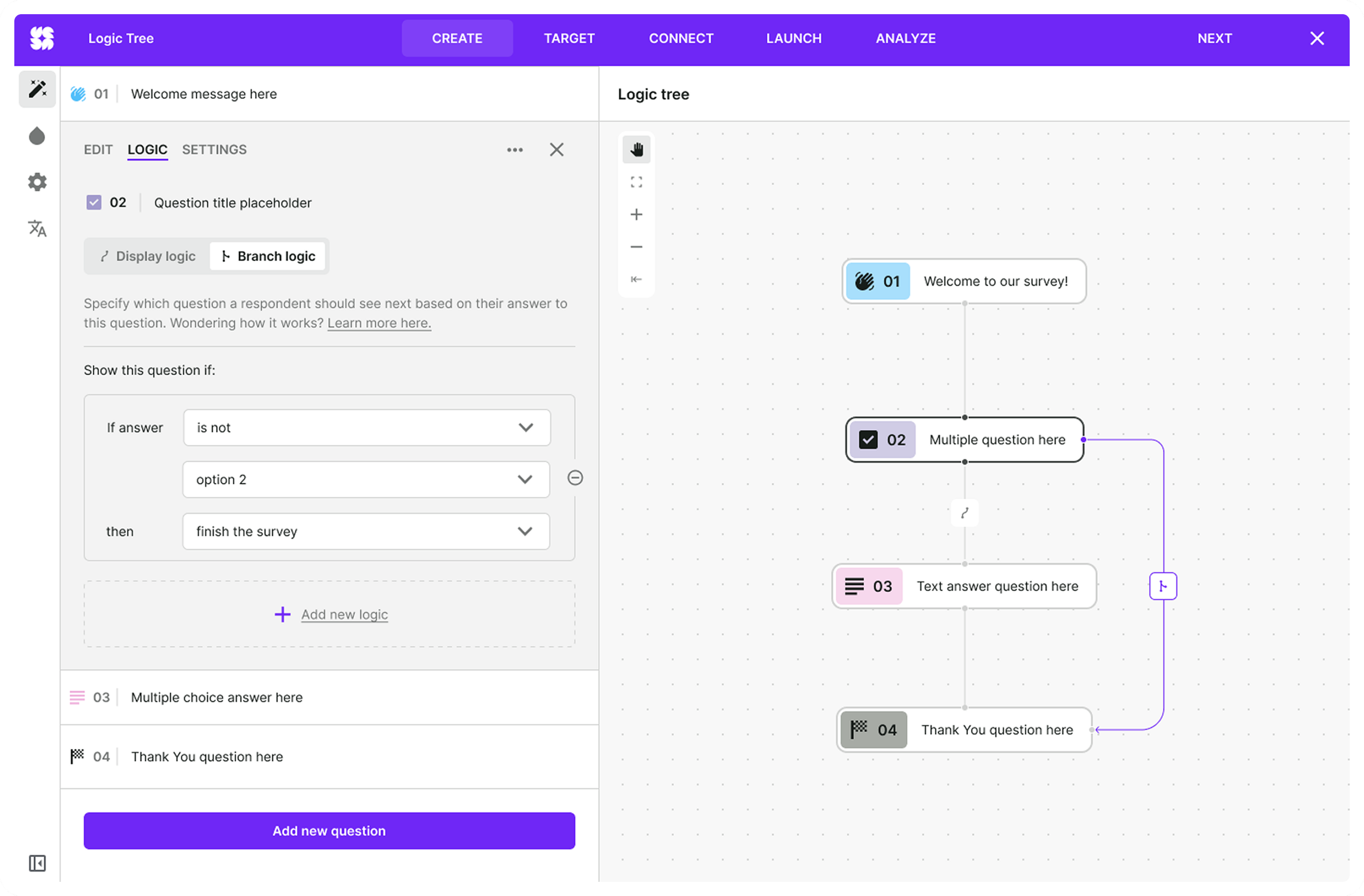
Logic editing was embedded directly into the survey structure, allowing users to:
edit conditions without leaving context,
understand neighboring logic,
maintain flow awareness during configuration.
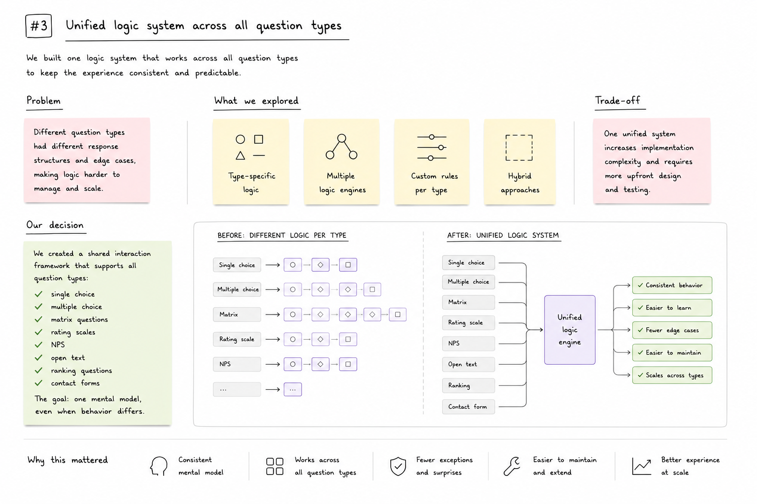
Decision #3 - Unified logic system across all question types
Problem
Different question types produced different response structures and edge cases.
Trade-off
Supporting all question formats inside one system significantly increased implementation complexity.
Final decision
We created a shared interaction framework that supported:
single choice,
multiple choice,
matrix questions,
rating scales,
NPS,
open text,
ranking questions,
contact forms.
The goal was consistency of mental model — even when technical behavior differed underneath.
Solution
We designed a visual logic layer built around:
readable blocks,
visible connections,
contextual editing,
scalable interaction patterns.
The system exposed survey behavior step by step while hiding unnecessary technical complexity.
Key capabilities included:
conditional branching,
dynamic endings,
multiple path handling,
visual path previews,
logic visualization across survey structure.
Users no longer needed to understand the engine behind the system. They only needed to understand the flow.
Another valid point:
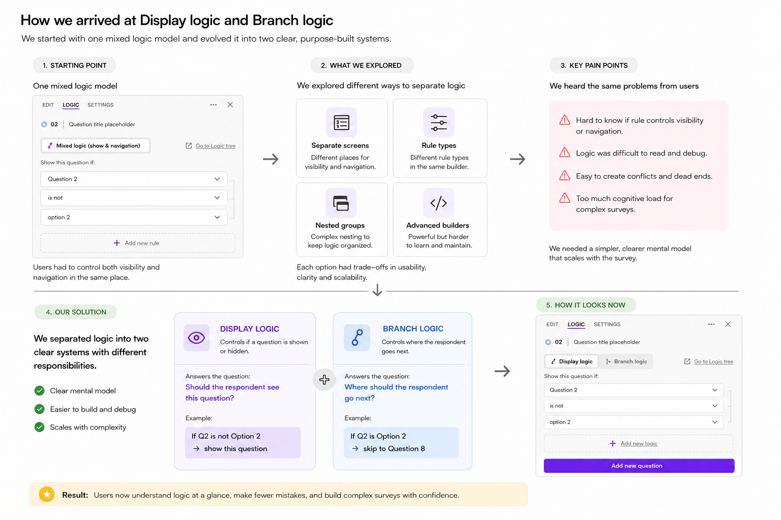
Users struggled because “show/hide conditions” and “survey navigation” were treated as the same type of logic.
This created confusion:
users didn’t know whether they were controlling visibility or navigation,
debugging survey behavior became difficult,
complex flows became unpredictable.
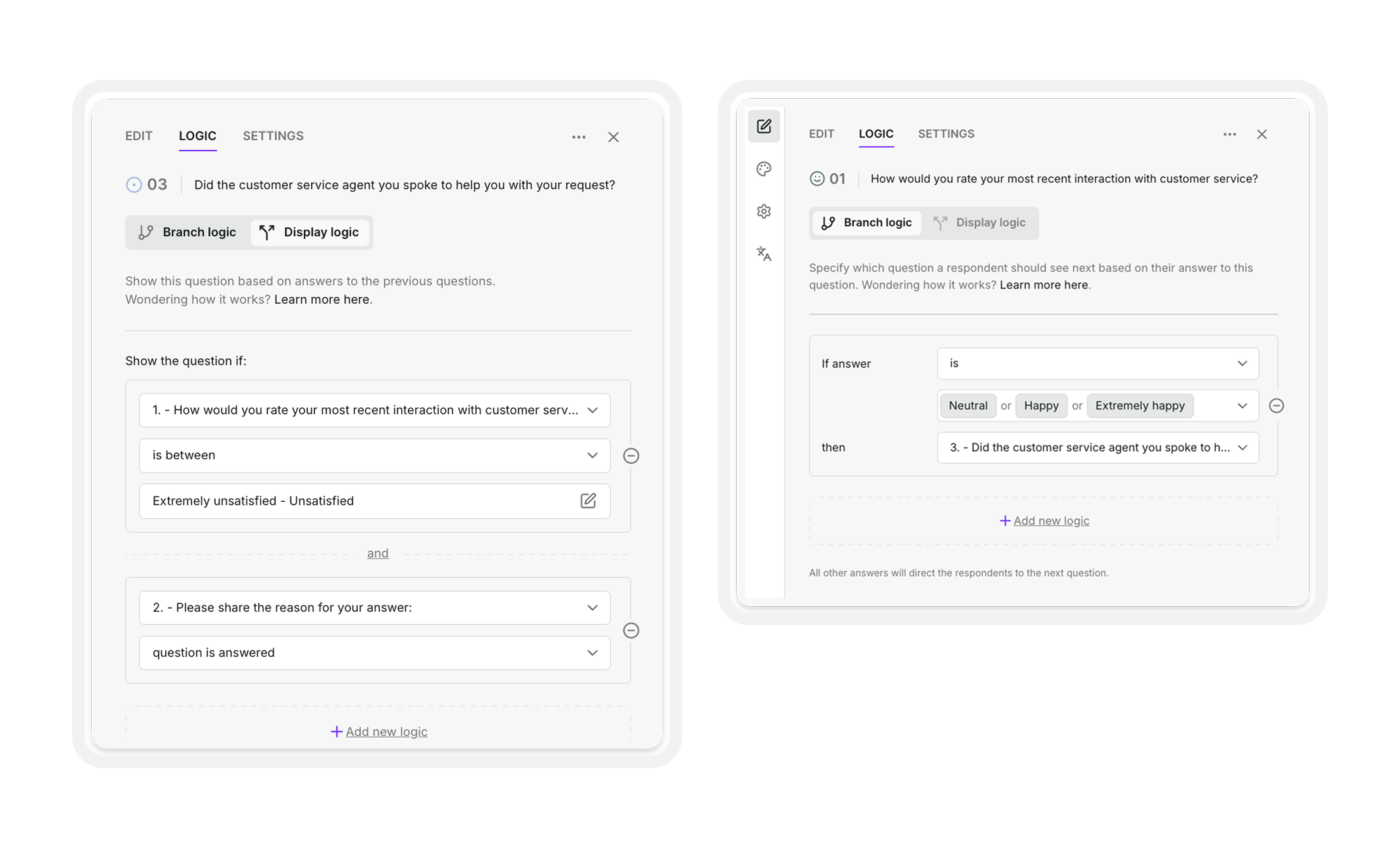
We separated logic into two clearly defined systems:
Display logic → controls visibility of questions
Branch logic → controls respondent navigation
This reduced cognitive load and made survey behavior easier to understand and debug.
System Foundations
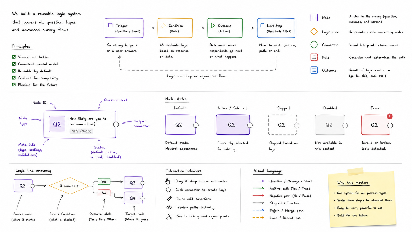
Because Survey Logic® needed to scale across many question types and future product evolution, the interface had to behave as a reusable system
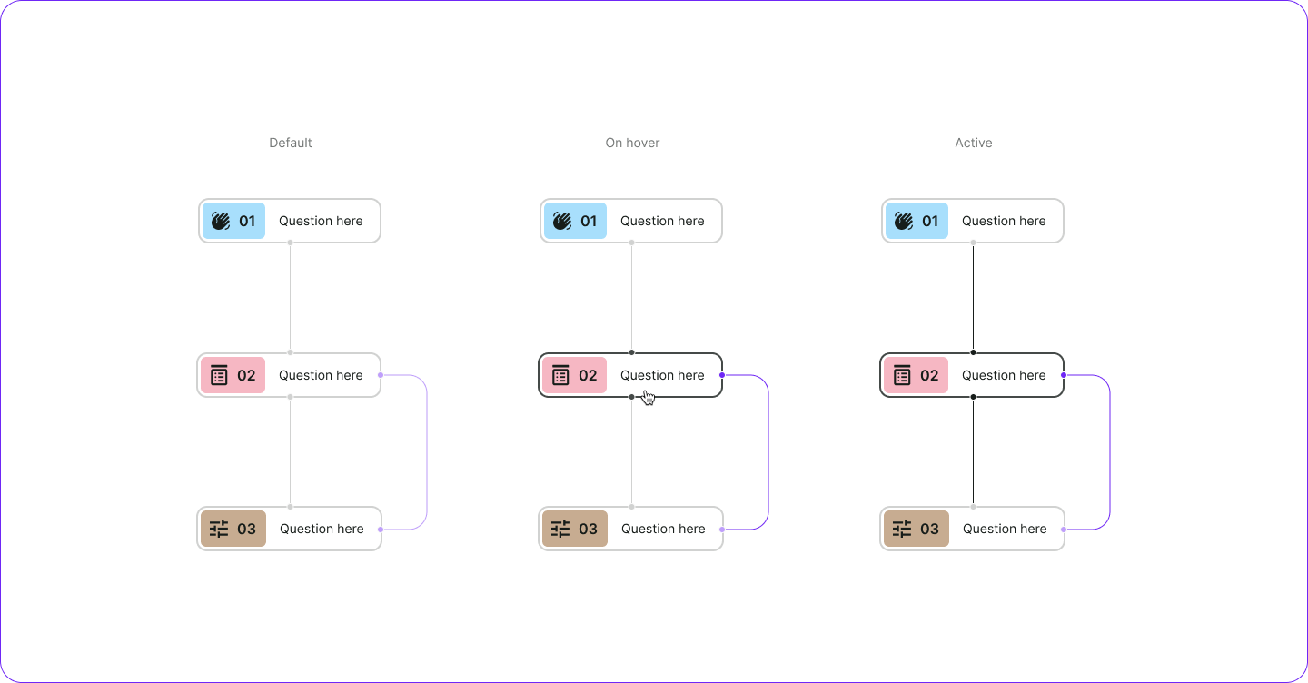
We created reusable foundations for:
node states,
logic lines,
connectors,
interaction behaviors,
semantic colors,
active/hover states,
visual hierarchy,
component relationships.
The UI kit became structural infrastructure for the feature. This reduced fragmentation while enabling future scalability.
Interaction Design
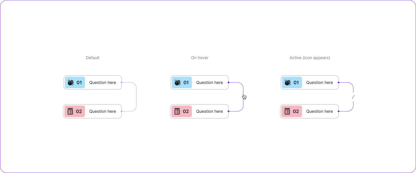
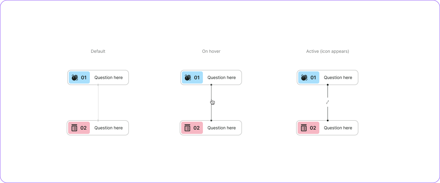
A major focus of the project was reducing ambiguity through interaction feedback.
The system visually communicated:
active logic,
hover states,
editable connections,
selected paths,
relationship ownership,
branching hierarchy.
Even small interaction details significantly affected user confidence.
The interface constantly reinforced:
where users are,
what is connected,
what is editable,
what changes next.
Validation
Testing revealed a strong behavioral shift.
Users:
created advanced flows faster,
made fewer logical mistakes,
better understood survey structure,
relied less on trial-and-error behavior,
adopted advanced logic more confidently.
The system stopped feeling like an advanced “power-user” feature. It became understandable for a much wider group of users.
Impact
Survey Logic became a foundational capability for advanced survey creation inside Survicate.
The project:
increased accessibility of advanced logic features,
reduced friction in complex survey creation,
introduced scalable interaction patterns,
established reusable UI foundations,
improved consistency across survey experiences.
It changed how users build and reason about survey flows.
Reflection
Looking back, the biggest challenge wasn’t designing conditions. It was designing clarity inside complexity.
The project taught me that:
visibility reduces anxiety,
consistency builds confidence,
scalable UX requires system thinking,
interaction design becomes critical in complex products.
If I redesigned the system today, I would further explore:
progressive complexity,
zoomable flow navigation,
AI-assisted logic creation,
collaborative survey editing,
debugging and simulation modes.