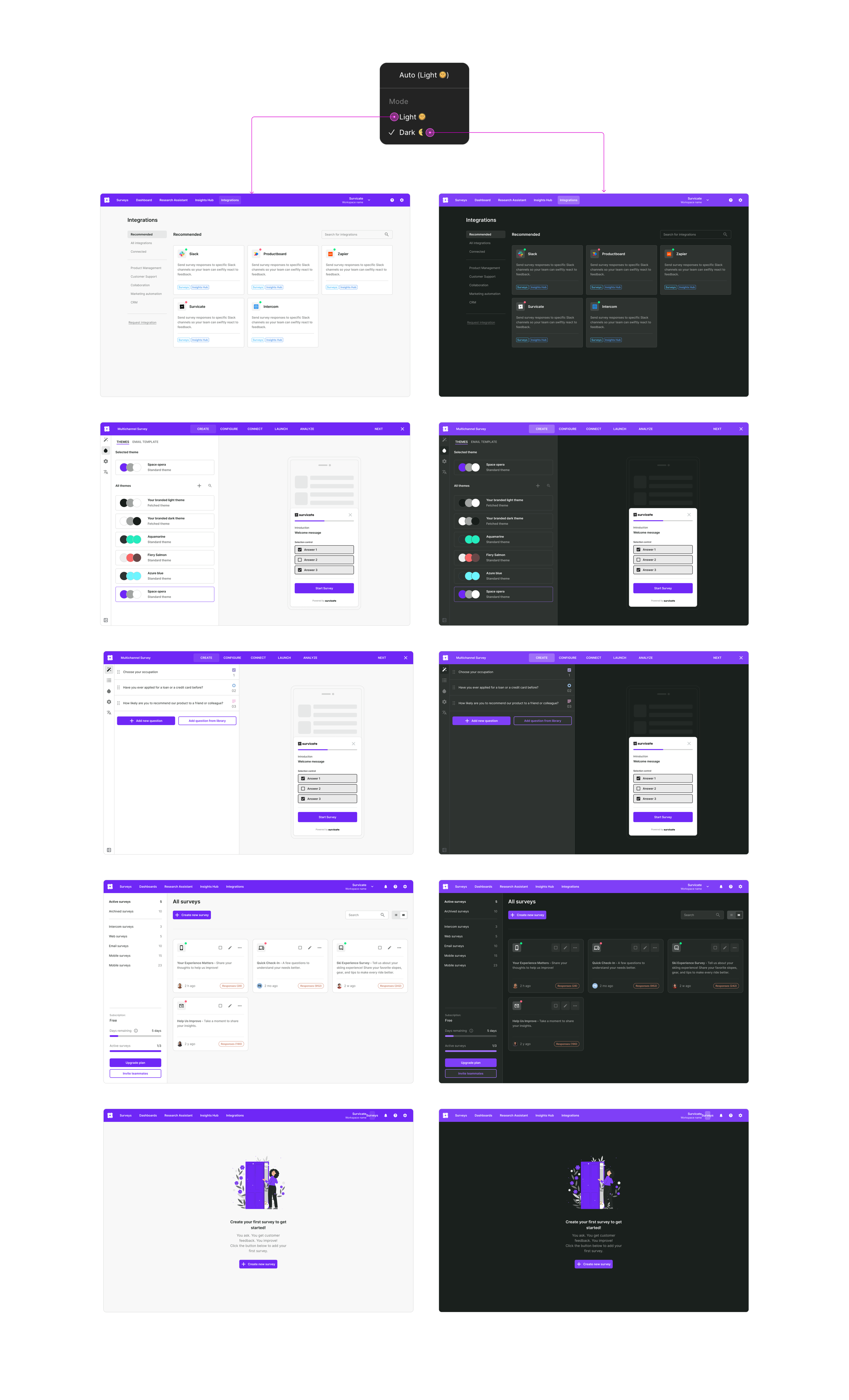

Building a scalable UX foundation for a growing SaaS platform
Survicate® was growing across multiple products and teams, but the interface evolved inconsistently over time.
I worked on creating a scalable design foundation that unified workflows, interaction patterns, and UI behaviors across the platform.
Overview
Role: Product Designer
Scope: Design System · Survey Workflows · Mobile · Logic Builder · Dashboards
Duration: ~1 year
Collaboration: Product · Engineering · Frontend
The platform was scaling faster than the UX
As Survicate expanded, different teams started solving similar problems in different ways.
UI patterns became inconsistent, workflows fragmented, and onboarding complexity increased across the platform.
The product no longer behaved like one coherent system. Navigation, forms, logic configuration, and dashboard behaviors varied between modules, slowing down both users and internal teams.
Some of the recurring problems included:
— duplicated components across products
— inconsistent interaction behaviors
— disconnected survey creation flows
— different spacing and typography rules
— fragmented mobile experiences
— inconsistent logic configuration patterns
— accessibility gaps across modules
— growing design-to-engineering friction
Without a shared foundation, product complexity increased with every new feature.
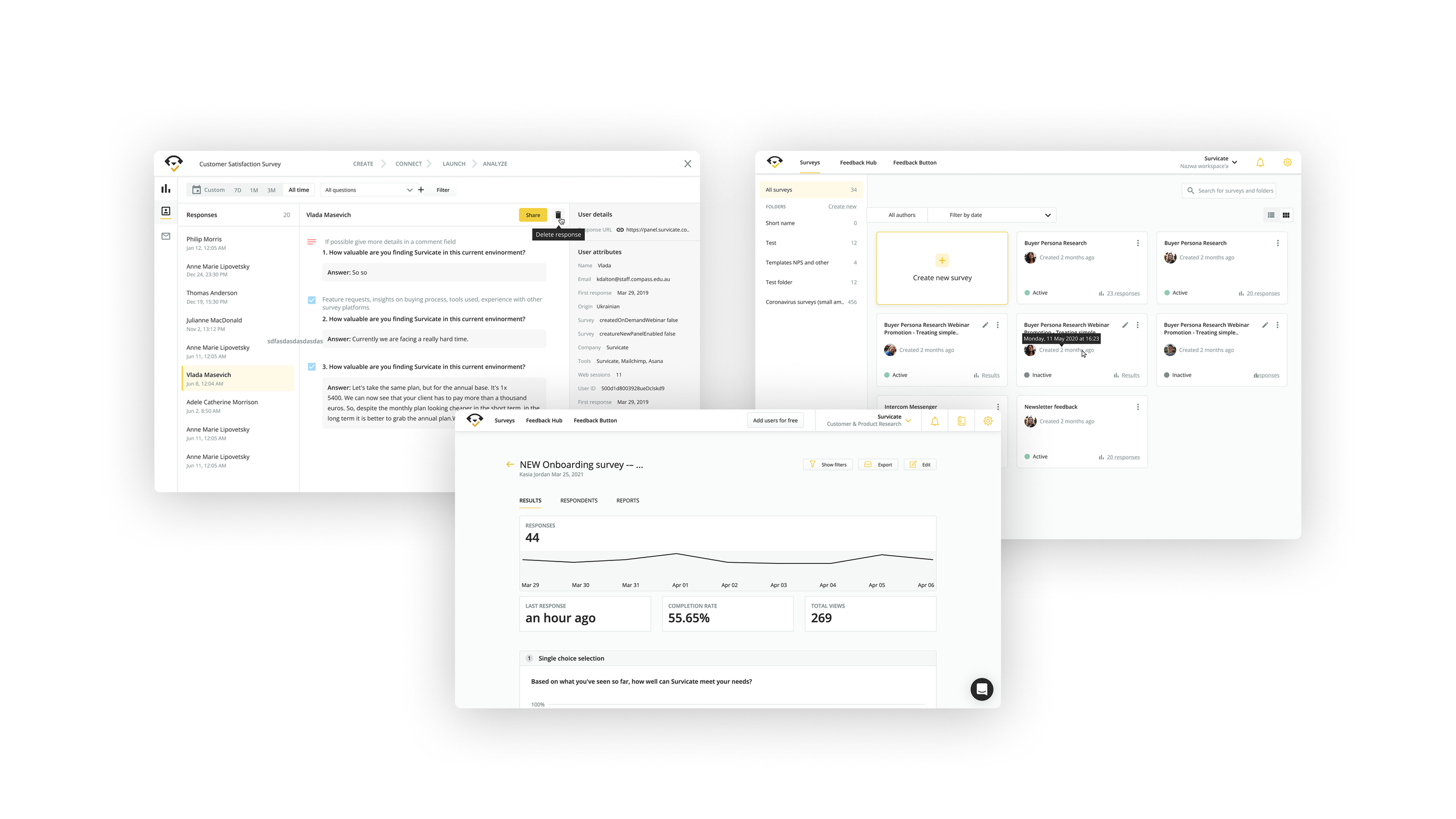
Previous Survicate platform.
Constraints shaping the system
The challenge was not creating a visual refresh. It was introducing consistency without slowing product delivery.
The platform already relied heavily on an existing Bootstrap-based frontend architecture that continued to power active product development.
Rather than replacing the framework entirely, the goal was to evolve the system incrementally while improving scalability, consistency, and usability across modules.
The system needed to:
— work within existing Bootstrap foundations
— support ongoing product delivery without major disruption
— reduce inconsistencies across legacy modules
— align design decisions with frontend implementation realities
— scale across desktop and mobile experiences
— introduce reusable patterns without rebuilding the product from scratch
— remain maintainable for multiple teams over time
This constraint heavily influenced the design approach.
The work focused on system evolution rather than complete replacement.
The goal was structural clarity, not cosmetic redesign.
Auditing the product ecosystem
I started by mapping inconsistencies across the platform — navigation structures, form behaviors, logic flows, spacing systems, and component usage.
The audit revealed repeated UX problems:
— duplicated solutions for identical tasks
— inconsistent component states
— different interaction patterns between modules
— missing hierarchy and layout rules
— multiple versions of similar workflows
— inconsistent naming conventions
— accessibility inconsistencies
This process helped identify which parts of the product needed shared foundations instead of isolated redesigns.
Defining system principles
Instead of redesigning isolated screens, the focus shifted toward creating shared foundations and a scalable product language.
The system was guided by several core principles:
Consistency over novelty
Interactions should behave predictably across the platform.
Reusability over one-off solutions
Components needed to scale beyond individual features or teams.
Structure before visuals
The objective was reducing product complexity, not introducing unnecessary visual changes.
Design aligned with engineering
The system needed to reflect implementation realities and support scalable frontend architecture.
Accessibility by default
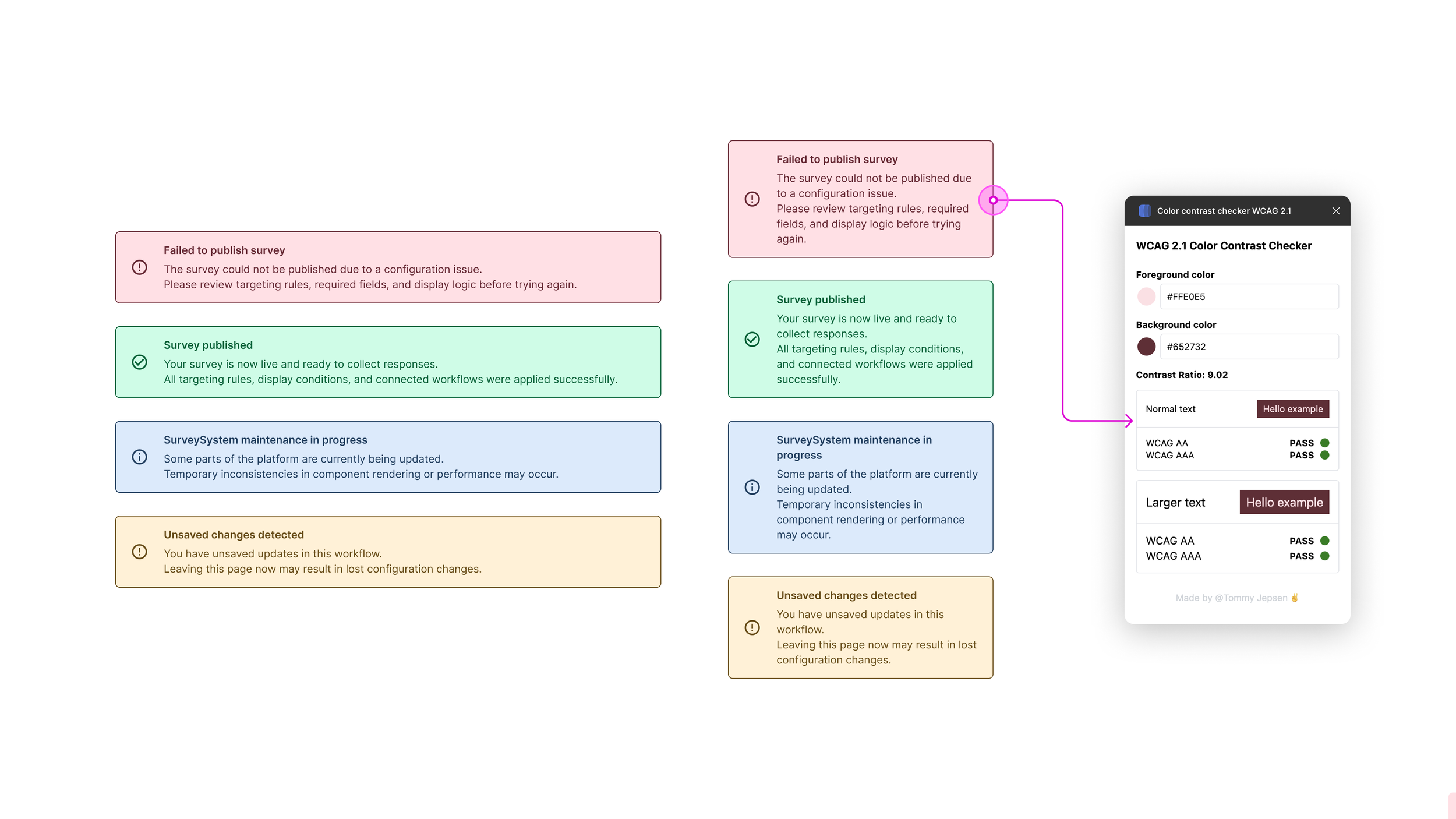
States, contrast, spacing, and interaction behaviors were standardized early in the process.
These principles helped create alignment between design, engineering, and product teams.
Building reusable foundations
The work centered around creating reusable UI foundations and applying them consistently across the platform.
The system included:
— shared form behaviors
— standardized input and validation states
— reusable navigation patterns
— modular dashboard structures
— unified survey creation flows
— scalable spacing and typography rules
— responsive mobile survey foundations
— shared interaction logic across modules
Instead of behaving like separate tools stitched together, the product started functioning as one cohesive system.
The work centered around creating reusable UI foundations and applying them consistently across the platform.
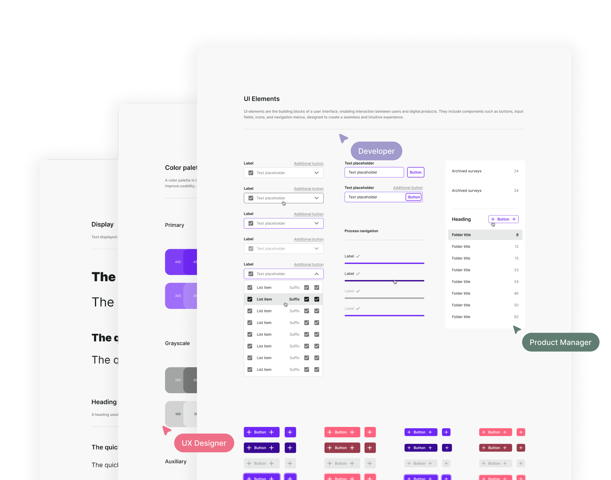
Selected UI components
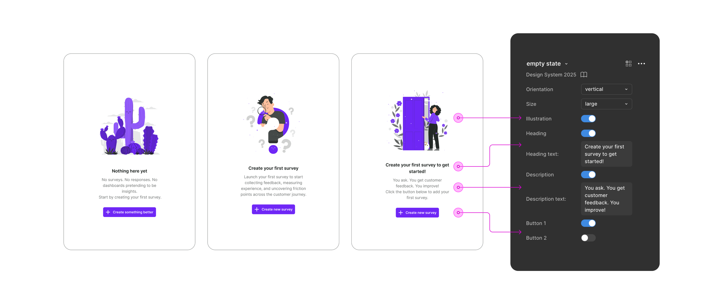
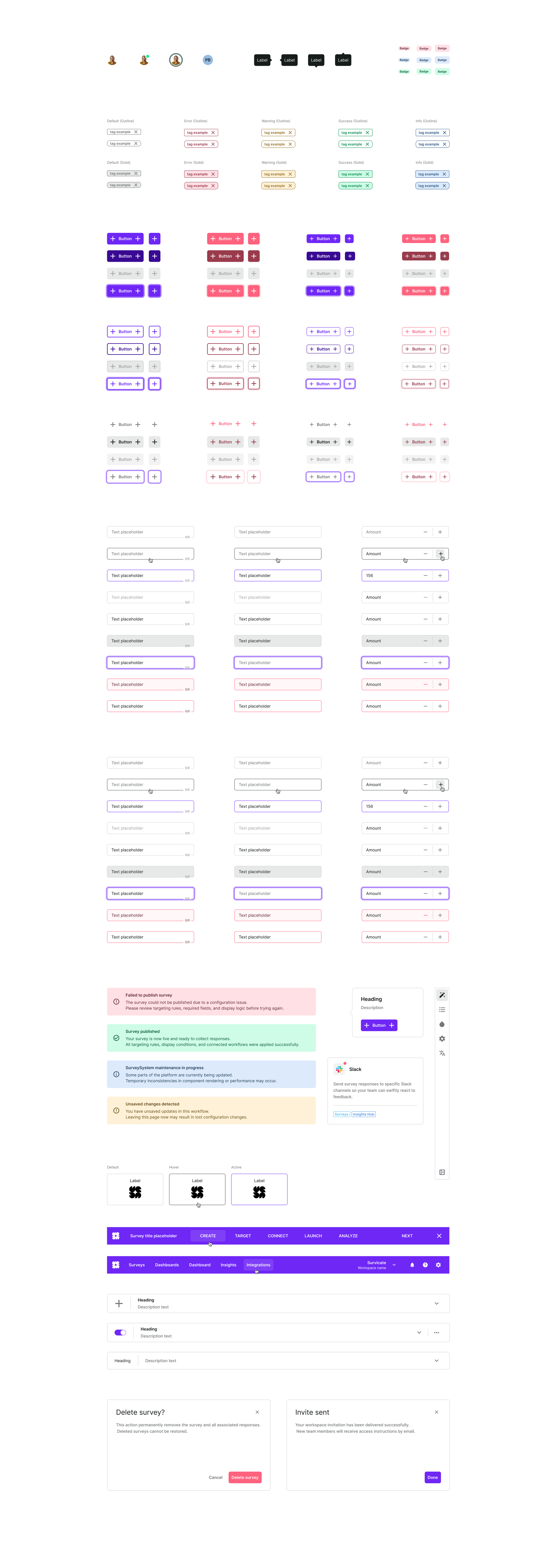
Components were designed as configurable building blocks rather than static UI assets.
Variants, visibility rules, content structure, and interaction states could be adjusted directly through scalable component properties, allowing teams to adapt interfaces without recreating layouts from scratch.
This reduced duplication, improved consistency, and accelerated workflow creation across modules.
Component architecture
The design system introduced reusable components built using Atomic Design principles, ensuring consistency, scalability, and predictable behavior across workflows and environments.
Key areas included:
— inputs and form validation
— buttons and interaction states
— navigation systems
— process flows and logic configuration
— scalable component composition patterns
— dashboard modules
— avatars, badges, and status indicators
— responsive layouts
— mobile interaction patterns
Special attention was placed on defining consistent states, hierarchy rules, component relationships, and predictable interaction behaviors.
The architecture was designed to support long-term scalability within the existing Bootstrap-based framework already used across the product ecosystem.
The objective was not component quantity, but behavioral consistency at scale.
Designing scalable architecture
As the system matured, I introduced token-based foundations that allowed the interface to scale beyond a single visual theme.
Colors, spacing, typography, elevation, and interaction states were structured as reusable design tokens, improving consistency between design and implementation.
This foundation later enabled dark mode exploration without rebuilding components from scratch.
The theming architecture focused on:
— semantic color tokens
— reusable elevation and surface systems
— scalable spacing rules
— accessible contrast handling
— state consistency across themes
— maintainable token structures for engineering
Dark mode became a validation of the system’s scalability rather than a separate visual exercise.
Predefined spacing, radius and color tokens for light and dark mode.
Product impact
The design system improved more than visual consistency. It changed how teams built product experiences.
The outcomes included:
— reduced UI inconsistency across modules
— faster feature iteration
— more predictable onboarding experiences
— improved collaboration between design and engineering
— scalable foundations for future modules
— reduced duplication in design workflows
— more consistent product decisions across teams
— improved maintainability of product interfaces
The platform became easier to extend without multiplying complexity.
Long-term impact
The design system became a scalable foundation for future product growth.
New features could be built faster and with less ambiguity. The product felt more cohesive across dashboards, survey creation, logic configuration, and mobile experiences.
Consistency shifted from something manually enforced into a shared default across teams.
The project demonstrated how system thinking can improve not only interface quality, but also product scalability and collaboration across organizations.
Reflection
One of the biggest lessons from this project was understanding that scaling design is often less about creating new UI — and more about reducing entropy.
Strong systems are not built through visual polish alone. They emerge through consistency, shared rules, predictable behaviors, and alignment between teams.
The project reinforced the importance of thinking beyond individual screens and designing foundations that can evolve with the product over time.
Future opportunities
Future opportunities for the system included:
expanding accessibility standards
deeper token automation
stronger documentation workflows
improved component governance
scalable multi-theme support
tighter integration between design and frontend systems
more precise naming convention across Figma and Handoff files
The system created a foundation that could continue evolving alongside the platform.