Reducing uncertainty in smart home onboarding
Reframed onboarding from UI simplification to confidence-building, increasing activation by 42%.
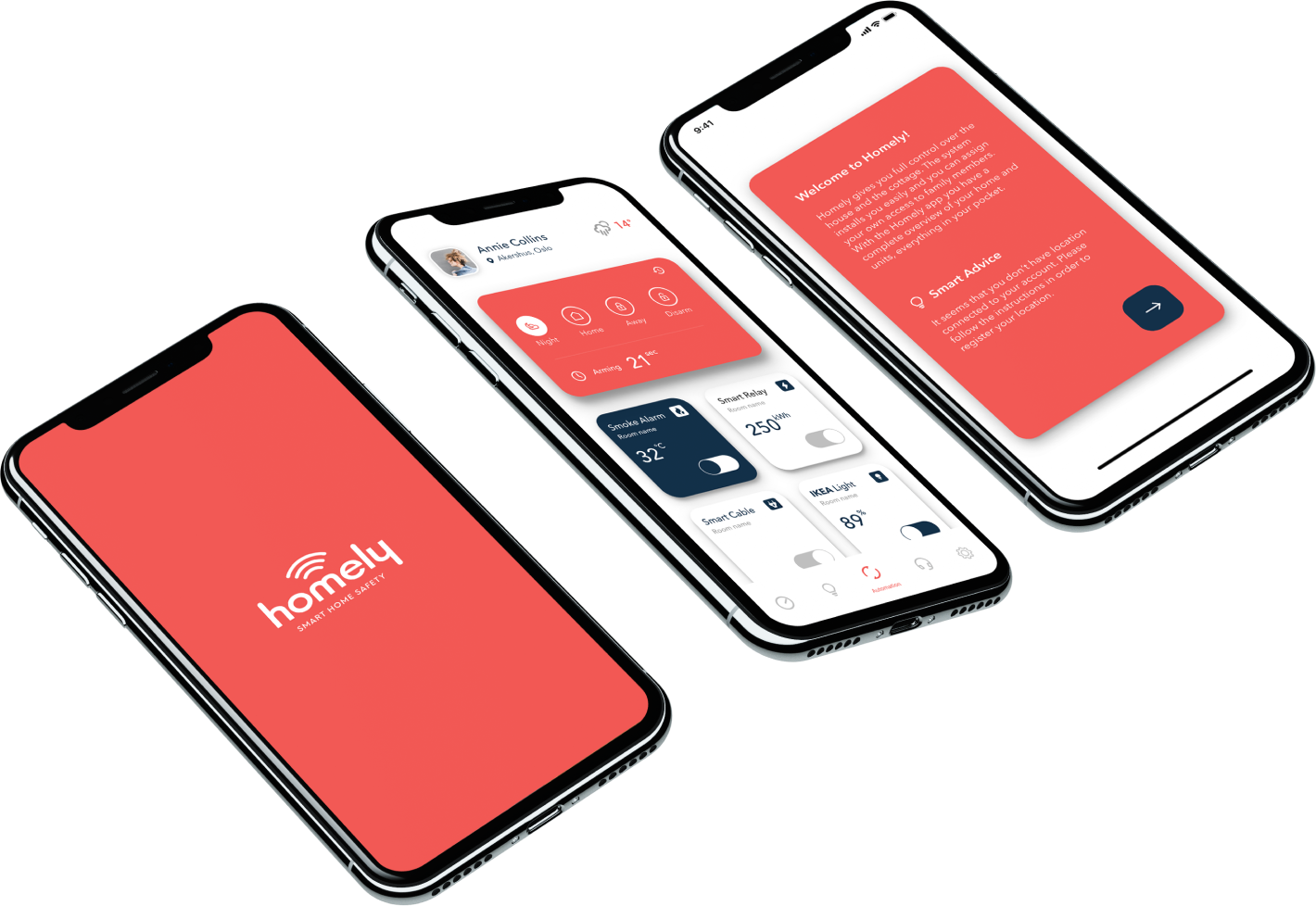
Role: Lead Product Designer · Duration: 5 months · Team: PM, Engineering, Research
Executive Summary
Redesigned a failing onboarding experience into a predictable, confidence-driven system that helped users successfully set up their devices.
Instead of simplifying the UI, we focused on reducing uncertainty during setup — the primary cause of drop-off.
Impact:
+42% onboarding completion
Pairing success increased from 21% to 74%
7-day retention doubled
Support tickets reduced by 37%
Why this mattered
Smart home adoption depended on successful activation.
Most users abandoned setup before connecting their first device.
Hardware sales were strong, but activation rates remained critically low.
Support costs increased as onboarding confusion grew.
Business risk
low activation
poor retention
increased support dependency
reduced ecosystem adoption
Product challenge
The onboarding flow needed to reduce uncertainty for first-time users without increasing complexity.
Context & Problem
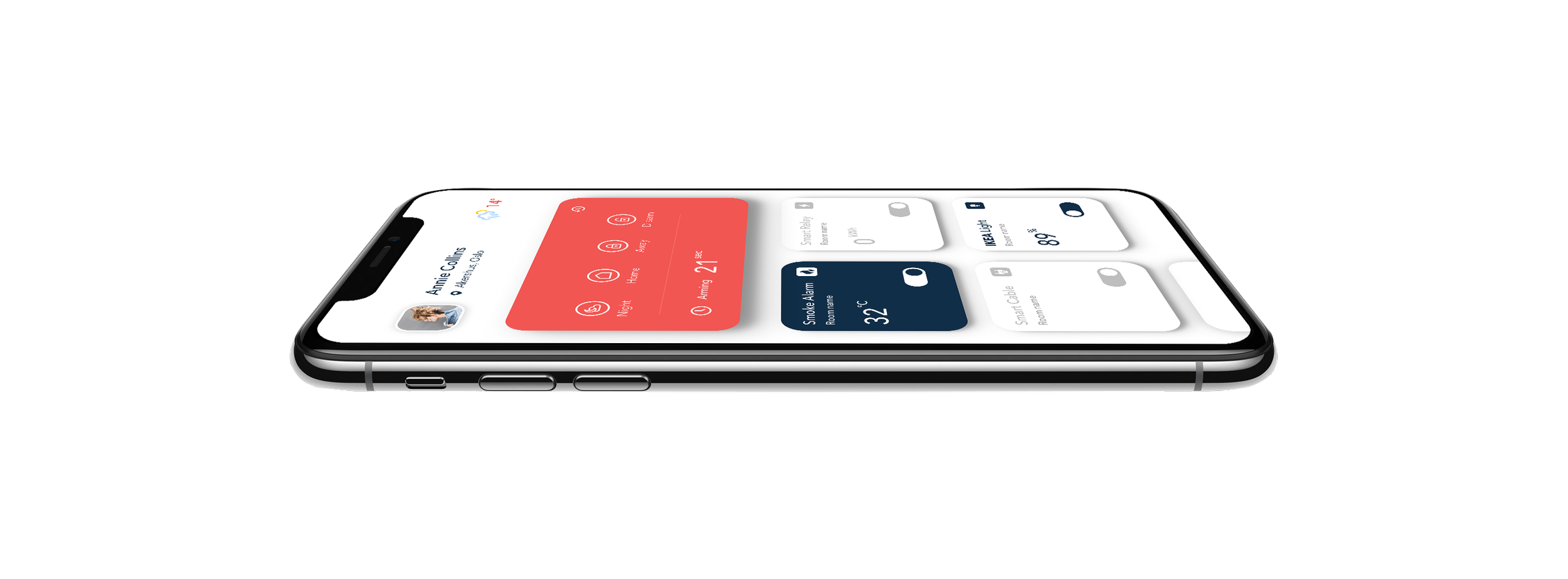
Homely was bundled with smart home hardware, but the mobile app struggled to convert buyers into active users.
Despite strong hardware sales, users failed during setup and abandoned the product early.
Key issues:
high onboarding drop-off
unreliable device pairing
increasing support dependency
weak early retention
This was not a UI problem — it was a behavioral bottleneck blocking activation.
Discover & Insights
We combined analytics, interviews, and usability testing to understand where and why users failed.
Initial hypothesis
We assumed the onboarding was too complex and needed simplification.
What we discovered
users didn’t understand device hierarchy
setup language created fear of mistakes
long pairing moments lacked feedback
unclear system states caused hesitation
Key insight
The problem wasn’t too many steps — it was a lack of clarity and predictability.
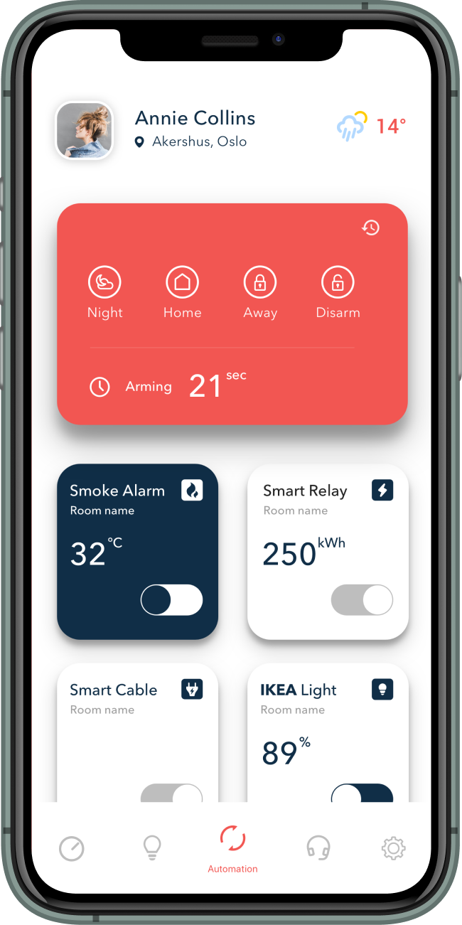
Failed assumptions
Assumption 1
Reducing steps would improve onboarding completion.
What happened
Users became less confident and more likely to abandon setup.
Why it failed
Users didn’t need fewer steps. They needed reassurance and predictability.
Assumption 2
Tooltips could solve confusion without changing the flow.
What happened
Users ignored guidance under stress.
Why it failed
The onboarding architecture itself created uncertainty.
Key realization
The issue was behavioral, not instructional.
Decision
We explored multiple directions before defining the final approach.
Option 1: Simplify the flow ❌
Reduce steps and UI elements to speed up onboarding.
Result: Testing showed that removing steps increased confusion and drop-off.
Option 2: Add guidance layers ⚠️
Introduce tooltips and explanations on top of existing flow.
Result: Users ignored guidance and still felt uncertain.
Final direction: Build confidence through structure ✅
Instead of reducing steps, we:
broke the process into predictable micro-steps
made system states visible at all times
introduced recovery paths for failures
This shifted onboarding from task completion → confidence building
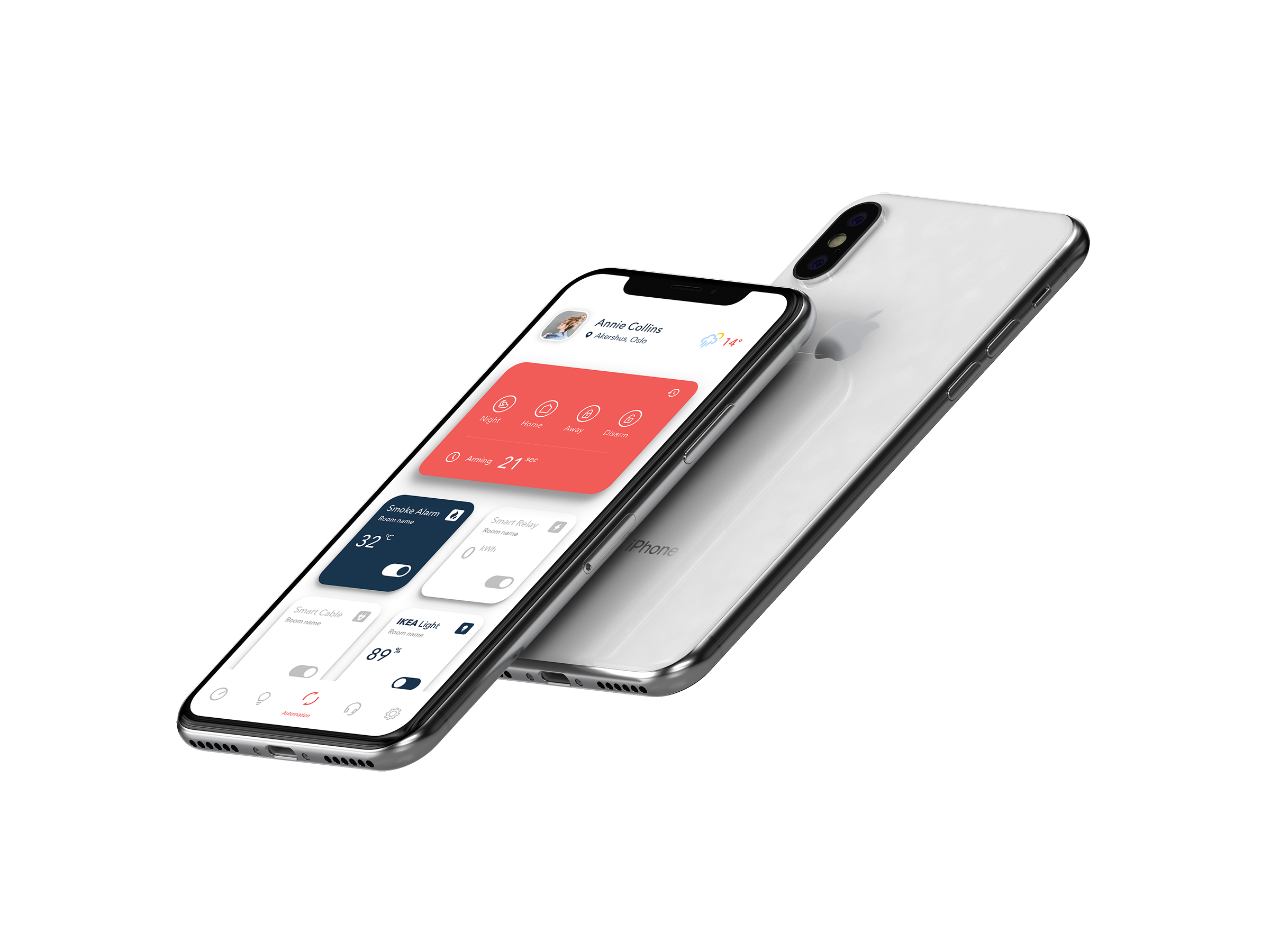
Solution: rethinking onboarding
We redesigned onboarding as a structured, guided system focused on clarity and control.
Key principles
predictable step-by-step progression
continuous system feedback
clear success and failure states
reversible actions and recovery paths
Key changes
introduced guided micro-steps instead of long flows
added explicit system states (searching, connecting, success, failure)
reduced ambiguity in device setup language
ensured every action had visible feedback
The goal was not speed — it was confidence.
Solution Architecture
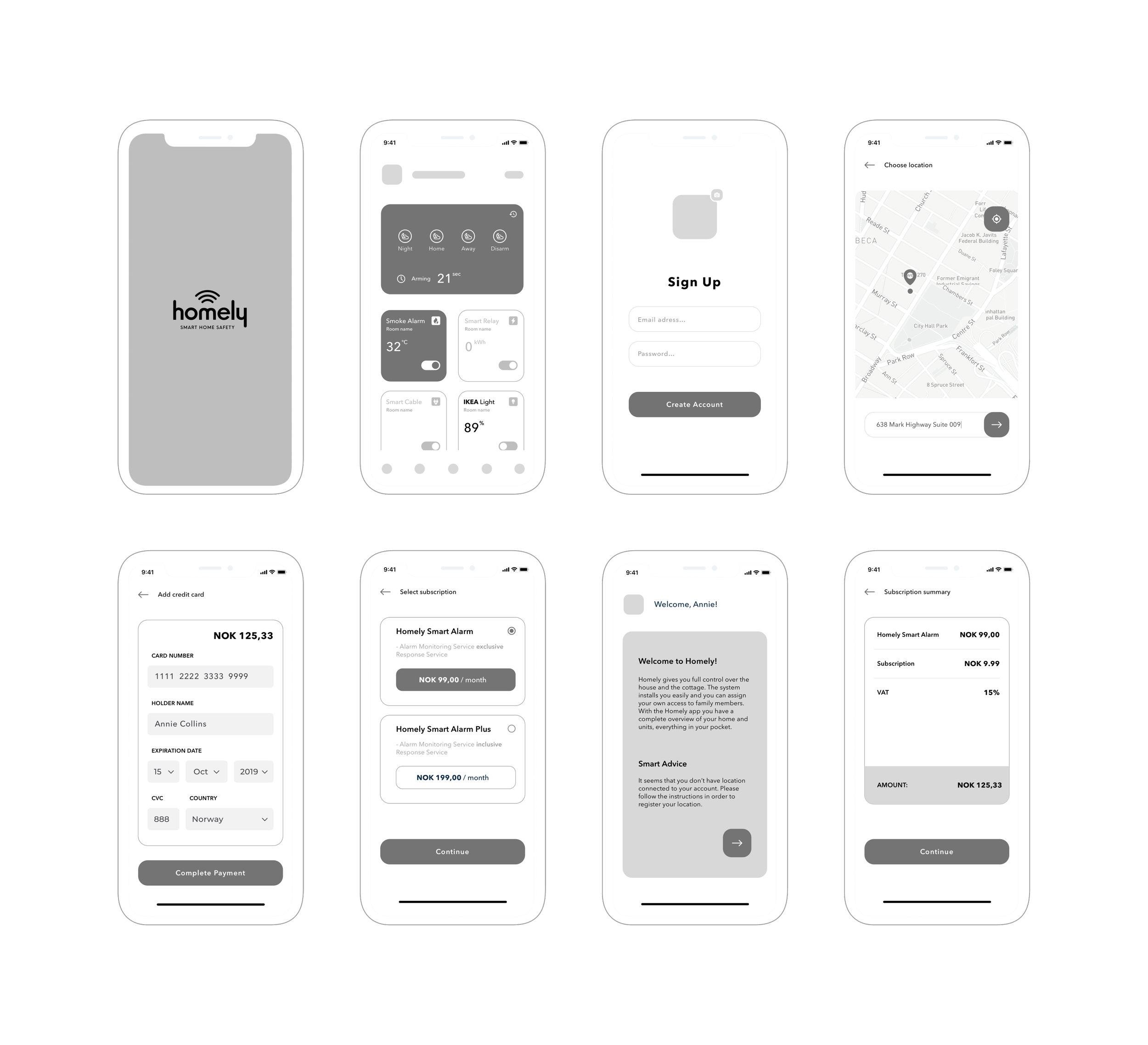
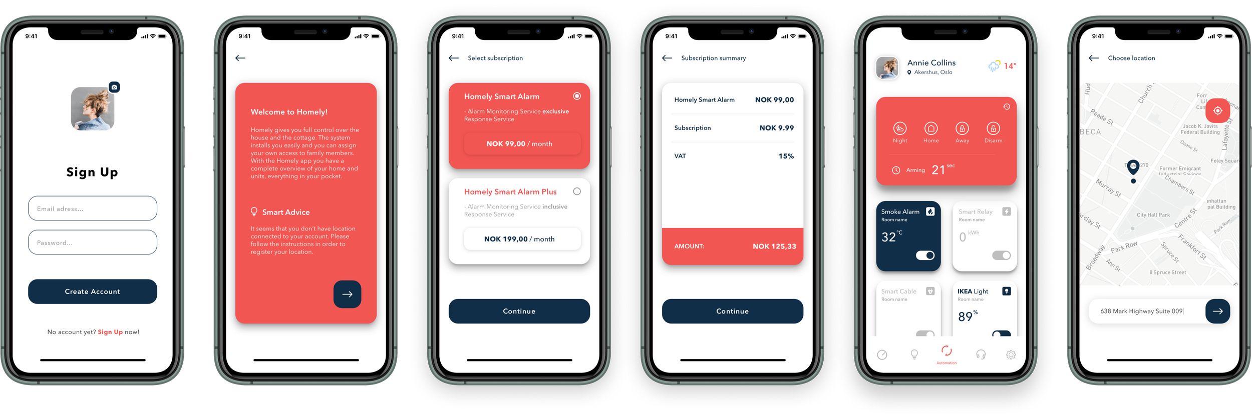
The system was designed to reduce cognitive load and guide users through setup with minimal ambiguity.
Interface decisions
strong primary actions guiding progression
limited use of color to highlight key actions
consistent icon system for device recognition
predictable layout and spacing
clear feedback states for every interaction
The interface reinforced a single idea:
👉 “You always know what’s happening and what to do next.”
Iteration & Testing
We validated the solution through rapid RITE testing cycles. Each iteration focused on reducing hesitation and improving clarity.
Key improvements
unclear transitions → replaced with explicit system states
long waiting times → enriched with feedback and time expectations
failure states → redesigned to be recoverable instead of blocking
Testing guided every major decision and helped prioritize changes with the highest impact.
Outcome & Business Impact
Measured over 8 weeks post-launch:
onboarding completion increased by 42%
pairing success rose from 21% to 74%
7-day retention doubled
support tickets dropped by 37%
activation time reduced by 53%
The onboarding became faster, more predictable, and significantly more reliable.
Reflection
This project showed that clarity drives adoption, while uncertainty blocks behavior.
Simplifying UI is not always the answer — in complex systems, users need confidence, not minimalism.
Design impact is measured in behavior change, not visual polish.