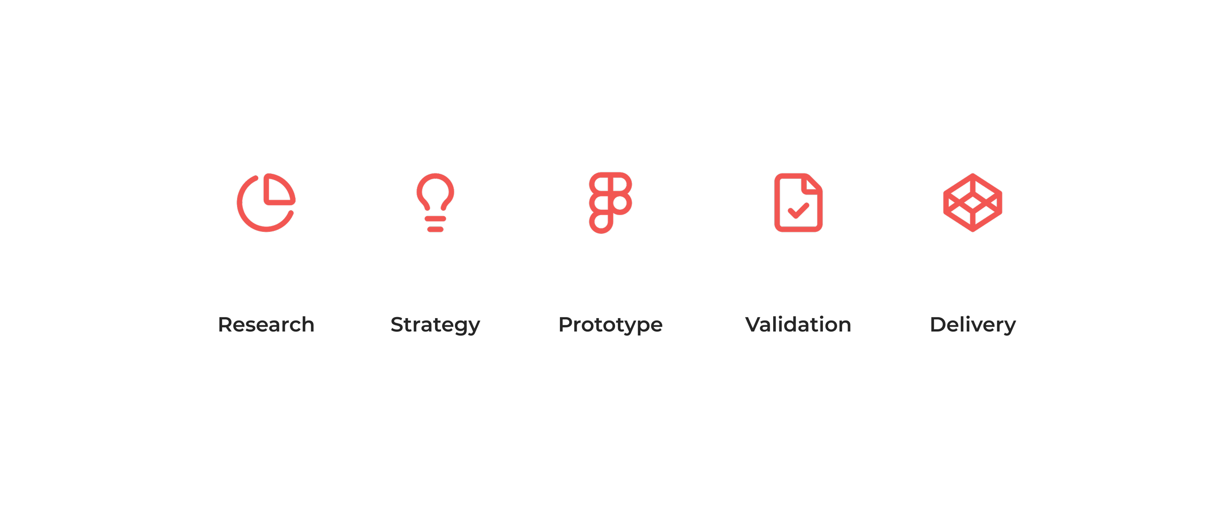
Executive summary
Redesigned a failing smart home onboarding experience into a scalable activation engine that increased completion by 42% and doubled weekly engagement.
Role: Lead Product Designer
Duration: 5 months
Team: PM + Engineering + Research
Scope: Strategy, UX architecture, validation
Impact: +42% activation • 2× engagement • −37% support load
Context & business problem
Homely was bundled with smart home hardware, but the mobile app struggled to convert buyers into active users. Device setup was fragile and confusing, leading to abandonment and rising operational costs.
The ecosystem risked stagnation despite strong hardware sales.
Key business risks:
high onboarding drop-off
failed device pairing
growing support dependency
weak early retention
This was a growth bottleneck, not a cosmetic problem.
My role & ownership
I led the UX direction of the onboarding redesign, focusing on activation as a product metric.
My scope included:
aligning stakeholders around measurable goals
defining research direction
architecting new interaction flows
driving validation cycles
aligning design with engineering feasibility
I owned outcomes, not deliverables.
Discovery & insights
Research combined analytics review, interviews, and usability testing to identify systemic friction.
We discovered:
users didn’t understand device hierarchy
setup language created fear of mistakes
long pairing moments lacked feedback
uncertainty caused hesitation and abandonment
The barrier was emotional friction, not visual complexity. Users feared breaking the system.
Strategic decision
Instead of simplifying UI, we reframed onboarding around confidence and predictability.
The strategic shift focused on:
guided micro-steps
visible system feedback
recovery reassurance
clear success confirmation
The north star metric became successful activation within five minutes.
This moved the project from redesign to behavior engineering.
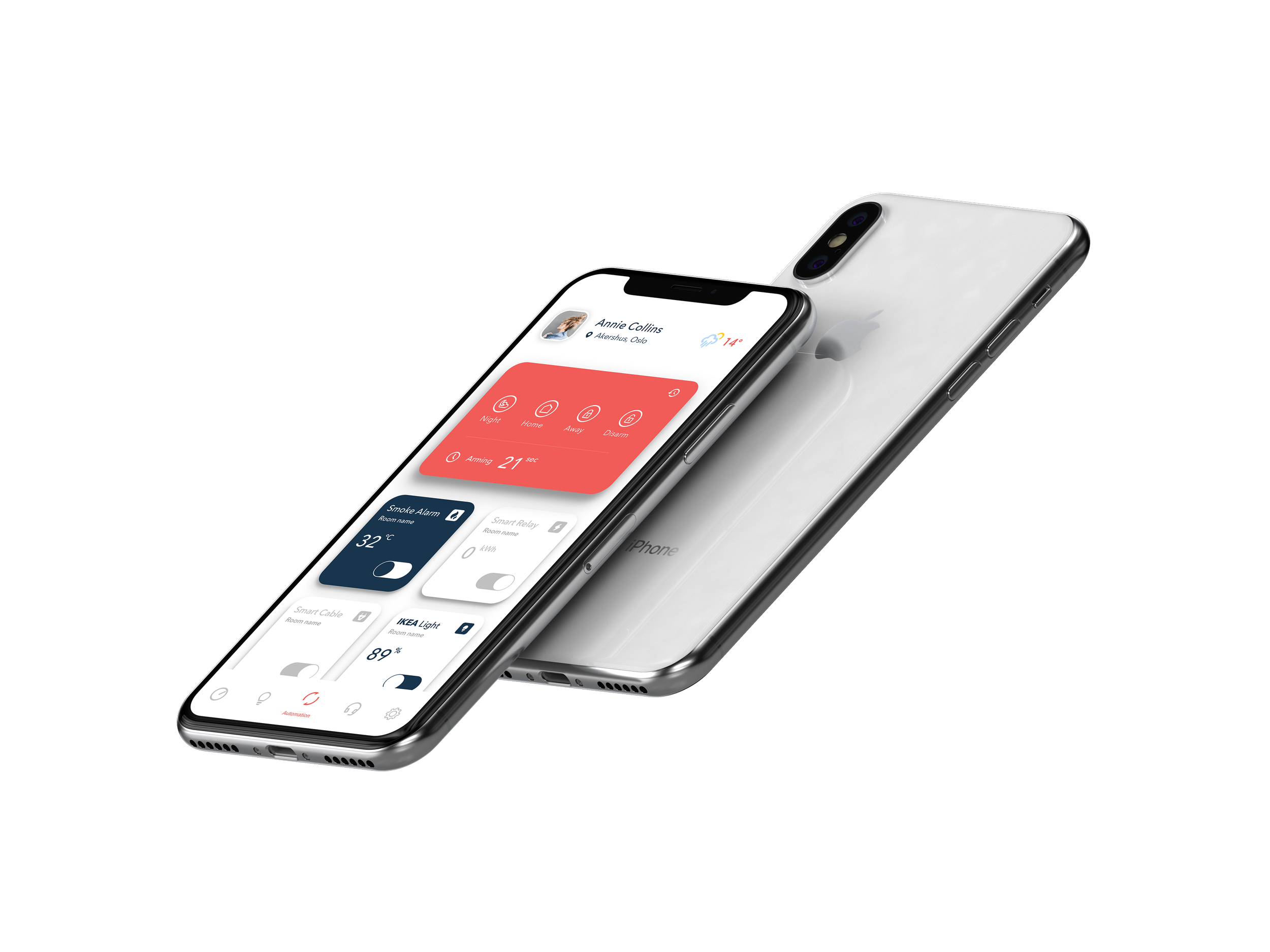
Solution architecture
Every visual decision reinforced clarity and reduced cognitive friction. Instead of emphasizing aesthetics, the system prioritized readability, hierarchy, and feedback.
Key interface principles:
bold primary actions to guide progression
restrained color palette to reduce noise
icon consistency to reinforce device recognition
predictable spacing and rhythm
strong feedback states for every interaction
The UI was engineered to support behavior, not decoration.
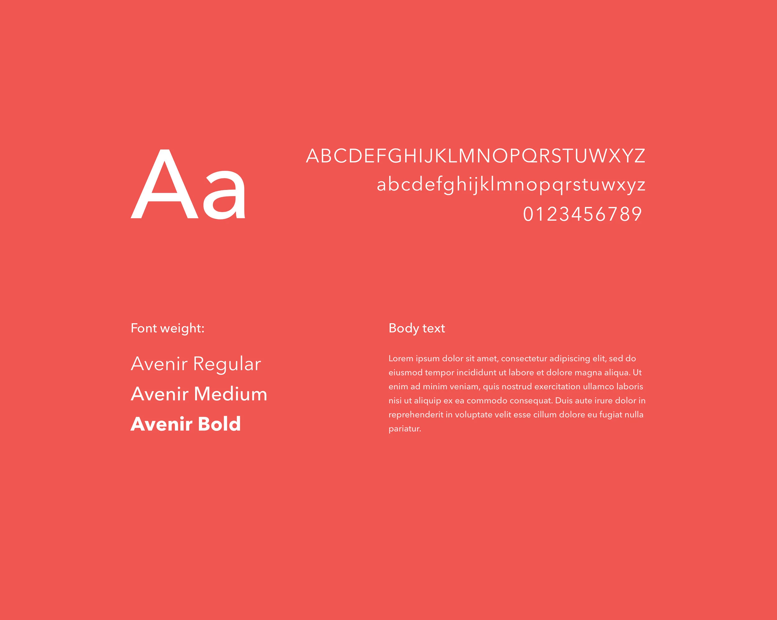
Typography
Between 2004–2007, Frutiger, together with Linotype's in-house type designer Akira Kobayashi, reworked the Avenir family to expand the range of weights and features. The result was titled Avenir Next.
The initial release of the typeface family was increased to 24 fonts: six weights, each with a roman and italic version, in two widths (normal and condensed). Frutiger's numbering system was abandoned in favor of more conventional weight names. The glyph set was expanded to include small caps, text figures, subscript and superscripts, and ligatures.
We decided to use only one type of font. The visual hierarchy of content could be achieved through additional spacing and adding appropriate font weights.
Color Palette - we used the existing Homely® brand book color scheme to emphasize the brand and its business position. Our main goal was to familiarize the user with the new design and keep all screens in a clean and simple way. We pushed the red color as a primary one.
Such a procedure makes the design more fresh and trendy.
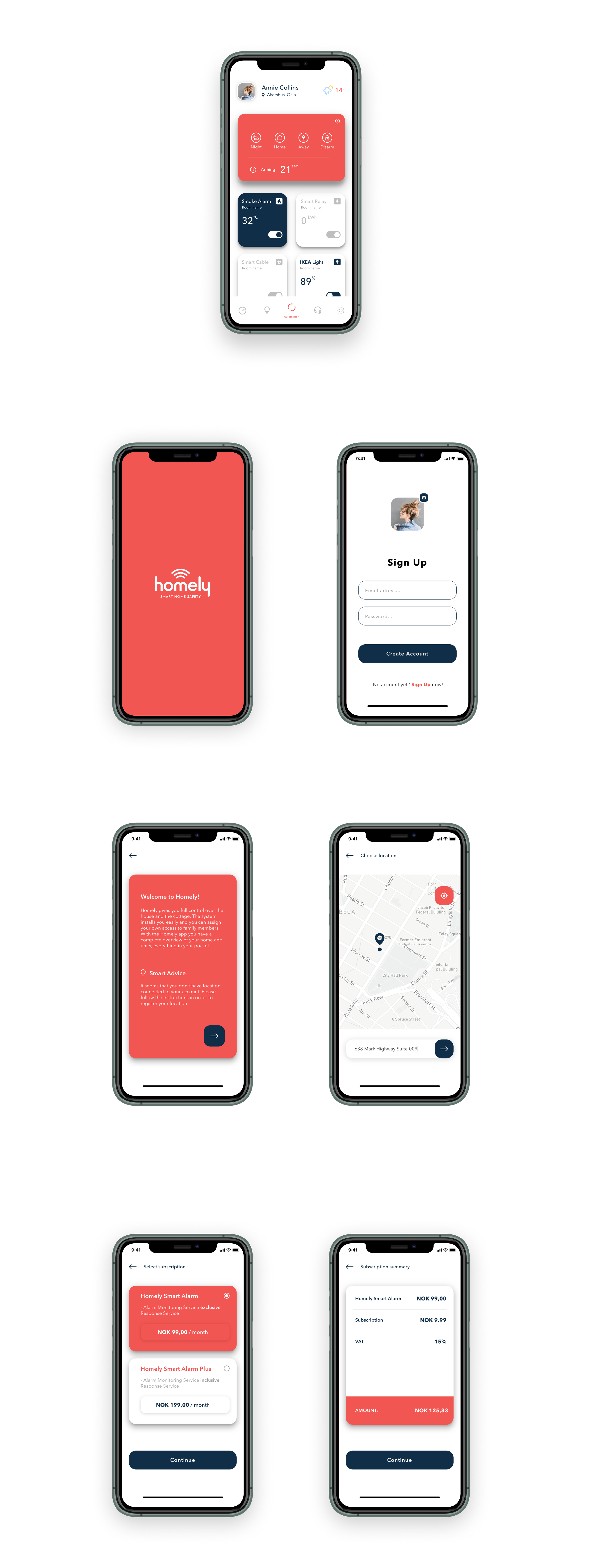
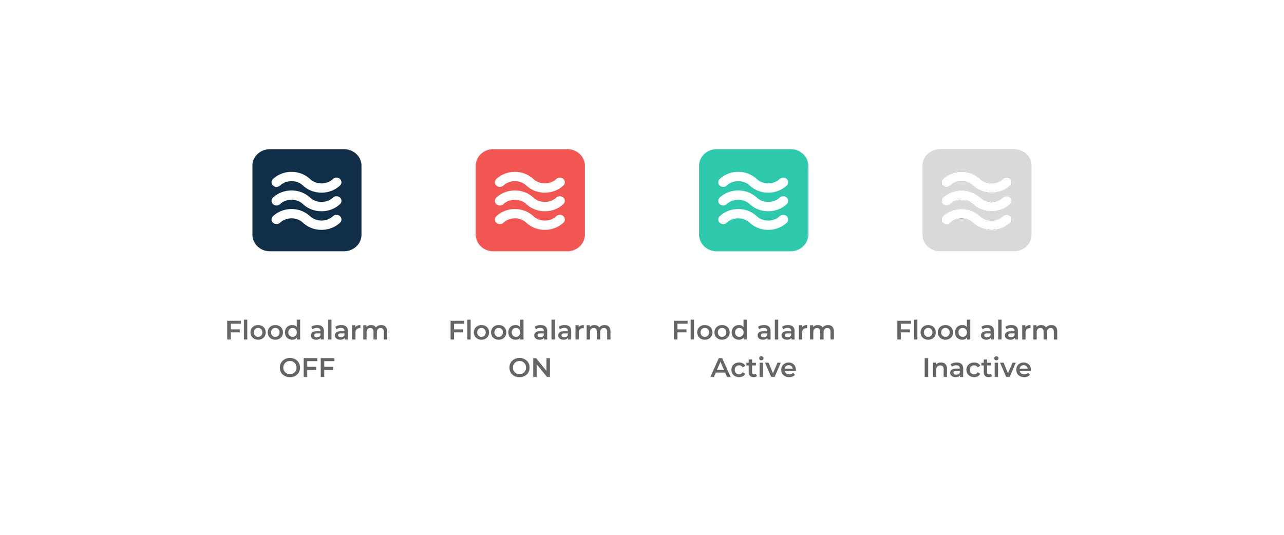
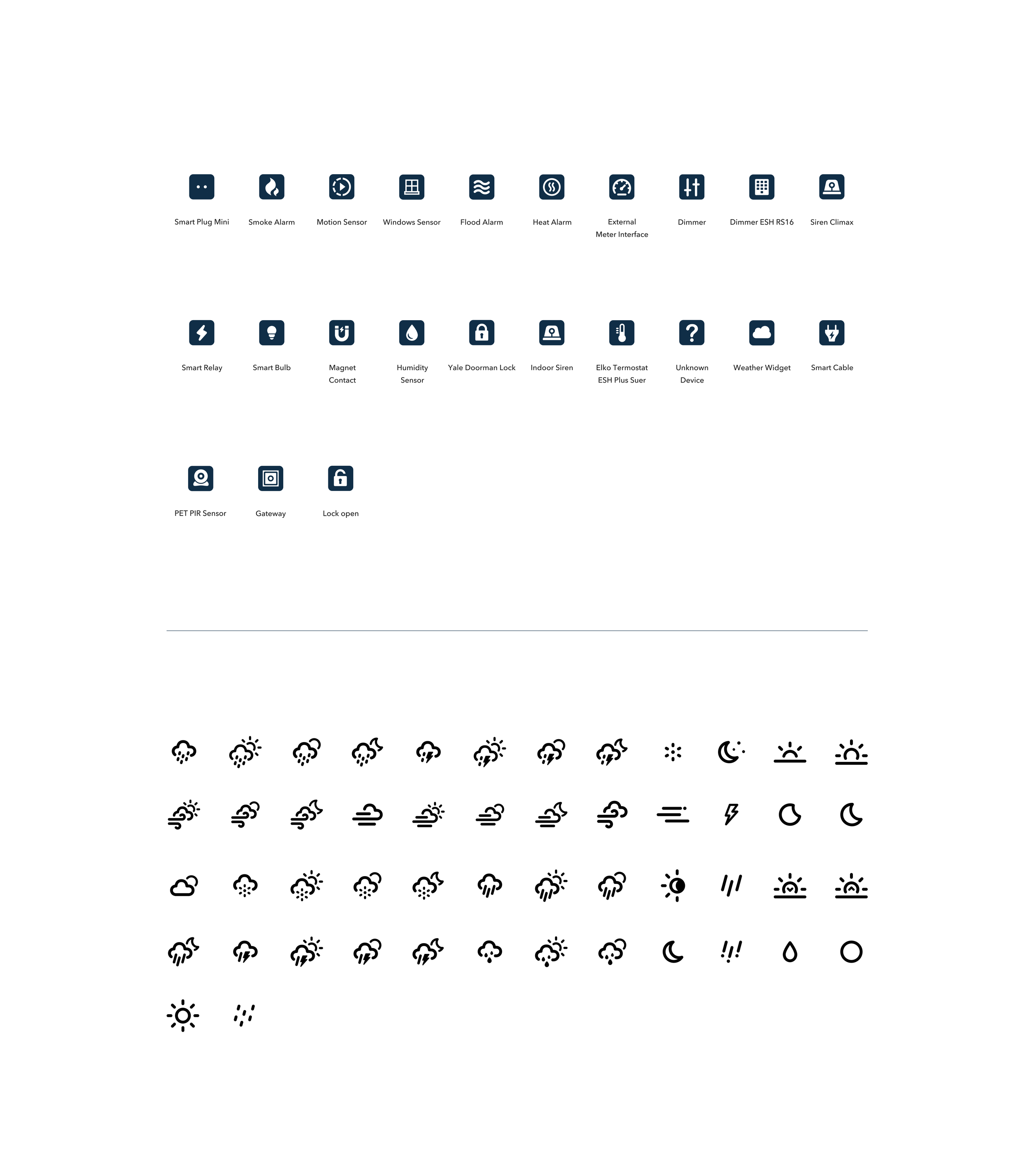
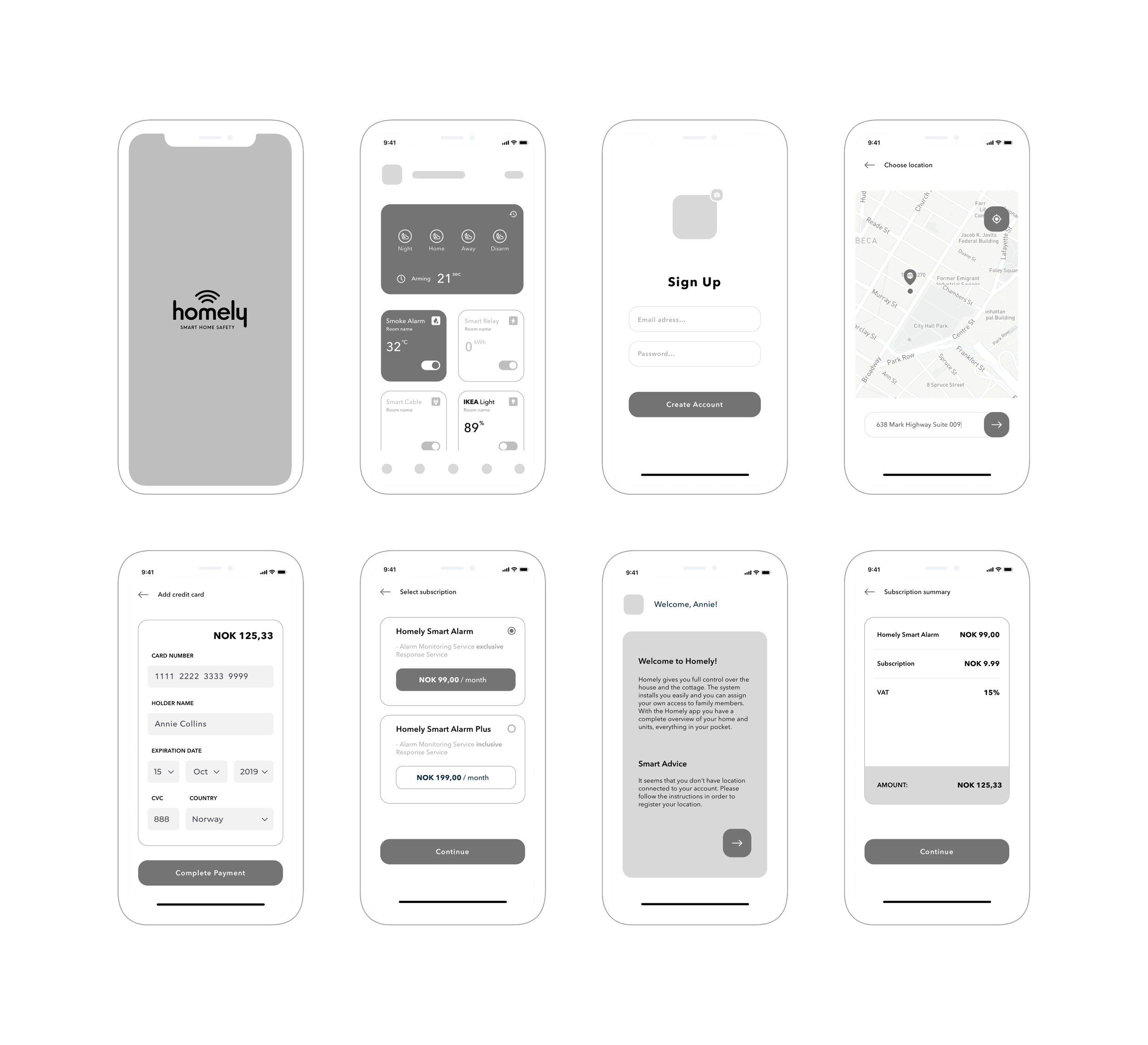
Iconography - We wrote down all the necessary devices.
After that we designed a unique icon library for the new Homely style guide. For each device we had to propose a different icon. Each icon has it own state indicated with a color from existing style guide:
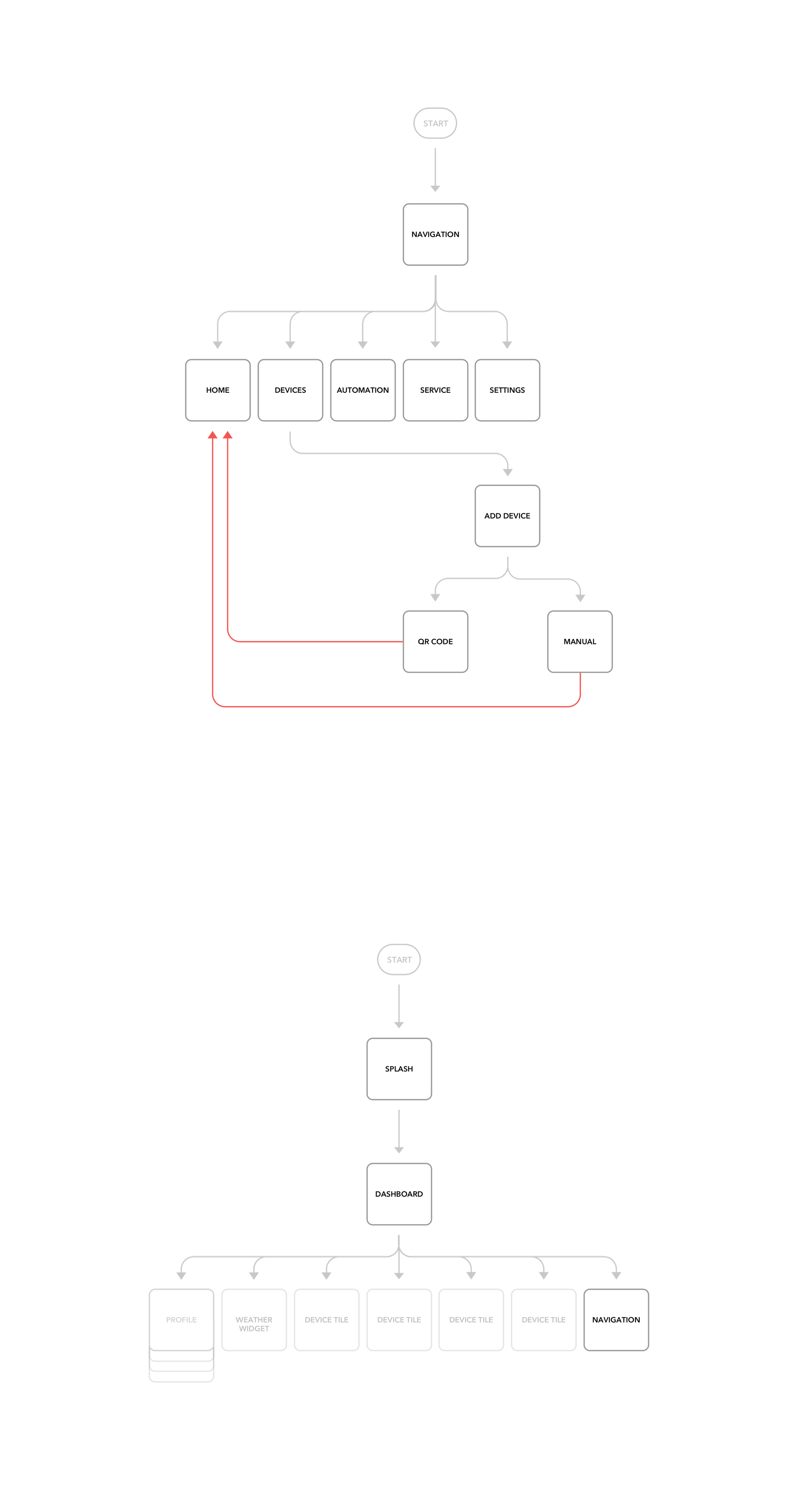
User Flows
We've created user flow diagrams to map every step of the users interaction required to achieve the main goal of this app: "As a user, I want to have a remote control of my home devices!”
Wireframes
We turned our revised sketches into a black and white interactive prototype done with Sketch. I defined UI elements, design patterns and visual hierarchy. Then we tested the prototype remotely.
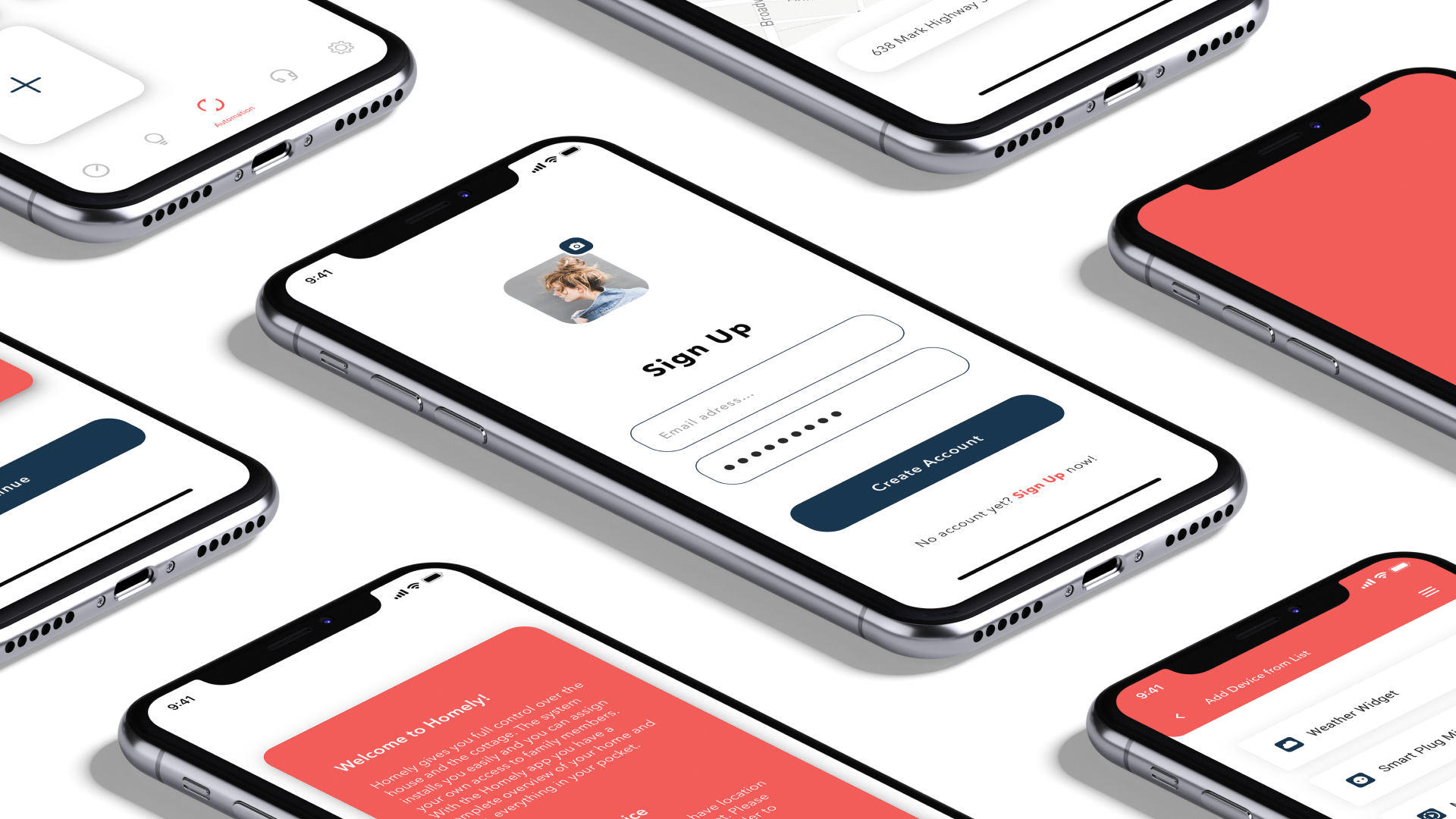
Validation - Proof over opinion
We validated major interactions through rapid RITE testing cycles.
Each iteration targeted hesitation patterns observed in sessions:
unclear transitions were redesigned
anxiety moments were shortened
failure states were made recoverable
Testing guided every major decision.
Evidence replaced opinion.
Outcome - Business impact
Measured over 8 weeks post-launch:
Onboarding completion increased by 42%.
Pairing success rose from 21% to 74%.
7-day retention doubled.
Support tickets dropped by 37%.
Activation time reduced by 53%.
The redesign transformed onboarding from a barrier into a growth lever.
This project reinforced that clarity drives adoption and emotional friction blocks behavior. Testing early prevents costly mistakes, and strong UX leadership begins with reframing the right problem.
Design impact is measured in behavior change, not pixels.