
UBS® — Internal Employee Experience Platform
Designing a scalable employee portal that unified HR services, knowledge access, and internal tools into a single predictable experience.
Role: Product Designer
Scope: UX architecture + platform redesign
Area: Employee portal / HR platform
Duration: 2 months
Team: Product + Engineering + HR stakeholders
Executive summary
UBS® needed to consolidate fragmented internal systems into a unified employee experience platform.
The goal was not visual refresh — it was structural clarity.
We redesigned the portal architecture to reduce friction, improve discoverability, and create a predictable navigation system across HR tools, knowledge bases, and employee services.
Context & business problem
Employees relied on multiple disconnected systems to access HR services, benefits, and internal documentation.
This caused:
— navigation confusion
— duplicated content
— inconsistent interaction patterns
— high support dependency
— low discoverability of resources
The platform existed — but it didn’t behave like a system. It behaved like stitched tools.
My role & ownership
I led UX architecture and experience design for the unified employee portal.
My responsibilities included:
— mapping existing system fragmentation
— redesigning information architecture
— structuring cross-platform navigation
— defining scalable UI patterns
— aligning HR and product needs
— collaborating with engineering on feasibility
The challenge was not screens. It was ecosystem logic.
Discovery & insights
Research showed employees didn’t lack tools — they lacked orientation.
Key insight:
Users didn’t trust navigation. They didn’t know where things lived.
We identified hesitation points:
— search dependency instead of browsing
— inconsistent labeling
— duplicate workflows
— unclear ownership of content
— fragmented mental model
The problem was cognitive, not visual.
Strategic decision
Instead of redesigning pages individually, we restructured the platform around predictable system rules:
— explainable navigation hierarchy
— consistent interaction logic
— unified search + browse model
— modular content architecture — shared component language
We designed the system to be learnable once. Not relearned every visit.
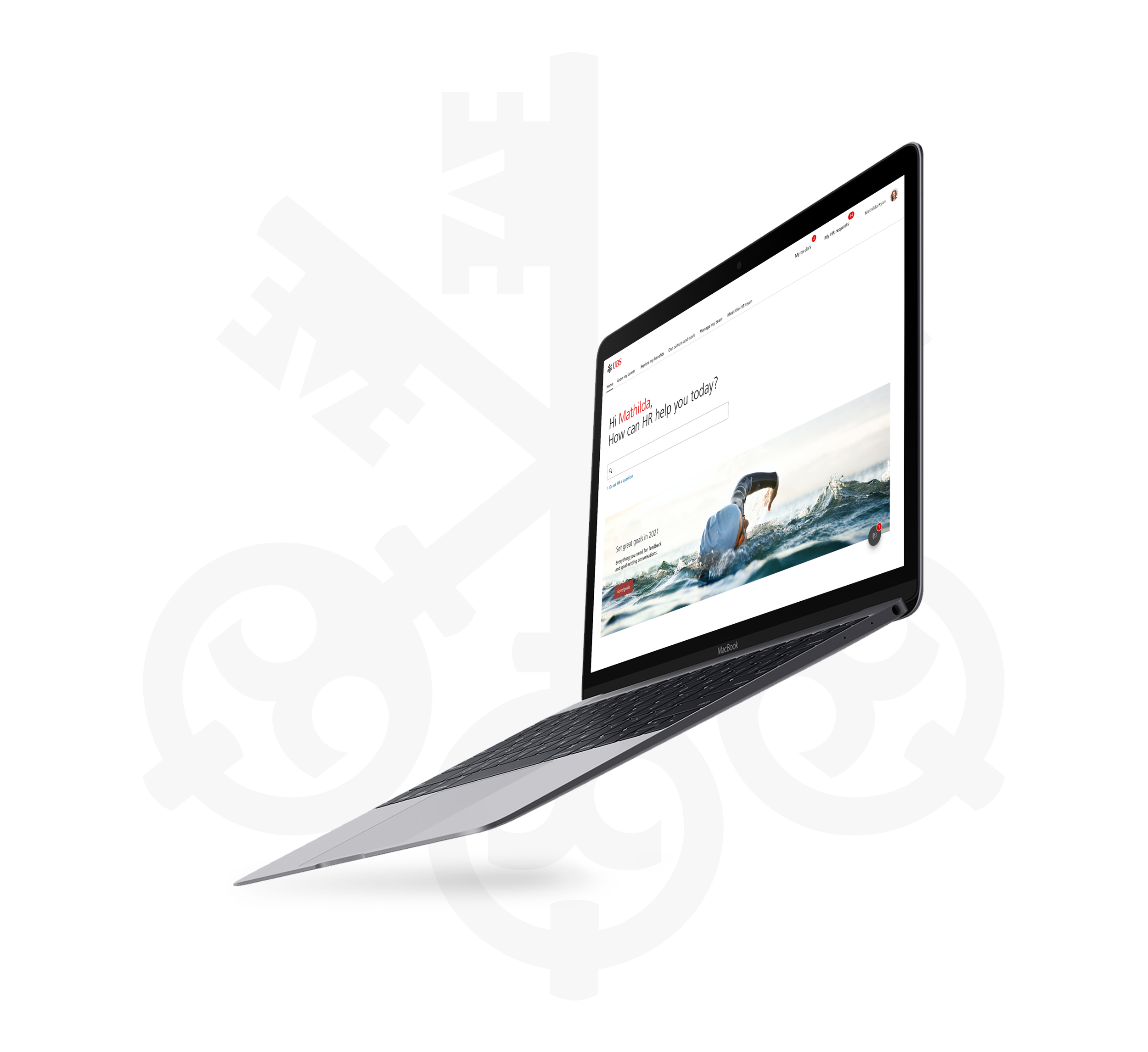
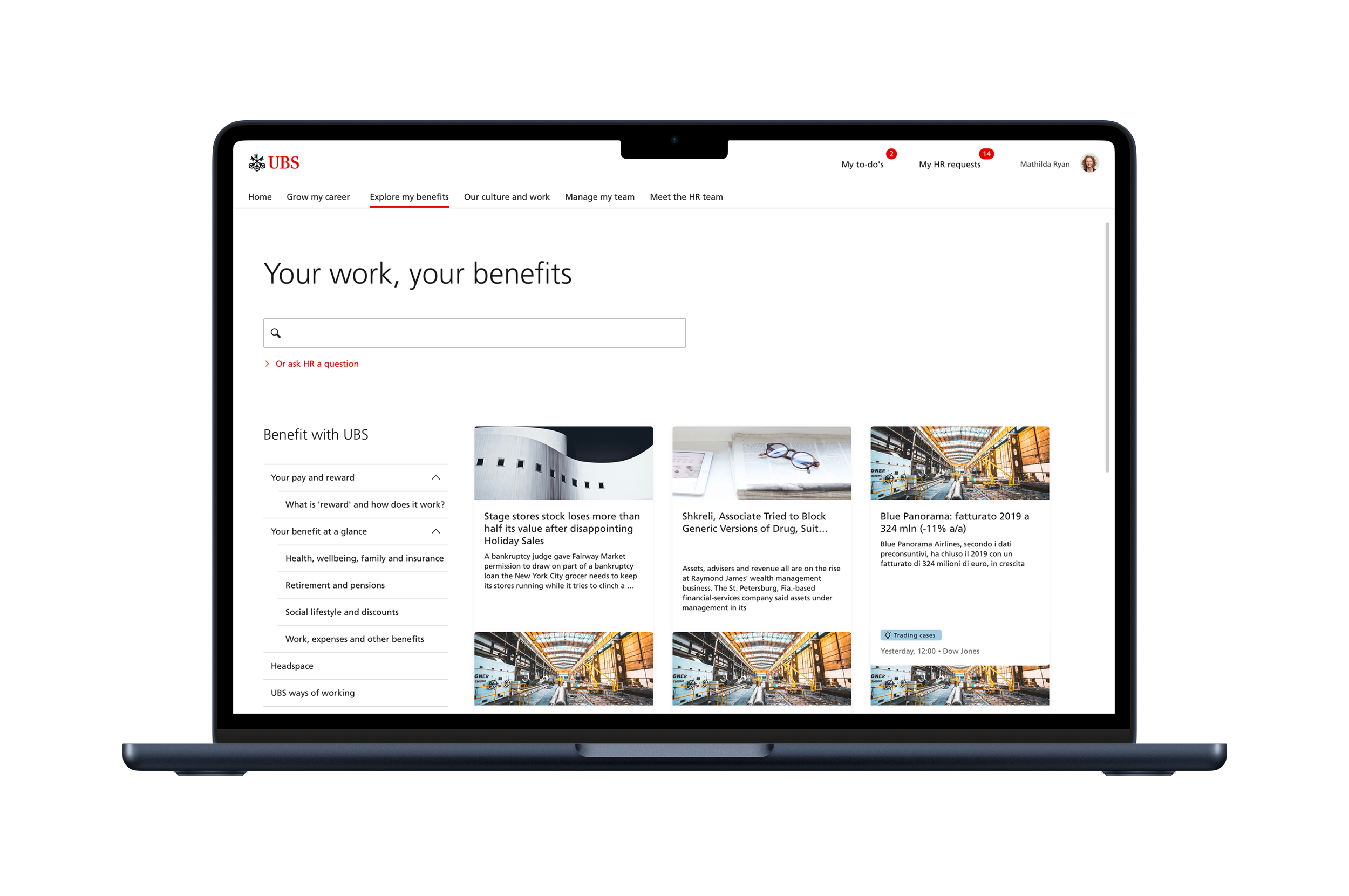
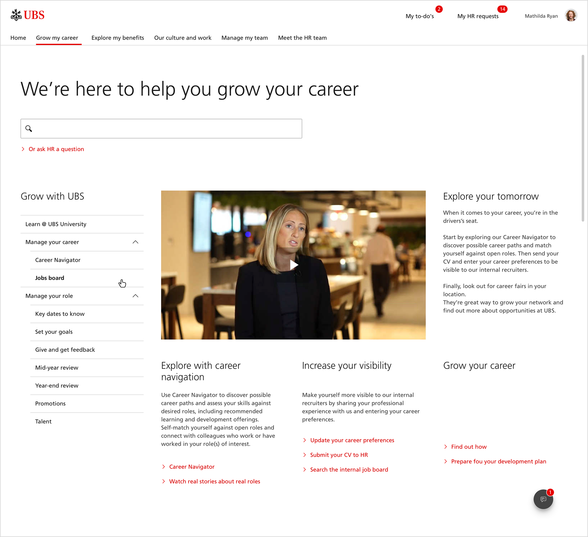
Solution architecture
The new platform focused on:
— centralized HR access hub
— predictable global navigation
— structured knowledge discovery
— scalable content modules
— unified employee workflows
— reusable UI framework
The portal shifted from a tool collection to a coherent system.
Validation
We validated decisions through stakeholder testing and internal pilot rollout.
Results included:
— faster task completion
— reduced support requests
— improved navigation confidence
— higher engagement with internal resources
Employees stopped asking where to go. They knew.
Outcome
The redesign created a scalable foundation for internal tools.
Future HR features could be integrated without breaking mental models.
The platform felt consistent, stable, and predictable.
The biggest success wasn’t visual polish. It was trust.