
A mobile-first survey experience built for speed, clarity, and flow.
Overview
Mobile Surveys was one of the projects where the challenge wasn’t adding more features — it was removing friction.
Surveys are often designed on desktop, but most respondents complete them on mobile. That gap creates broken layouts, unreadable questions, and interactions that feel clumsy or tiring. The goal of this project was to rethink how surveys behave on small screens and design an experience that feels native, lightweight, and effortless.
This wasn’t just a responsive exercise. It was about designing for mobile as a first-class environment.
The challenge
Mobile introduces constraints that expose weak design decisions instantly:
— limited screen space
— touch precision instead of cursor precision
— shorter attention spans
— real-world distractions
— slower connections
— one-handed use
Traditional survey builders treat mobile as a scaled-down desktop version. That approach leads to clutter, cognitive overload, and higher drop-off rates.
We needed a system that:
• adapts intelligently to screen size
• keeps focus on one decision at a time
• reduces visual noise
• preserves survey logic and complexity
• stays fast and readable in any environment
The core problem wasn’t technical. It was behavioral.
How do you design surveys people actually want to finish?
Approach
We redesigned surveys around a mobile-first mental model:
One screen = one clear action.
Key principles:
— progressive disclosure instead of dense layouts
— thumb-friendly interaction zones
— large tap targets and predictable gestures
— visual rhythm that supports flow
— minimal chrome, maximum clarity
Every question type was re-evaluated for mobile behavior. Some interactions were simplified. Others were rebuilt entirely to feel natural on touch screens.
Designing question behavior
Different question types require different interaction models.
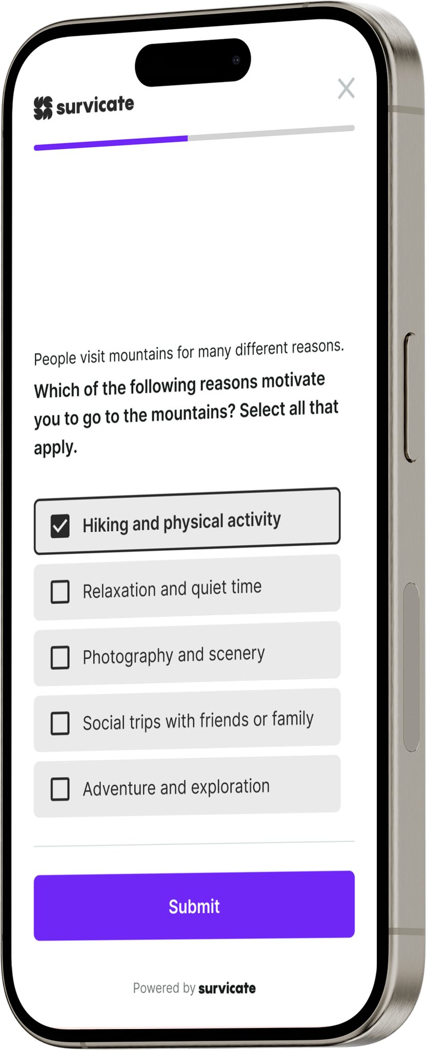
Single choice questions needed speed and clarity. Multiple choice required error tolerance and confirmation.
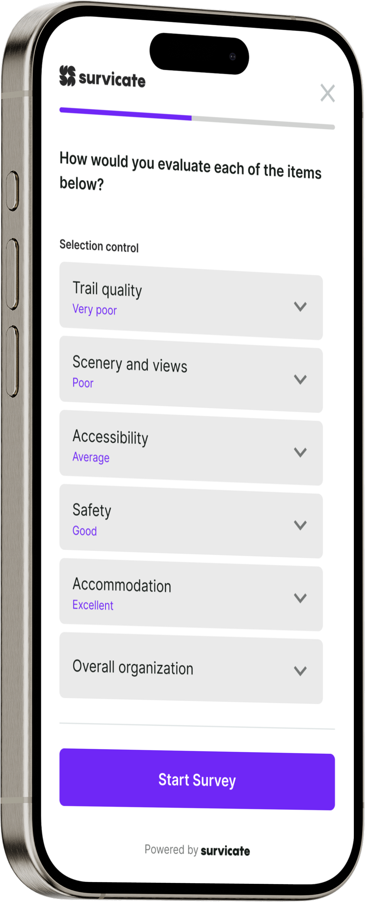
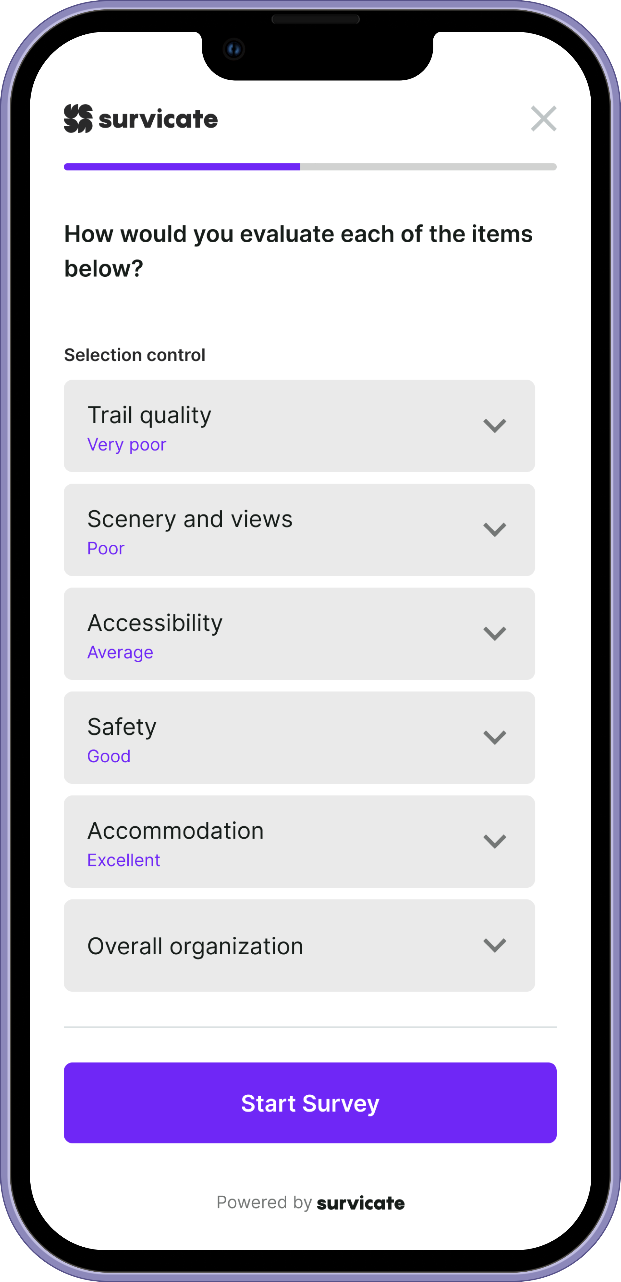
Matrix questions demanded special attention to readability and scrolling behavior.
We designed adaptive layouts that respond not just to screen size, but to cognitive load.
Examples:
— matrix questions switch to stacked or swipeable formats
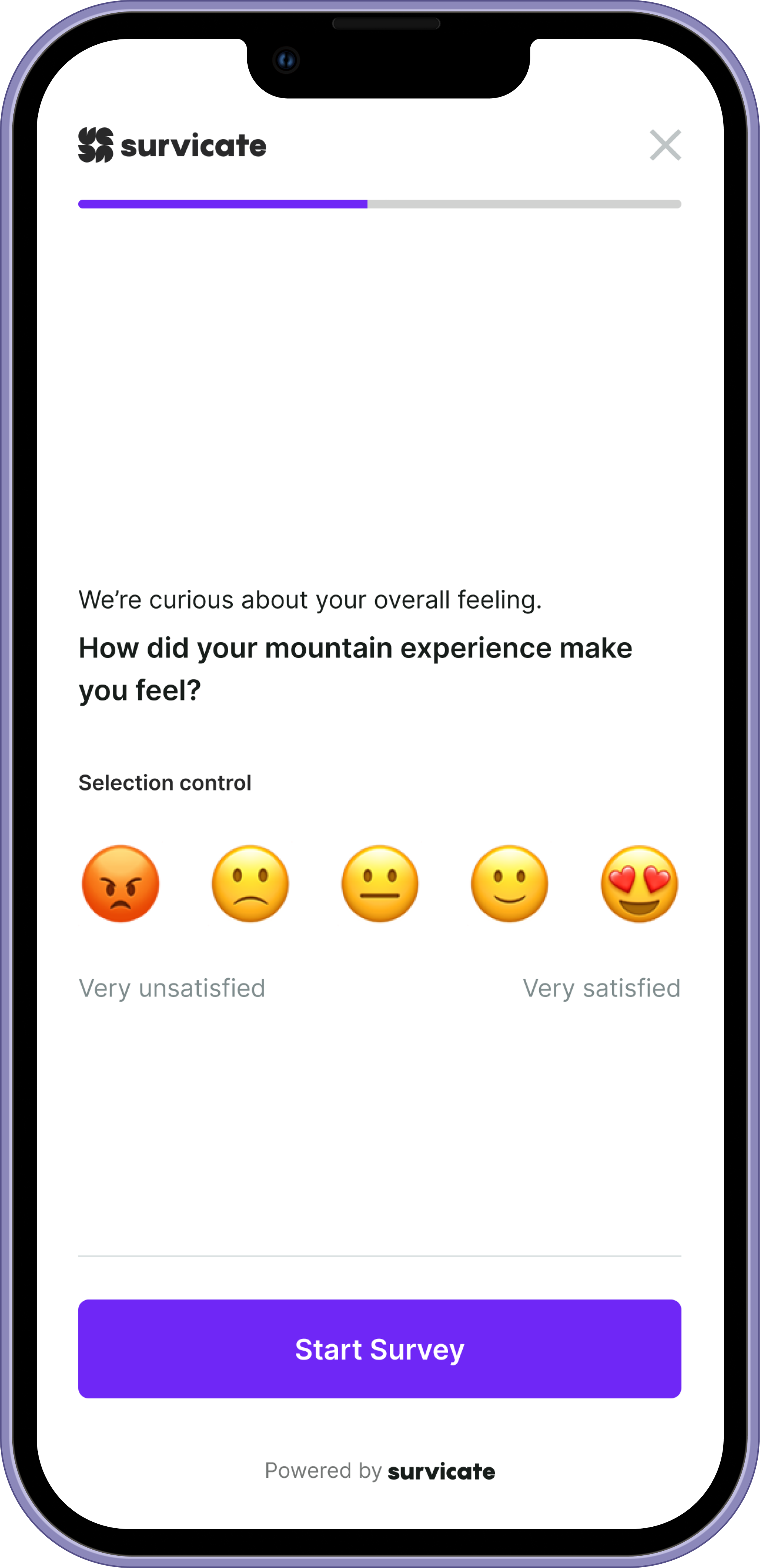
— rating scales emphasize thumb reach and gesture comfort
— text input prioritizes keyboard behavior and field focus
— long answers introduce breathing space instead of compression
The system flexes around the user, not the other way around.
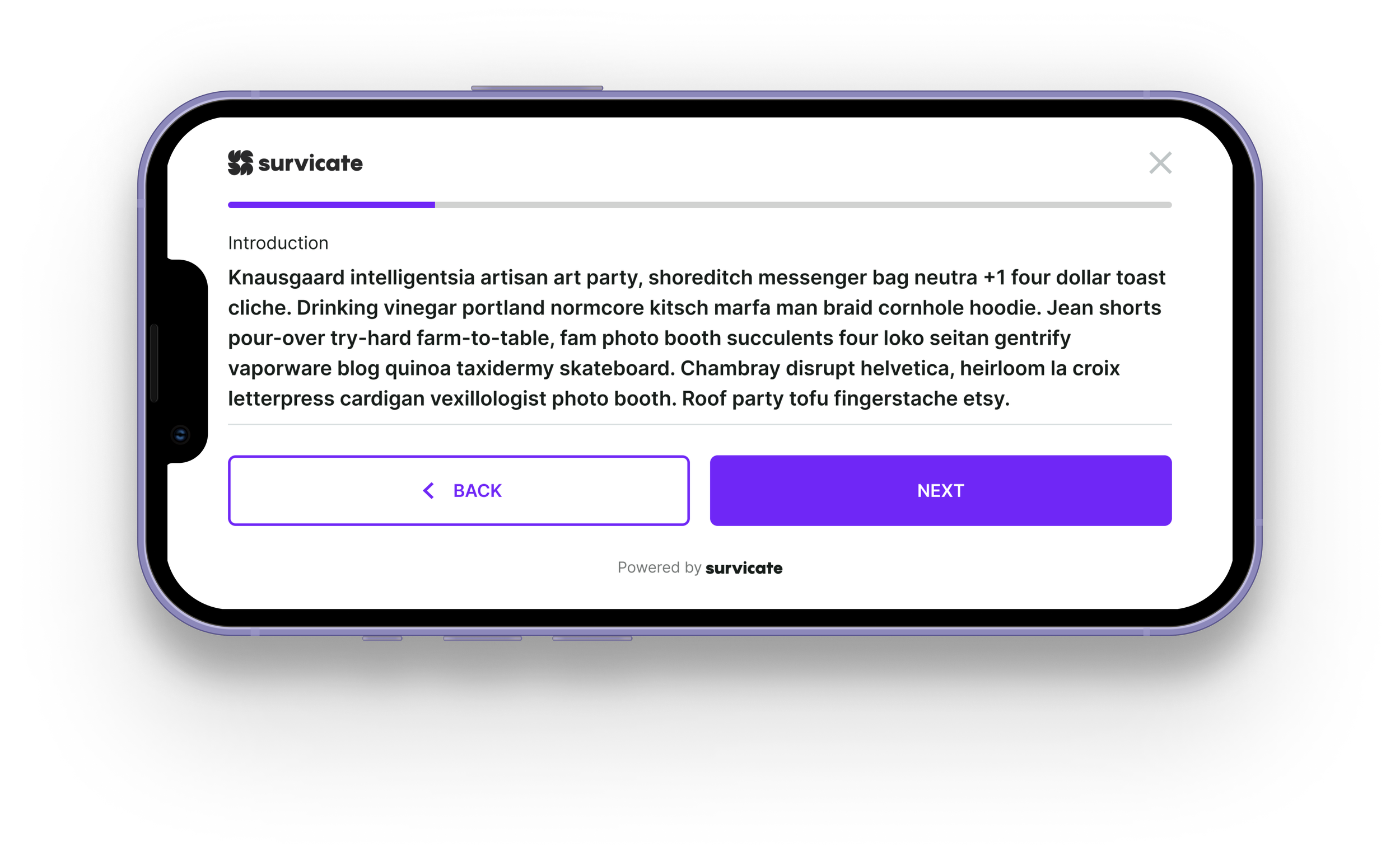
We also had to design for text-heavy scenarios. Surveys often include long introductions, detailed questions, and verbose answer options. The interface needed to flex around content without breaking readability. UI elements were built to expand gracefully, preserving hierarchy and spacing so even dense text remains scannable, calm, and easy to process.
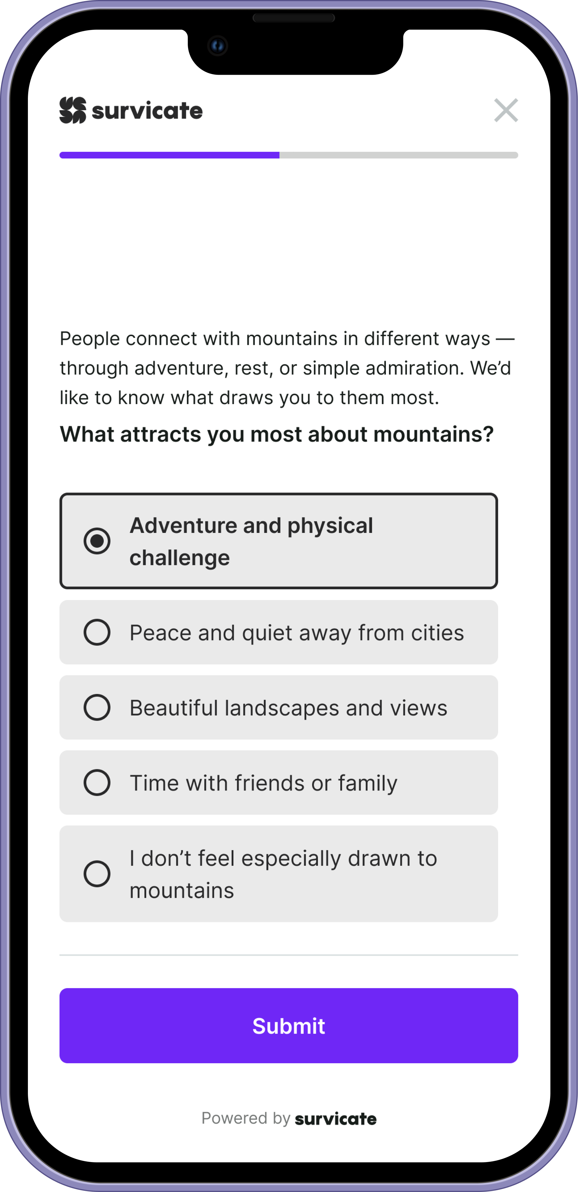
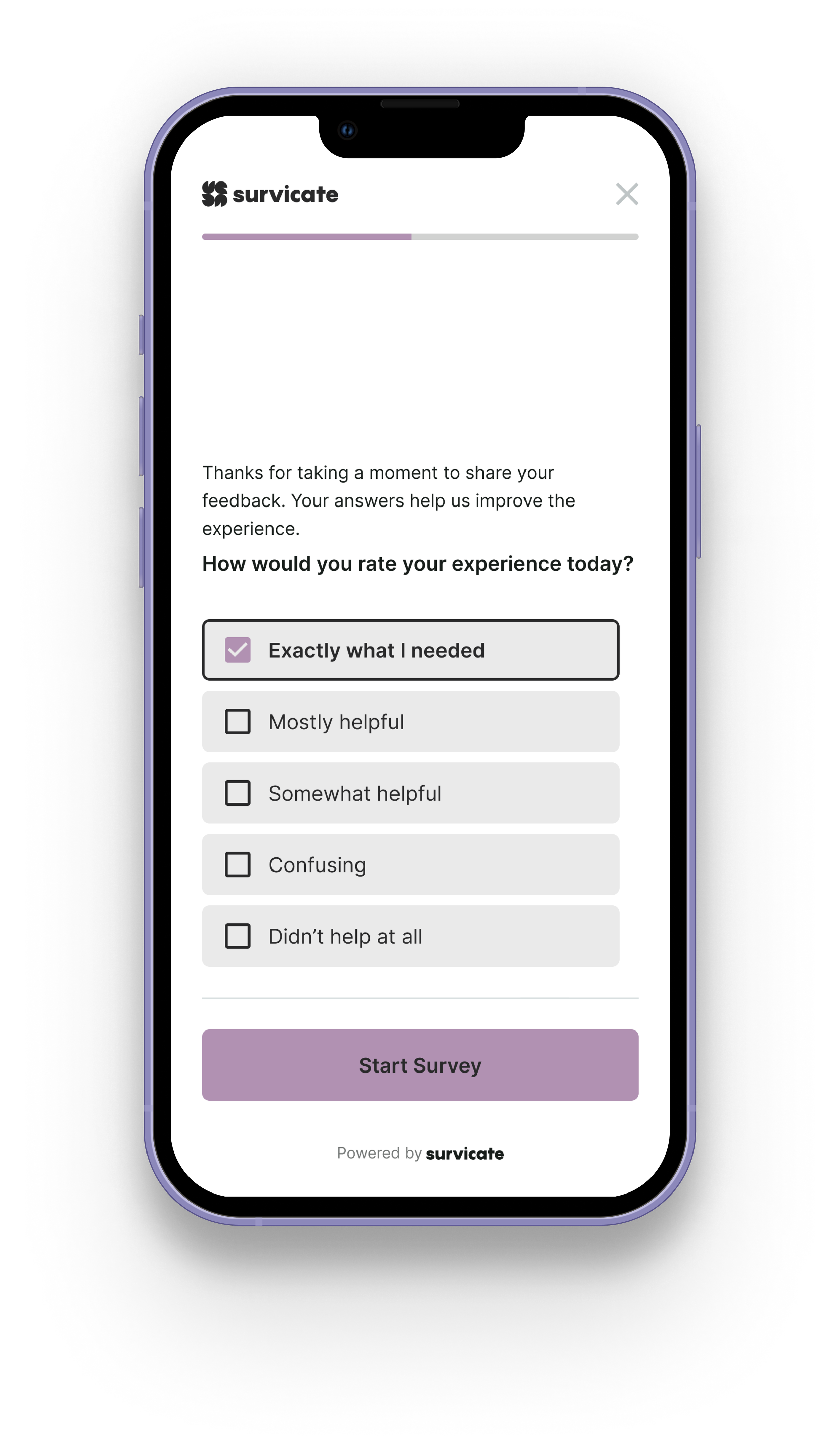
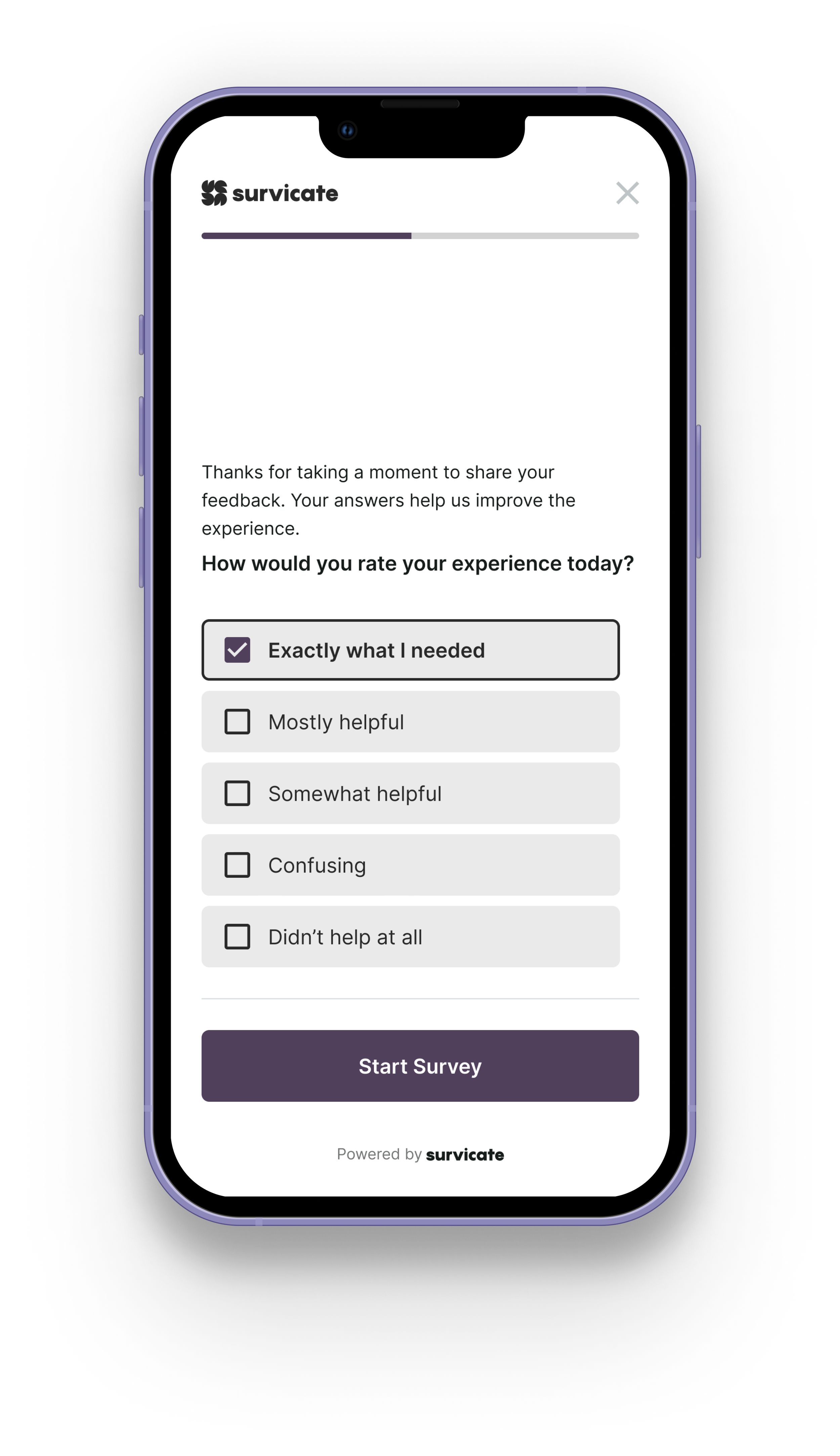
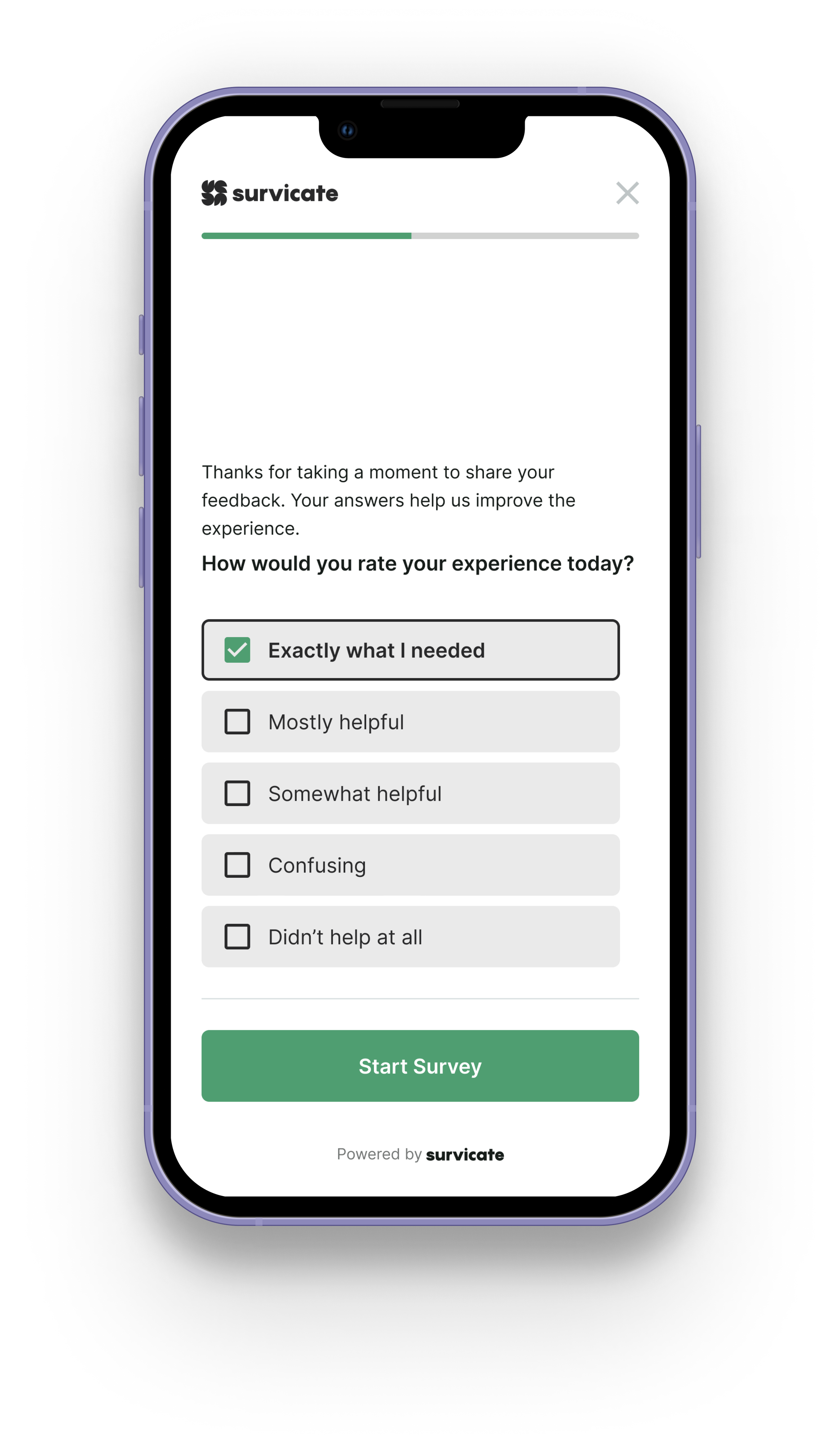
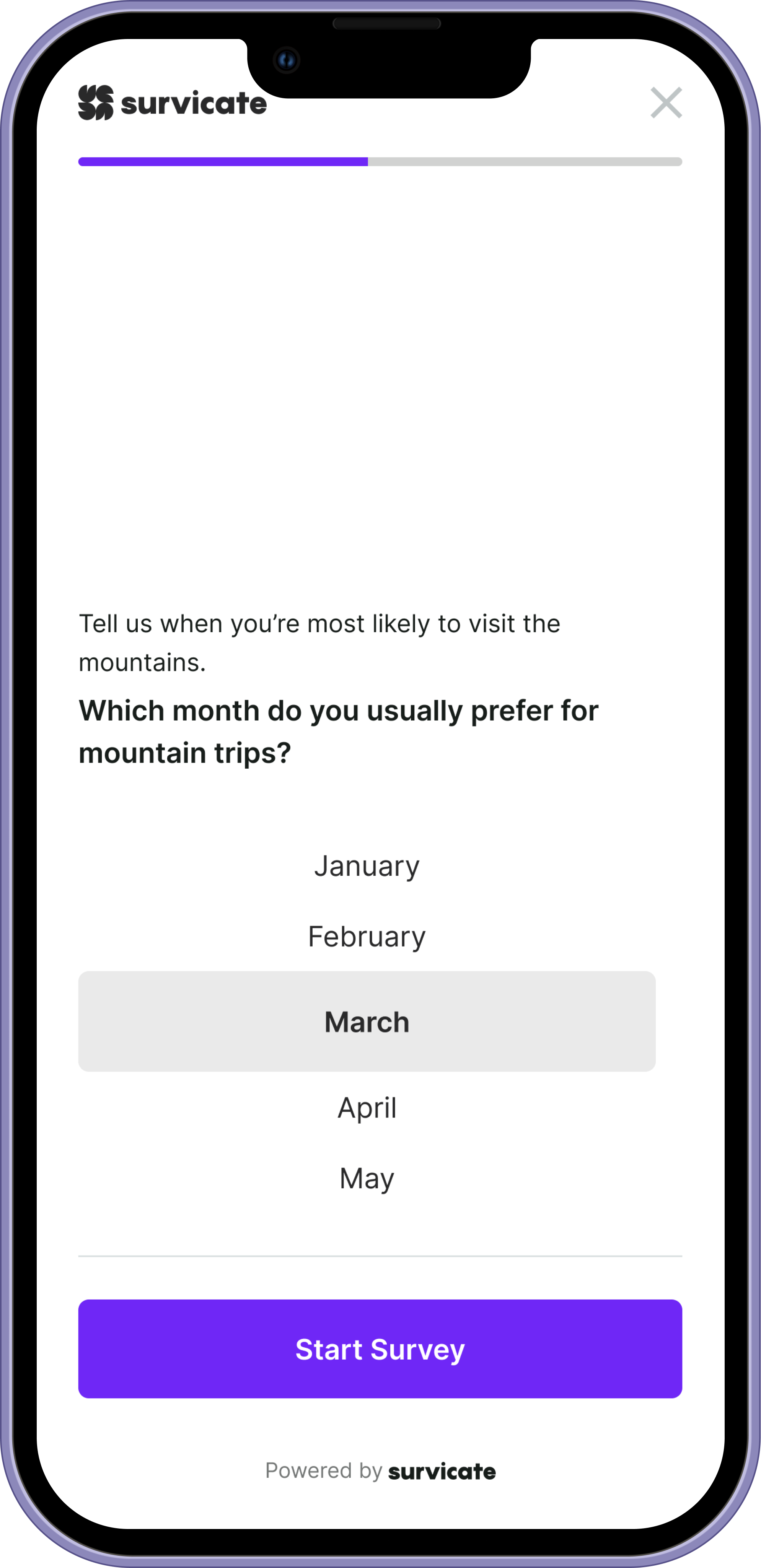
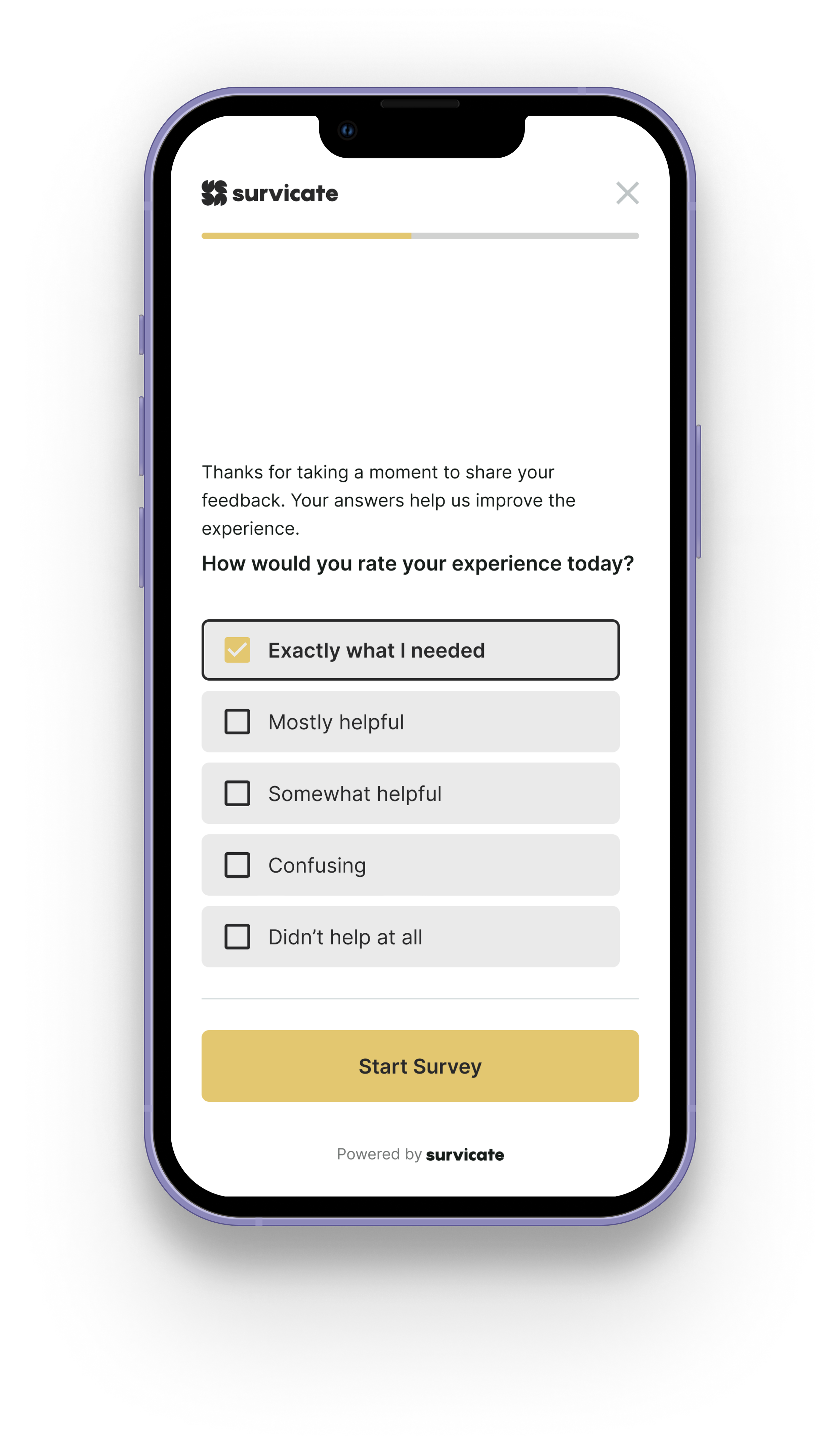
Single Choice Answer
Matrix Question
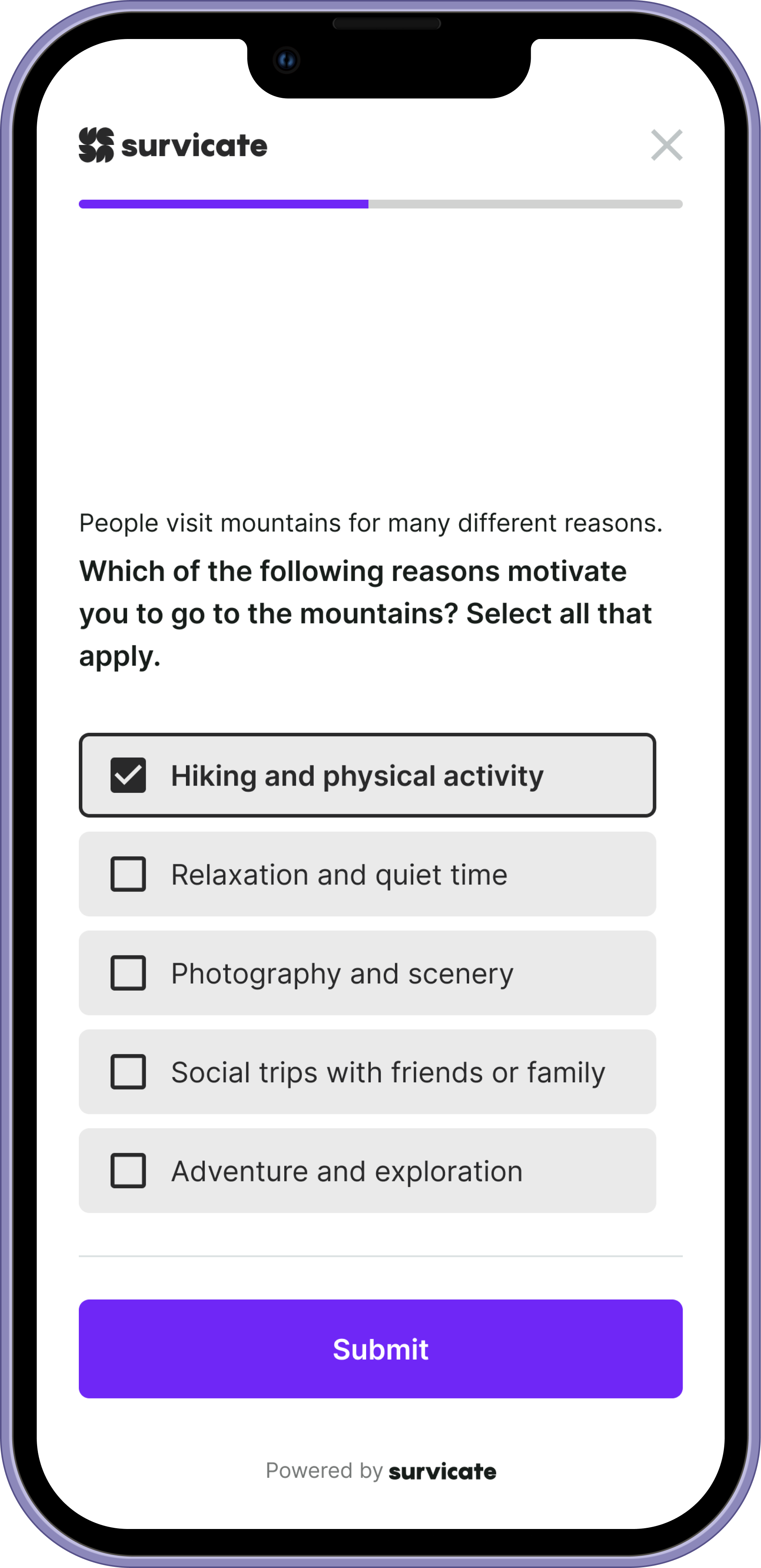
Multiple Choice Answer
Visual system
The visual language supports focus, not decoration.
We used spacing, hierarchy, and motion to create rhythm:
— clear separation between decisions
— calm color palette to reduce fatigue
— typography optimized for scanning
— subtle transitions to preserve flow
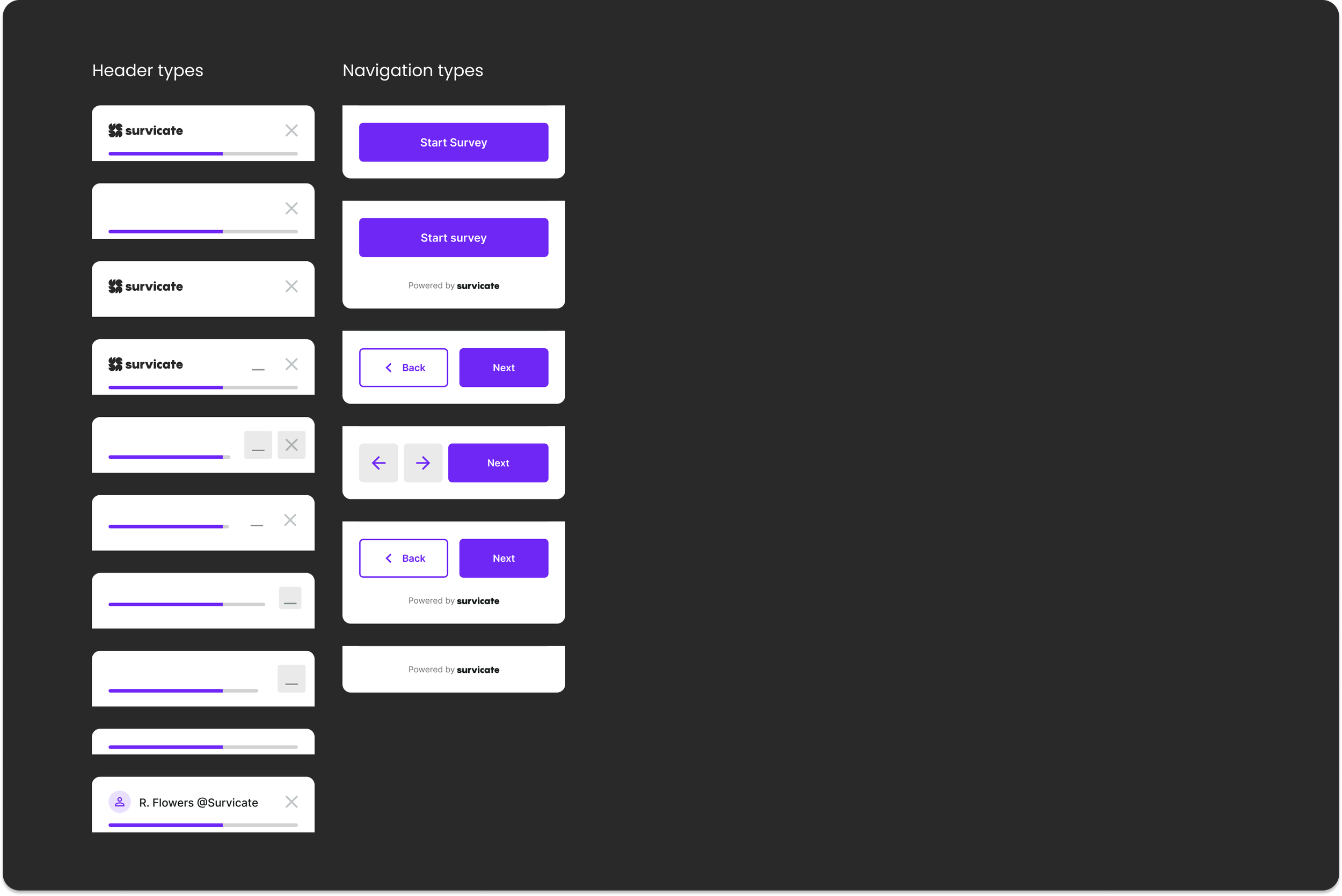
The system is flexible by design. Before publishing, users can configure the survey to match their goals, tone, and context. Different scenarios demand different UI elements — from minimal flows focused on speed to more guided experiences with additional controls. The interface adapts without breaking consistency, letting users shape the survey while preserving clarity and structure.
Mobile surveys should feel lightweight. No friction. No noise. Just progress.
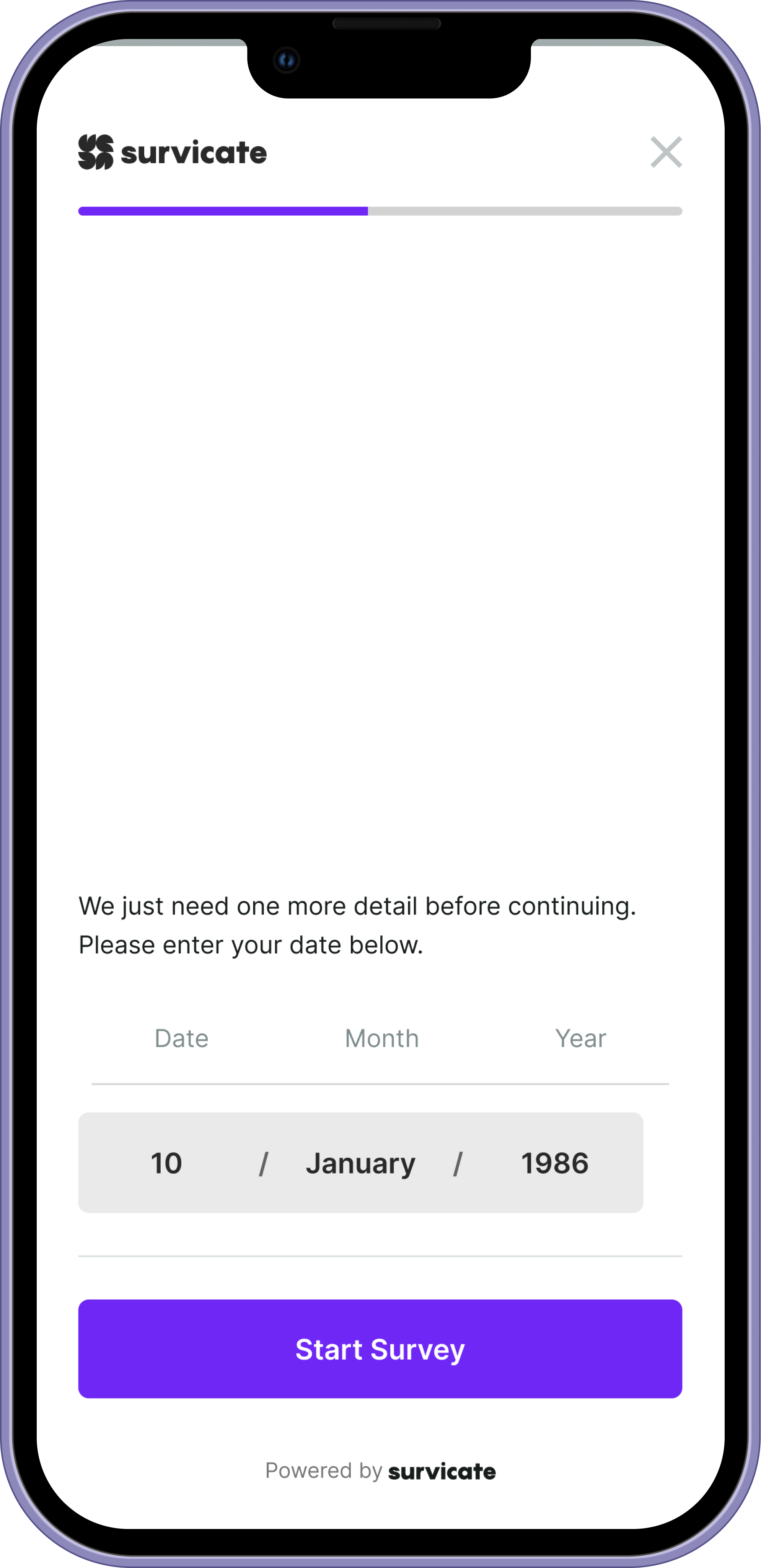
Date
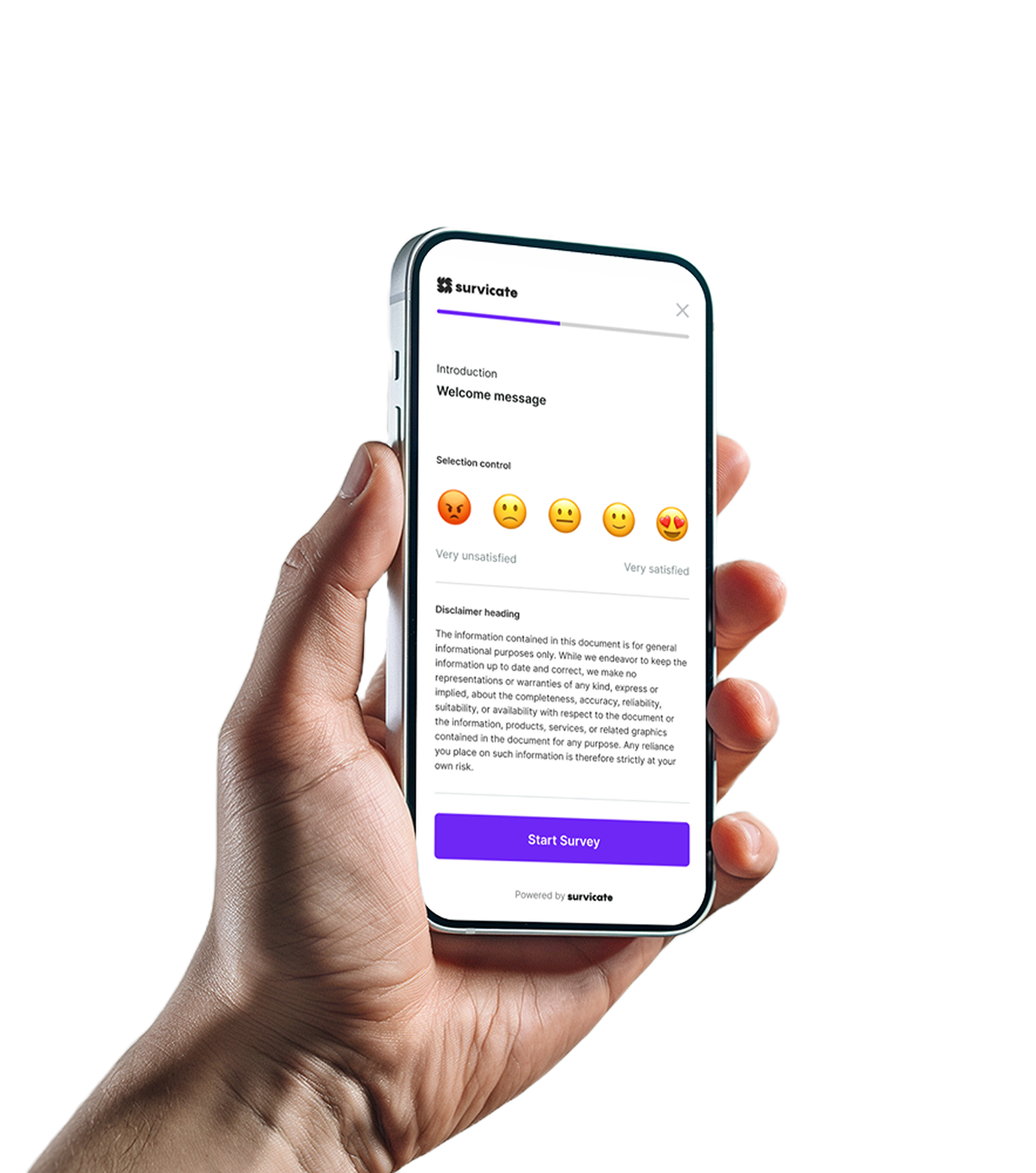
Smiley Scale
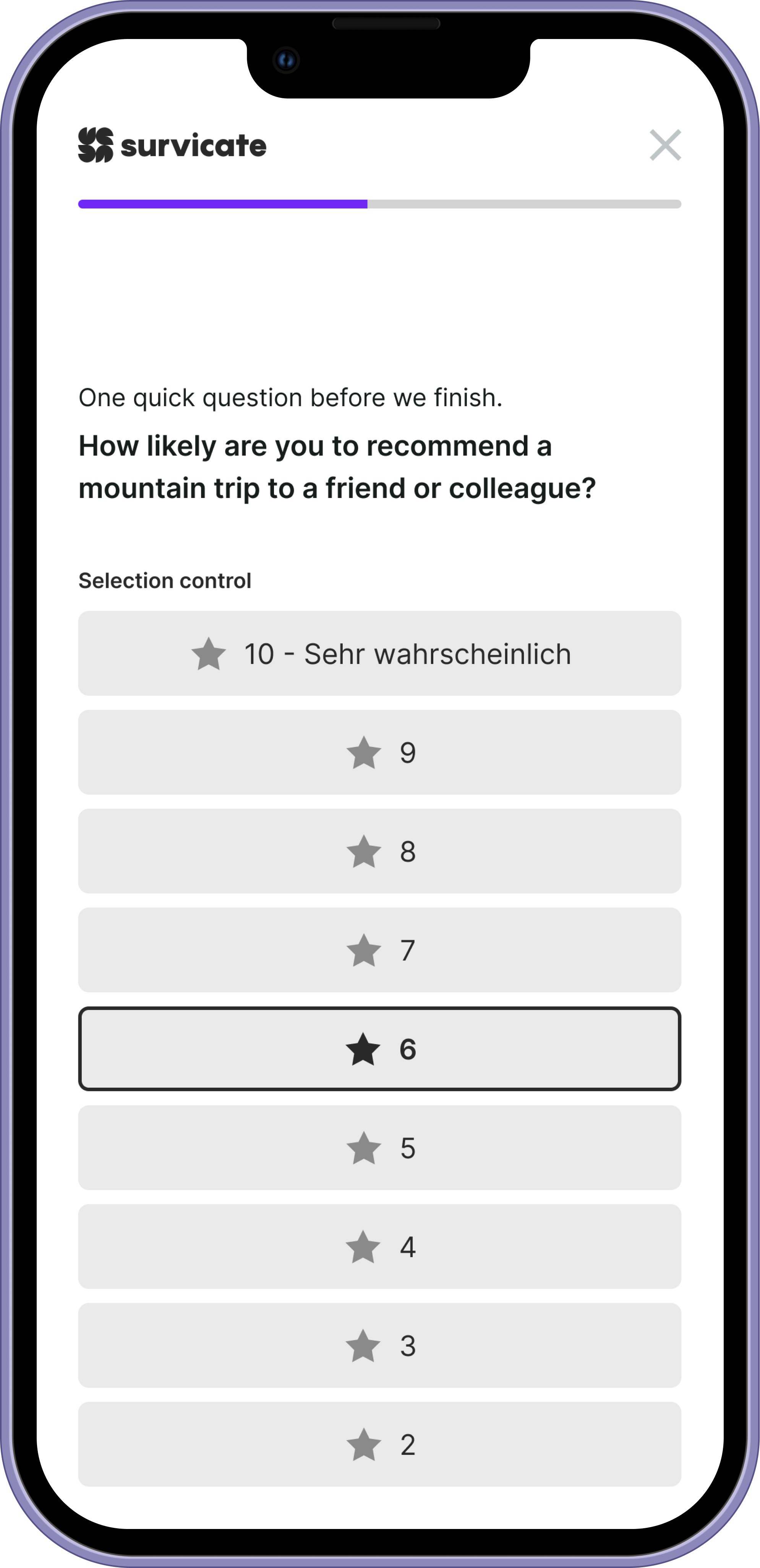
Rating Scale
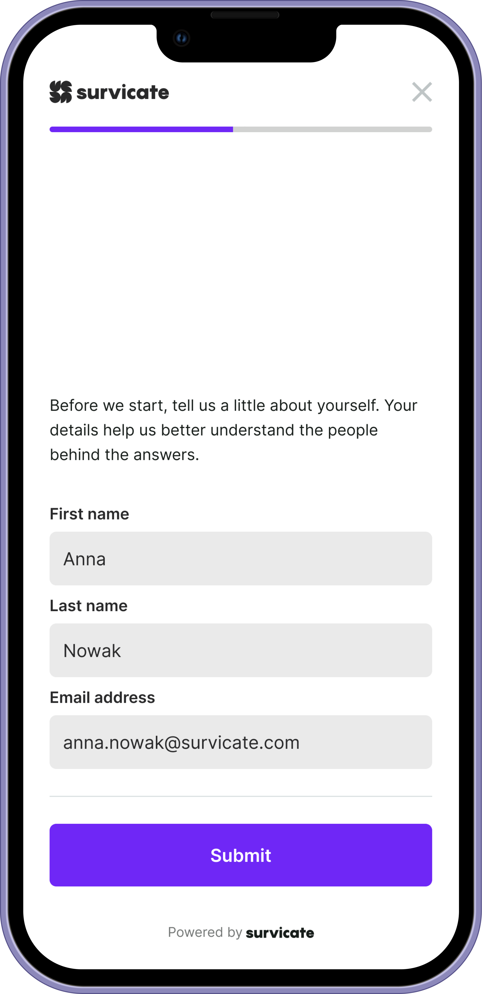
Contact Form
Dropdown
Outcome
The final system delivers:
— faster completion times
— reduced drop-off on longer surveys
— clearer interaction patterns
— consistent experience across devices
— scalable architecture for future survey types
More importantly, the design reframed how surveys behave on mobile.
Instead of feeling like a compressed desktop tool, Mobile Surveys became a focused interaction experience designed for real-world use.
Surveys stop feeling like tasks. They start feeling like conversations.
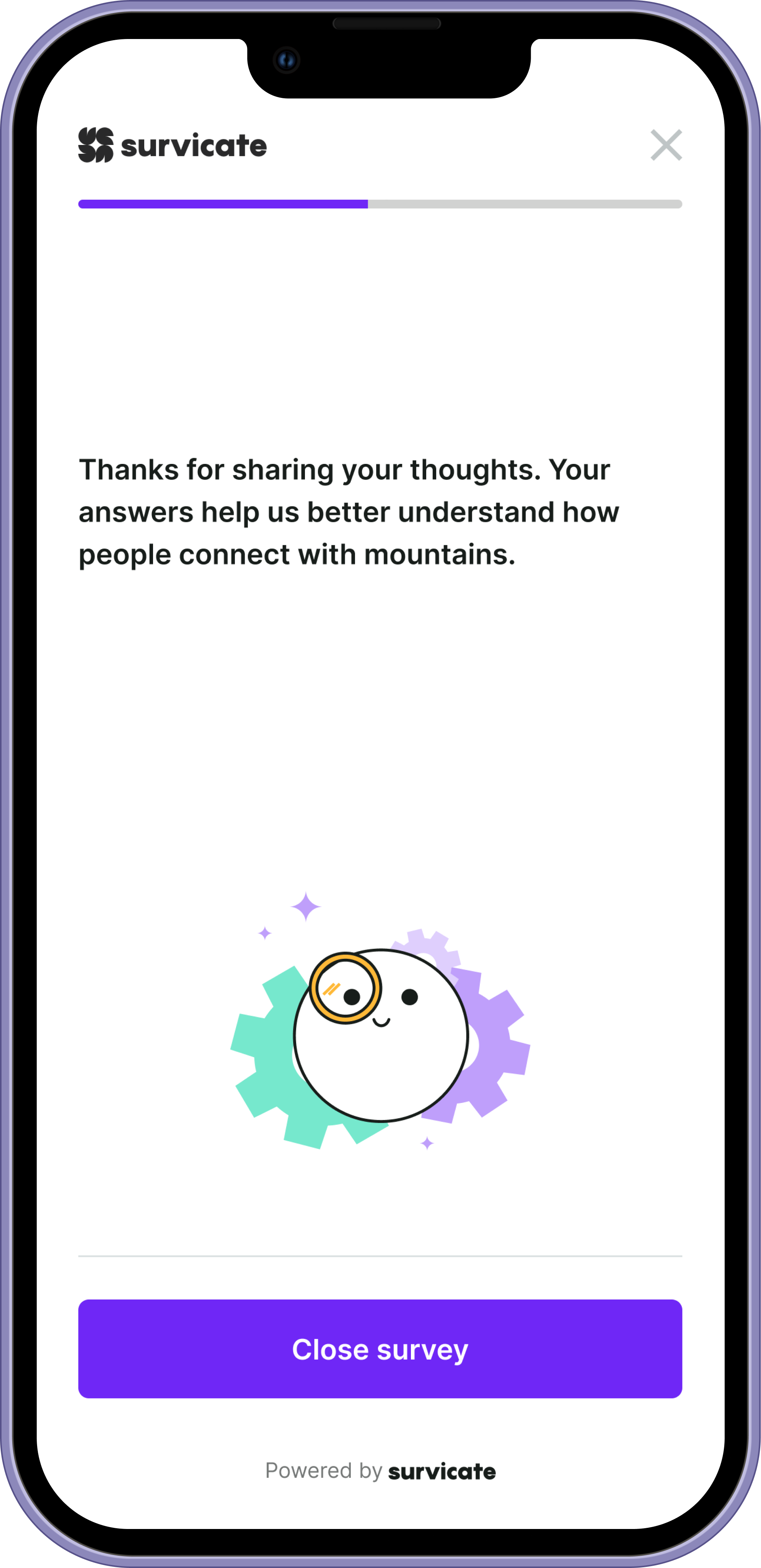
Thank You Screen
Example: horizontal orientation
Customization & Theming
Mobile surveys aren’t one-size-fits-all. Different brands need different voices.
We designed a theming system that allows teams to customize the primary color of the survey interface and save it as a reusable theme. This makes it easy to maintain visual consistency across campaigns without rebuilding styles each time.
The platform includes a set of ready-made system templates that follow WCAG accessibility standards, giving teams a safe, compliant starting point out of the box. At the same time, we intentionally left room for full visual customization. Businesses can override defaults, adjust contrast, and personalize surveys beyond strict accessibility presets if their branding requires it.
We didn’t want to lock users into a rigid system. We wanted to give them guardrails — not walls.
Beyond color, users can personalize surveys to match their brand identity — including logo replacement and visual adjustments — so the experience feels native to their product, not like a third-party widget.
The goal wasn’t decoration. It was trust.
When a survey looks like it belongs to the brand, users are more likely to engage, complete it, and treat it as part of a cohesive experience rather than an interruption.
Read more here